

 Hyphens are an important contributor to elegant, easy-to-read typography, especially when text is fully justified as is the convention in book typography. This article explains how justified text works, and how proper hyphenation improves the legibility of your type.
Text justification works by expanding the spaces between words on each line until the evenly spaced words precisely fill the width of the text field. Some typographers hate justified text; they prefer the natural spacing of the type to the artificially expanded spacing, and they don’t mind the uneven right edge. A compelling argument can be made that ragged-right (left-aligned) text is the most legible, but a beautifully proportioned rectangle of text set inside the rectangle of the page is likewise an engaging aesthetic experience. Designers must balance page layout considerations against the need to format text that’s inviting and comfortable to read.
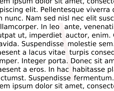
Varying spaces between the words on a line results in slightly different spacing for each line. If the line is long and the words are short, the average space won’t vary tremendously. But if we highlight the adjusted spaces as in the following example, the differences in width from one line to another can be clearly seen.
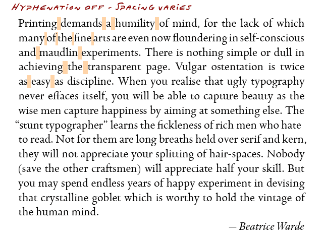
Without hyphens, when the line length becomes narrower, longer words create more of a problem. When only two words can fit on a line, the gap between them can become dramatic. Word lengths vary as do the number of words that fit on a line. Spacing becomes awkward and noticeably inconsistent.
In some cases, the spaces align to form “rivers” in the text.
Hyphenation addresses this “gapping” problem by allowing long words to break. When three words won’t fit on a line, it’s often possible to fit two-and-a-half well spaced words instead of two words with a big gap between them. Spacing becomes more consistent and helps the justified text flow smoothly.
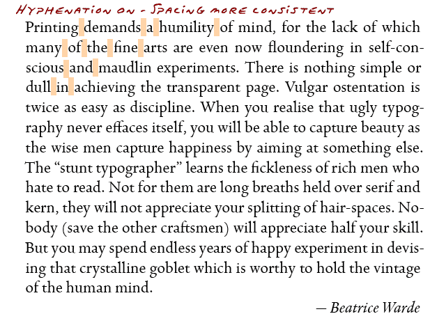
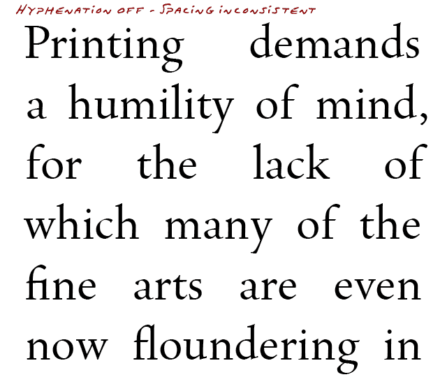
If the lines are narrow and the words are long, it may not be enough to simply “turn hyphenation on.” Hyphens don’t fix all the awkward spacing issues in the example below (though they help).
Page layout software gives you fine control over hyphenation and its resulting typographic compromises—which is one reason why it’s superior to using a word processor to prepare your book block. In the above example, even with hyphens turned on, the first line would be better off as “Printing demands a,” which would introduce two more characters (“a” and a space). The secret solution is found in InDesign’s Hyphenation Controls under Paragraph Settings.
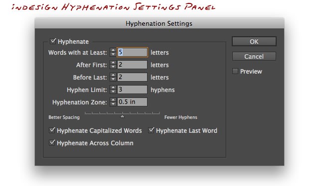
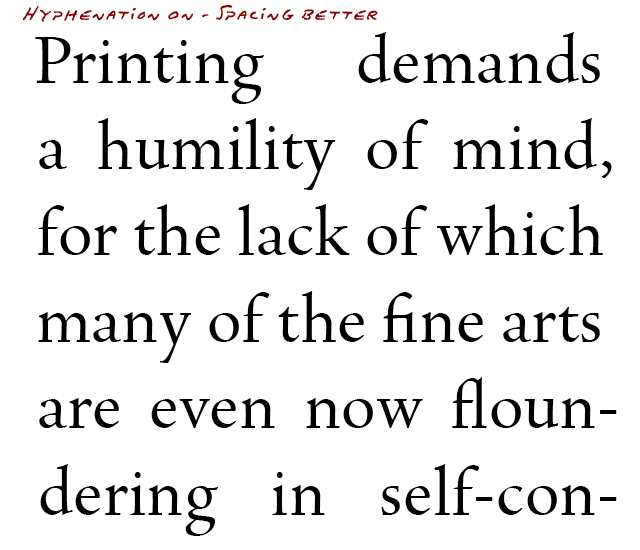
Use this panel to limit the number of hyphens in consecutive lines or to set a minimum length for a word that’s a candidate for hyphenation. Look what happens when I set the “Words with at least _ letters” setting from 5 to 4 (you wouldn’t want to hyphenate a word of 3 characters or fewer).
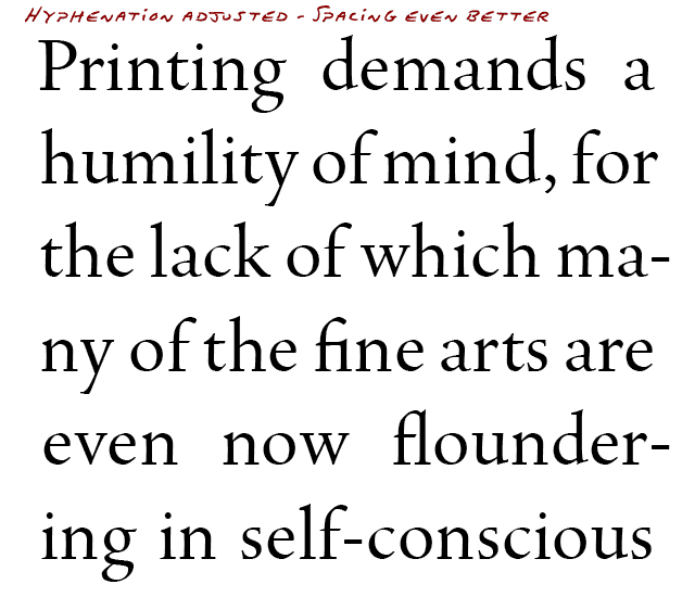
The spacing is greatly improved. If the entire paragraph was shown, we’d see more hyphens, but by allowing the four-character word “many” to break, the typesetting engine finds better ways to adjust the spacing. The default settings are usually fine for book typography, but when setting narrow column text (as in a newspaper), use more hyphens.
Adobe InDesign offers the following hyphenation options and controls:
Words With At Least _ Letters – Choose the minimum word length for hyphenated words.
After First _ Letters / Before Last _ Letters – Choose the minimum number of characters at the beginning or end of a word that can be broken by a hyphen. For example, by specifying 3 for these values, aromatic would be hyphenated as aro‑ matic instead of ar‑ omatic or aromat‑ ic.
Hyphen Limit _ Hyphens – Specify the maximum number of hyphens that can appear on consecutive lines. Zero means unlimited hyphens.
Hyphenation Zone – the amount of white space allowed at the end of a line of unjustified text before hyphenation begins. In other words, when you’re setting text ragged-right, this option allows you to control how ragged the right edge is allowed to become.
Better Spacing / Fewer Hyphens – To alter the balance between the above settings, adjust the slider at the bottom of the dialog box.
Hyphenate Capitalized Words – To prevent capitalized words from being hyphenated, deselect this option. This helps to ensure that proper nouns won’t be hyphenated.
Hyphenate Last Word – To prevent last words in paragraphs from being hyphenated, deselect this option. This helps to prevent “runts” from occurring—paragraphs with a single word (or shorter) last line.
Hyphenate Across Column – To prevent words from being hyphenated across a column, frame, or page, deselect this option.
For hyphen-haters, justified text is a quandary. I once had a prospective client walk away because I couldn’t guarantee him a minimum number of hyphens per page without introducing unsightly spacing problems. Shorter words translates into fewer hyphens. Shorter line widths mean more hyphens. Longer paragraphs offer more opportunities to average spacing variations over more lines. Too many hyphens results in better spaces but may produce undesirable “ladders”—3 or more consecutive lines ending in a hyphen.
When setting full-justified type, understand the important trade-offs between word spacing and hyphenation. Ideally, use typesetting software that provides more sophisticated hyphenation options than “on” and “off.”
More Book Design Basics:
Book Design Basics Part 1: Margins and LeadingBook Design Basics Part 2: Optical Margins, Indents and Periods
Book Design Basics Part 3: Running The Numbers
Book Design Basics - Dashes, Hyphens and Dots
Book Design Basics: Small Capitals – Avoiding Capital Offenses
Book Design Basics - Drop Caps and Initial Impressions
Article: Writing is Design: The Grammar of Book Design
Book Design Basics - Use Hyphens for Justified Type
Article: Fine Control Over Justified Text
Simulating the Appearance of Traditional Print
Page Layout: Illustrated Books and the Rule of Thirds
Book Cover Design: Moving from Screen to Printing Press
Book Design Basics: Quotation Marks and Primes
Book Design Basics: Choosing a Book Font