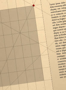
 This article explores page layout strategies for books based on the Rule of Thirds. A grid system based on traditional guidelines ensures harmonious proportions and placement of objects on a page.
Page layout for books is governed by a range of factors. Trade publishers shipping 30,000 copies of a title realize significant savings by using smaller type, tighter leading (line spacing), and narrower margins. For them, aesthetic sacrifices are smart business. But indie publishers printing short runs are free from the business realities of mass production (POD publishers often order single books made to order). Classic page layout strategies offer an easy way for the small publisher to gain an aesthetic edge over the trade.
I discuss page layout in-depth in an earlier post, and Wikipedia’s Canons of Page Construction is an excellent resource, but though these articles present layouts based on page divisions of 1/9, readers are left wondering, why not 15ths or 8ths? Where did the idea of dividing a page into a 9×9 grid come from? The answer is found in a classic formula: the rule of thirds.
The rule of thirds has been used as an informal guide to composition since long before it was first named and written about in 1787. The concept is based on the opinion that a balanced, centered image is static and uninteresting. Here’s an example of a centered shot (left) next to a recomposed photograph of the same subject. In the right example, the subject and the horizon align loosely with page divisions of 1/3.

Boticelli’s Birth of Venus offers another classic example of thirds-based composition:
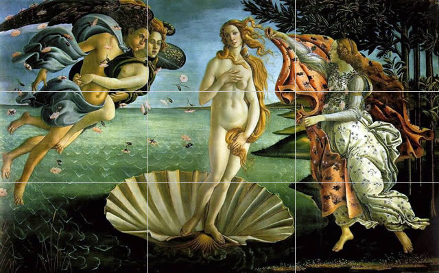
The sky, sea, and land are divided into horizontal bands of approximately one third the image height. The groups of figures are arranged in 3 columns; the angels on the left occupy the top two thirds of the left column of the image. Whether applied strictly or as a “rule of thumb,” the Rule of Thirds offers a convenient and easy-to-visualize strategy for achieving harmonious placement and proportion.
Book page layout has different requirements; division into thirds doesn’t offer many options:
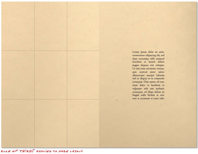
The above composition is static, space-wasting, balanced, and boring—and even if we were to place our text on the intersection of two lines instead of in one of the boxes created by the lines, our approach would overlook the fact that the rule of thirds is better suited to guiding the placement of multiple elements on a page in relation to one other.
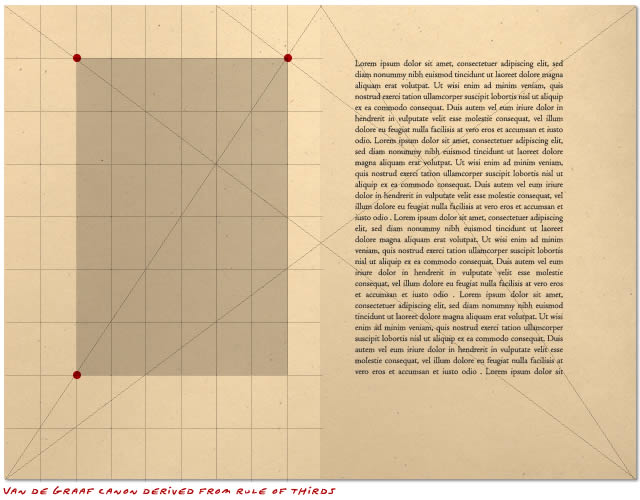
Text set on a page is fundamentally a box within a box. By dividing our thirds into thirds, we create a system of ninths that defines margins and the harmonious proportion of the text to the page. The margins occupy a third of the overall page height and a third of the overall page width. The margins, themselves, are divided into one-third and two-third areas. The text occupies two thirds of the overall height and width.
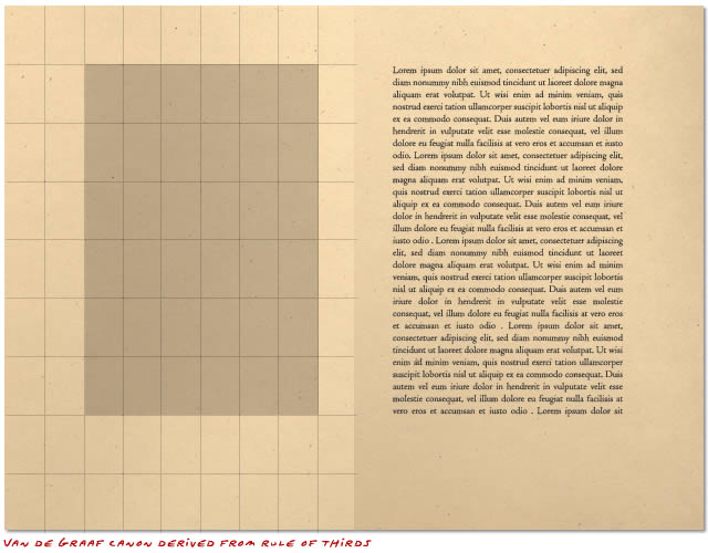
The Van de Graaf Canon and similar layout strategies have their roots in the rule of thirds. In the figure below, the lines and angles used to determine the positions and sizes of the text relative to the page correspond magically to the grid of ninths. The “Rule of Thirds of Thirds” reveals a logic used by page composers since before Gütenberg.
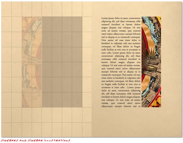
The grid of ninths proves useful when adding illustrations, sidebars, and other elements to a page. Page composers don’t always have the luxury of specifying the sizes and proportions of every page element they’re asked to incorporate into a book, but in cases when images will be inset into the text, communication and collaboration between the page designer and the illustrator at the planning stage, before the images are created, will result in figures that fit elegantly into the grid of the book.
In the following example, sidebar images were created/cropped to occupy one-third the width of the text:
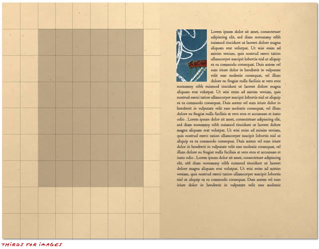
Here, smaller images are inset into the text in accord with a grid of ninths:
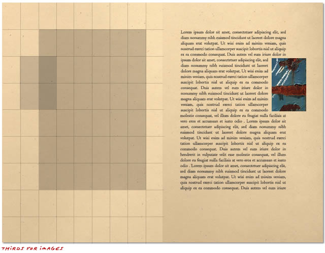
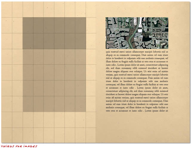
Grid systems can be liberating—or as limiting as prison bars. Rigid adherence to a grid can produce results that are fluid—or frozen. Sometimes, grids—like rules—are made to be broken:

Page composition is much like musical composition. The elements of a page combine to create consonance, dissonance, tension, resolution, rhythm, mood, color, and even descriptions that defy logical explanation—like “warmth” and “charm.” Just as a jazz musician may improvise “inside” or “outside” the chord changes, the capable page composer controls the relationships between text, images, and the surrounding paper page that constrains the work.
Whether dictated by classic formulas, by intuition, or by economics, every page has a simple structure associated with it—and every page layout is based on some relevance to that structure. Though the typical novel spread is little more than two boxes of text surrounded by two boxes of paper, the design of that simple composition should be a process of conscious aesthetic decision-making. It’s easy to blindly imitate the average trade-published novel, but a book is a vessel created to shepherd thoughts and ideas safely across oceans of time. When crafting your ship, consider using time-tested timbers and fastenings that have proven themselves worthy of that noble journey.
More Book Design Basics:
Book Design Basics Part 1: Margins and LeadingBook Design Basics Part 2: Optical Margins, Indents and Periods
Book Design Basics Part 3: Running The Numbers
Book Design Basics - Dashes, Hyphens and Dots
Book Design Basics: Small Capitals – Avoiding Capital Offenses
Book Design Basics - Drop Caps and Initial Impressions
Article: Writing is Design: The Grammar of Book Design
Book Design Basics - Use Hyphens for Justified Type
Article: Fine Control Over Justified Text
Simulating the Appearance of Traditional Print
Page Layout: Illustrated Books and the Rule of Thirds
Book Cover Design: Moving from Screen to Printing Press
Book Design Basics: Quotation Marks and Primes
Book Design Basics: Choosing a Book Font


