 Part 1 of Book Cover Design: Judging a Book by its Cover critiqued “professional” covers taken from Amazon’s Editor’s choice list. Read that article first as it provides background for this one. The article looked at design elements that worked and identified some that didn’t. This section looks at covers of indie books. As a group, these covers represent the state of self-published books quite well. Certainly, it’s easy to describe a design as “weak” or “ineffective.” But understanding and articulating why a design doesn’t work is more difficult.
To clarify, I don’t like making any distinction between self-published books and traditionally published books. As we saw in Part 1, design standards for trade books aren’t very high. This should represent a golden opportunity for self-publishers to present their work as a gourmet product. Instead, after spending years writing a book and polishing a manuscript, too many writers bypass professional editors and designers, believing they can produce satisfactory work on their own. The results are shown below. To a large extent we are responsible for the stigma attached to self-publishing.
If you’re not a graphic designer, this article won’t catalyze any grand transformation. But it will hopefully help you see more deeply, recognize the value of working with a professional, and assist you with distinguishing between real cover artists and overconfident pixel-monkeys. As a self-publisher, only you can set the standards for excellent work. Set them high.
Part 1 of Book Cover Design: Judging a Book by its Cover discussed implied margins, distressed text, centered text, and the “software footprint.” Let’s explore some new design principles before continuing.
Book Cover Design Principles: Too Many Typefaces
Writers get excited about words; typographers get excited about letters. Just as the right word implies a mood or a tone, the right typeface makes the narrative clinical or charming or lyrical or practical. Too many amateur cover designers “grab something pretty” from the font menu. All too often, they grab six or seven “something pretties” from the font menu. The result is a mixed and entirely unfocused message. Good typography often goes unnoticed because when it’s designed properly, it works its magic subtly and stealthily. Beatrice Warde had some sage things to say about “Crystal Goblet Typography.”
Use as few typefaces as you can to distinguish different kinds of content. For example, you may wish to quote a book review in a different typeface than the title to give the reviewer a “different voice.” But don’t think that choosing five really cool fonts will make your cover five times cooler.
Book Cover Design Principles: Appropriate Typefaces
A professional designer understands what typefaces are associated with specific eras and regions. Use Celtic text only if your book is set in Ireland. Don’t use Victorian typefaces if your story takes place in the 1950s. Frank Lloyd Wright typefaces look out of place on a work of contemporary fiction. Futura was designed in 1929 by Paul Renner at the Bauhaus. It’s wonderful for giving type a 1930s feel but there’s nothing “futuristic” about it in 2013.
Too often, typefaces are thought of as words plastered on top of a cover image. When used properly, type becomes part of the cover image. Before the title is actually read, its typeface provides important cues to the reader about tone and time. Those cues should be appropriate to the book’s content, and if the book appeals to a specific genre or era, those typefaces should be deeply embedded in that reader group’s “visual vocabulary.”
The P22 Type Foundry offers the ability to browse historical fonts by time period. Use this tool to find period-appropriate typefaces for your book cover.
Book Cover Design Principles: Avoid Script and Calligraphy Typefaces
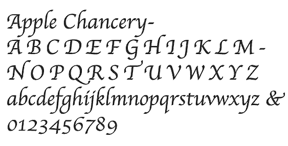
Script typefaces are great for hand-painted signs, wedding invitations, and the back windows of gang members’ cars. Though scripts have a subtle, feminine appeal, they are generally not very legible. And very few script typefaces are designed with enough sophistication to ensure that the letters connect together like a sign painter or calligrapher would have them do. Instead, the script is rendered as a sequence of disconnected letters—like writing in cursive without the connecting strokes. And some script fonts—like Chancery and its many variants—have become typographic clichés. Shun them as you would the dreaded Comic sans. And never set script typefaces in all caps.
Book Cover Design Principles: KER NY OUR TYPE
 (KERN YOUR TYPE) Kerning refers to the spacing between adjacent letters in a typeset word. Though this sounds trivial, consider the plight of an MFA student who produced a poster about child soldiers as part of his thesis project. The caption read: “In war there are two types of casualties.” But because he neglected to kern his text and relied on the default settings of his chosen typeface, his message read, “In war there are two types of casual ties.” See a few tragic-comic examples of kerning failures at http://www.ohmz.net/2012/07/25/why-kerning-is-so-important/.
Well-designed typefaces are carefully crafted so that almost every possible arrangement of characters will be legible and balanced. Free typefaces are less likely to have sophisticated kerning tables, but even high-end commercial typefaces aren’t always perfect for every situation. After you’ve chosen a typeface and set your type, look carefully at the relationships between adjacent letters. Do you see gaps or collisions? Fix them.
A related concern is tracking—the overall spacing between characters in a word. You may wish to tighten or loosen the tracking to fit larger type in a smaller space or give small type an expansive feel. See how well this works in the logotype for the movie Oblivion. The default kerning would have been legible but not nearly as dramatic.

Book Cover Design Principles: Ligatures
If you choose a typeface that’s appropriate for typesetting a book, ligatures—combinations of two or more characters combined into one—are usually substituted automatically. A common ligature is the combination fi. The ball at the end of the top curve of the f clashes with the dot on the i so the fi ligature either makes the ball and the dot one and the same or eliminates them. Not all typefaces come with a full set of built-in ligatures so choose fonts carefully.

Setting large text for titles opens up other opportunities to join letters together in creative ways. Sometimes, a title is improved simply by tracking the text tightly so the bottoms of the letters meet. Sometimes, a creative joining (or altering) of a character can transform a title from “just text” into a logotype that conveys something entirely more meaningful.
Famous typographer Herb Lubalin was a master at this:

How communicative is your cover typography? Is it merely a label or does it have something to say?
Book Cover Design Principles: Setting Type On Top of a Photograph
Many cover designers—even professionals—start with a cover image and then set type on top of it. Unfortunately, the image is often chosen without consideration for where the text is going to fit. One of the most subtly effective aspects of some of the designs discussed in Part 1 of this article is that the cover photos included expanses of sky or water that accommodated the type.
A good photograph usually incorporates a full range of tones. This makes it nearly impossible to set type on top of it; dark text blends with the shadows and light text blends with the highlights. When confronted with this daunting design challenge, designers commit a variety of aesthetic sins. And to complicate matters, the best solution—when there is a best solution—varies from cover to cover and image to image.
Stroked—or outlined—type can often work on top of a photograph, especially if the stroke is colored and the image underneath it is black and white. But stroked letters only work when they’re separate. Once they touch, the collision imparts an obvious amateur quality to the work.
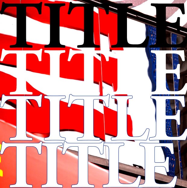
In the above example, neither the black nor the white text stands out against the background image. The stroked text is legible but rather than integrate successfully into the design, it sits inelegantly on top of it. The final example on the bottom shows what happens when stroked characters collide. This looks sloppy.
Drop-shadows are another place where designers seek refuge from storms of contrast.

 Inner or outer shadows allow the text to appear above or below the photo. The text is somewhat legible but this design example is still “stroby.” It’s loud and uncomfortable to look at. Shadows work well on some images but like other solutions, they can cause as many problems as they fix. A design that produces “visual anxiety” is a failure.
Ghosted boxes are another solution.
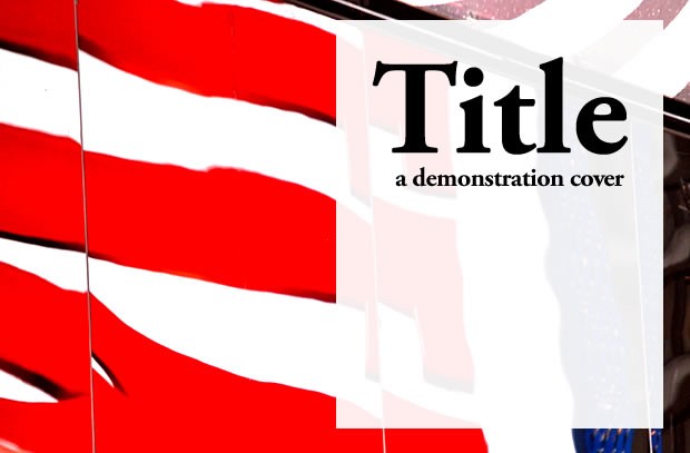
A ghosted box can eliminate contrast problems but it can also hide important parts of the cover image. The placement of the box and the relationship of the type to the box that contains it are all important design considerations. The opacity of the box is important, too. The ghosted box solution can work but only if the designer has the experience to make good decisions about a variety of new design elements that wouldn’t otherwise be of concern.
Page divisions – A variant on the ghosted box approach is to divide the page into a series of separate boxes.
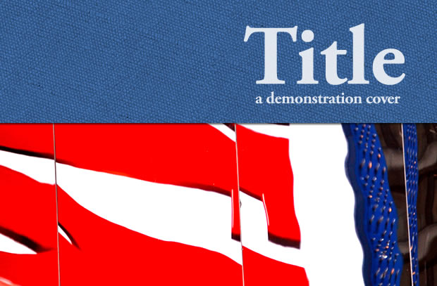
When used successfully, this approach can solve the problems of legibility and contrast. When applied incorrectly, the elements of the page never integrate into a single design. Instead, the book cover presents three or four separate blocks of information. Without some obvious flow or hierarchy to the design, the result is more visual anxiety. Unconsciously, the eye wants to know what to read first and what information is most important. Boxes can provide that guidance or they can fragment the design.
“Digital Background” boxes are another technique used to separate type from the image beneath it. Instead of a simple ghosted box, the designer decides to show off some “cool” Photoshop skills.
 This technique solves the problems of contrast between text and image at the expense of making your book cover look like the splash page for a technology company’s website. The “software footprint” was discussed in Part 1 of the article. Don’t step in it.
Book Cover Design Principles: Stretching Exercises
Stretched type and photographs are sure signs of amateur design.
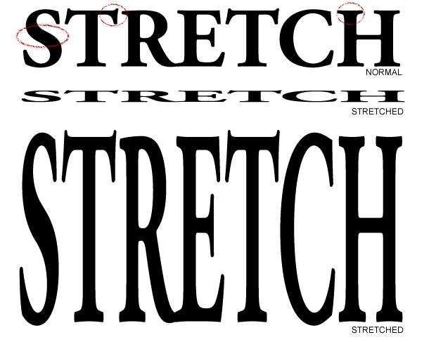
If you need to fit long words in a narrow space, use a condensed typeface. If you need to fit a short word in a wide space, use bigger type, an expanded font, or wider tracking. In the example above, a few parts of the letter forms are circled in red. Notice how badly distorted they get when stretched vertically or horizontally. After spending hours to choose the perfect typeface and possibly spending hundreds of dollars on it, why would you treat it like a sheet of rubber?

And the same thing goes for photographs. Resize and crop if you need to, but don’t ever distort a photograph. That absolutely screams “amateur.”
Book Cover Design Principles: The Photoshop Montage
The Photoshop Montage is perhaps one of the most abused techniques in both professional advertising and amateur cover design. The discriminating eye recognizes an aggregate of digitally hodge-podged photos instantly. When the combined images in a cover design look like separate images that have been digitally blended, the dangers of powerful tools in untrained hands become obvious. Compositing photographs is an art and a craft. When done successfully, the elements fuse into a single, effective image. Usually, the result is a horrible, digital cliché.
Book Cover Design: Looking at Book Covers
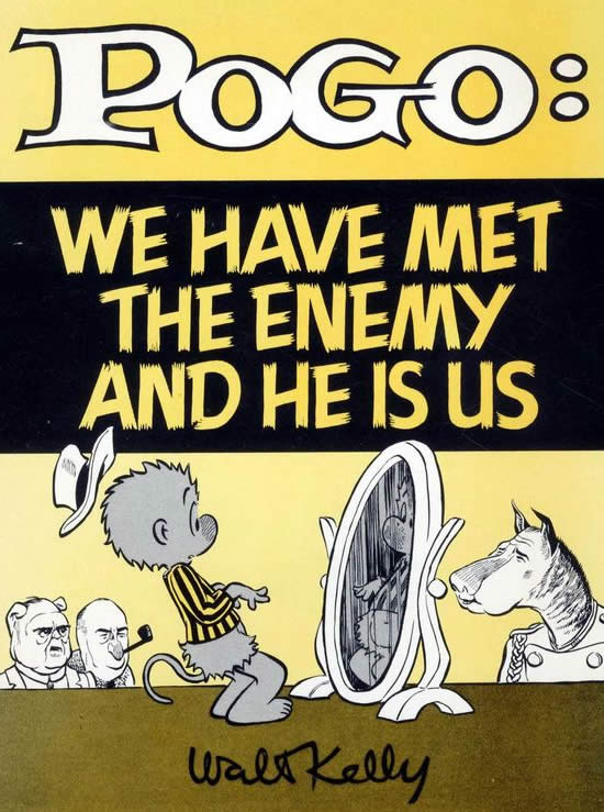
The books samples discussed here all received positive reviews. I haven’t read any of them and I don’t know any of the authors. I chose covers at random rather than cherry-picking books with problematic covers. All the mistakes made in these designs were made innocently by writers who either created their own covers or by designers who overlooked important design considerations. I applaud all these writers for having the temerity to write and publish their books, but they’re not helping the reputation of self-publishing with these designs. As Pogo said, “we have met the enemy and he is us.”
Book Cover Design: Waning Moon

Waning Moon displays a number of design liabilities—almost every one mentioned in this article! I see at least four typefaces. The kerning between the W and the a in “Waning” is loose and sloppy. The ornament above the title is superfluous and looks Victorian (1880s) in origin. No attempt has been made to join any of the letters in the title even though the i and the n are crying to be married where the serifs kiss at the bottom. The green box has Celtic borders but nothing else about the imagery or cover text is Irish. Probably, there’s no Irish content in the book, but it’s hard to be sure. The typeface used for the author’s name is set in Chancery—a cliché calligraphy font. The title is set with a dark glow in a box that has a techy digital reflection. The image shows a full moon even though the title is “Waning” Moon. The Photoshop montage offers a strange juxtaposition of elements; either the girl’s giant head has sprouted from the ground or the road has cut her off at the shoulder. Why not position the road behind the girl in a realistic way? And the color transition between the brown of the road to the blue/black of the night sky is strange. The book review quote is slapped on top of the design in Arial in a way that is utterly soulless. Typographer David Bergsland refers to typefaces like Arial, Helvetica and Times Roman as “insitutional typefaces.” Though a few clever designers have found ways to breathe life into them, amateurs, especially, should avoid them as the “unflavored gelatin” of typography.
Book Cover Design: Islands of Love and War

Let’s forgive the centered text on this design because it fits comfortably in the space adjacent to the flames and smoke rising from the burning ship. Beyond that, the cover image consists of a Photoshop Montage that’s been digitally filtered to (very roughly) emulate the appearance of a painting. I don’t know what the black artifact is below the raven’s beak; is it the unintended result of the image processing or some clue to the book’s content? It needs to be either clarified or removed. At the bottom, we have the author’s name rendered in white, stroked Helvetica. This book would look out of place on a bookstore table.
Book Cover Design: Warrior’s Song

Too bad on this one because the cover image is interesting. But the “digital boxes” that surround the text just don’t say “American Civil War”—and they’re gray. Also, the boxes crowd the text. The typeface might work but the giant apostrophe looks too much like a tadpole leaping out of the type. The W in the first word needs kerning help. A ghosted black box at the bottom with white type might have helped this design as the bottom of the image is not of any great narrative importance. Finally, the image is filtered in such a way that the darkest shadows are a medium gray. Some contrast would have made the image more dramatic. This treatment makes it look like a negative.
Book Cover Design: Countermeasure
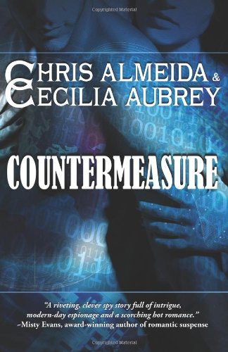
Here we see Victorian typefaces superimposed on a field of “digital” zeroes and ones. The blue tones are cliché—”visual code for an action thriller—but that might not be a bad thing as long as the book actually is an action thriller. The drop-shadows on the type are probably unnecessary but they work given the “shadowy” quality of the image behind. Of all the designs discussed here, this cover probably comes closest to emulating a trade fiction book but the text is too wide; it crowds the edges. The design is divided into three horizontal bands but these boxes don’t communicate anything or serve much of a purpose. The bottom bar contains the (centered) quote, but I suspect the zeroes and ones graphic just wasn’t available at a sufficient resolution to cover the entire book. This cover has too many typefaces and these create a confusing temporal context. A better treatment of the text would focus on creating some implied margins with a type choice that matched the “digital espionage” message of the cover imagery.
Book Cover Design: Kids’ Clubs and Organizations.

Every photograph on this cover is stretched and distorted. The stroked, centered text on the title crowds the top edge and the blue box that contains it. The author’s name at the bottom is the only successful design element. It sits in its red box with room to breathe, and it reads easily without needing a stroke around it.
Book Cover Design: Garden Stake

I assume this is a murder mystery but the blood spatters are completely inauthentic; they look like paint. The map looks like clip-art. In fact, I’ll bet you anything it is clip-art. The two pieces of type are centered but not symmetrically. This is not a cover design; it’s four elements stuck on a white background. To go to the tremendous effort required to write a book and then wrap it in a cover like this is a travesty and a tragedy. Cover design is not an afterthought.
Book Cover Design: Maybe they’ll remember me

The capitalization of the title is as strange as the choice of typeface is uninspired. And does this title need a question mark? This is a classic, failed attempt to set type on top of an image but in this case, the three dark, ghosted boxes are used to set type on top of two images. I’d drop the bottom image, and then move the top photo to the bottom. The sky above the ruined buildings could be used as an open area for arranging the text. And the cover doesn’t have to be black and white just because the images are black and white. It’s so easy to create warm sepia tones or even colorize the image to create a much more engaging cover. When I see the photos, I want to read Newey’s book. When I see the cover typography, I can only assume that the manuscript was edited to the same standards as the cover. I love a good memoir but I’m going to pass on this one—too risky.
Book Cover Design: Flight Surgeon

I’m not buying the image composition; the girl with the guitar was composited in front of the mountain scene and the airplane was composited into the sky. The grassy area with the author’s name wasn’t quite aligned with the bottom of the cover; notice the thin stripe at the very bottom where the “mountains” photo shows through. And what happened to Heidi’s feet? But even if the image is assembled well enough to convince most people that it’s one piece, the drop-shadowed Helvetica type is flavorless. With all that sky to write on, the designer chose to paste the text on top of the design.
Book Cover Design: Love’s True Second Chance


Script faces, especially digital scripts, are rarely romantic. Chancery is a bore. The text crowds the edges on the outside and the top but the vertical spacing between the lines is huge. The image features hands, a rose, and some type but they never blend into a cohesive composition. The rose is out of scale with the hands, and the two elements touch but don’t overlap. I’m not sure if the background is old parchment or something else, but it’s meaning is unclear. The author’s name is legible but somewhat hidden in the shadows. The waxy photograph of the hands clashes with the hand-rendered illustration of the rose.
It’s often useful to think of a design as a window into a larger world. In this world, too many outside elements are trying to crowd into the window. What this design needs most is open space and subtlety. Show more arm; let the lovers reach across the divide. Shrink the rose and put all these elements in the bottom third of the design. Let the design breathe. This is about “Love’s Second Chance”—not about a day-after, 50%-off sale on Valentine’s cards.
Though my quick revision would definitely not fit the style expected by readers of romance novels—and I’d personally lean toward a design that had more “edge”—it offers some ideas of what might have been done with the same design elements and a bit of respect for space.
Book Cover Design: Chronicles of Mark Johnson
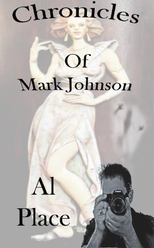
This cover features a horizontally stretched and ghosted color image in the background and a vertically stretched black and white image in the foreground. I’m assuming the book has something of a photographic theme but now I’m skeptical about what the writer knows about photography. The text is curved for no particular reason and it’s done so with a digital tool that distorts it in the process. The title kisses the top of the book, killing any implied margin. The font is flavorless. Why is “Of” capitalized? Why is the author’s short name set on two lines—and centered? What is the weird blur above the photographer’s head? These design elements may relate to the story but they don’t mean much before the reader understands the story. Metaphorical design can be powerful but only when the metaphors used have meanings that readers will find evocative before they consume the book.
Book Cover Design: Homework

What do you see in the following two cover designs? Script typefaces? Photo-montages? Are boxes used effectively? How well do the hand-illustrated pieces work against the photographic background? These designs have problems but what does work about them? How would you fix the problems? What would you keep? What would you toss?

Book Cover Design: Conclusions
Being a critic is easy work. Pointing out the flaws of others is a full-time occupation for too many people, but the endeavor is only of value when lessons can be learned and put to productive purpose. These designs are not the work of tacky philistines. Every one was produced or commissioned and approved by someone who had the talent, creativity, and discipline to write and publish a book.
Book cover art is the literature that wraps your literature. You research characters and settings and history to breathe authenticity into your narrative. You study grammar and style to breathe credulity and sophistication into your writing. In the same way and for the same reasons, a survey of the relevant history of design and typography is prerequisite to creating an authentic and engaging cover. Just as an educated writer avoids overused words like “paradigm,” an educated designer avoids script typefaces like Chancery and prefers good composition to cheap digital trickery.
And perhaps, in that spirit, what’s missing most from these covers is narrative. We don’t see lips about to meet, triggers about to be pulled, lonely figures with hunched shoulders and downcast faces to feel sympathy for, or unusual juxtapositions that engage our curiosity. Mostly, we see disconnected story fragments and incongruous type and imagery. A good story is driven by conflict. The same is true—at least some of the time—for design, but the narrative conflict must not be obscured by visual conflict.
Look at design in the world around you. Most of it is poorly kerned and like the world’s writing, weakly composed. Some is brilliant but subtle. A very few examples are overtly powerful and moving. As you seek designers to collaborate with who can match the quality of your prose, train your eyes to see and understand the difference. You and your books will only benefit.
And enough criticism. Part 3 of Book Cover Design: Judging a Book by its Cover examines great book covers and why their designs work.


