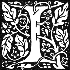
 NITIAL CAPITALS have historical roots in the early days of book design; their use predates the printing press and the invention of moveable type. Today’s initial caps are not as fancy as those carefully rendered in gold leaf in ancient scriptoriums, but their association with classic book design remains strong. Initial Capital letters are often referred to generically as “drop caps” though a drop capital is actually a specific style of Initial Cap.
Some modernists discourage the use of initial caps, citing a host of typographical problems, but “Once upon a time” just wouldn’t be the same without a great big letter “O” at the beginning. Though not appropriate for every book, initial caps announce the beginning of a chapter with classical style. They suggest that the text you are about to read transcends mere data; this is literature.
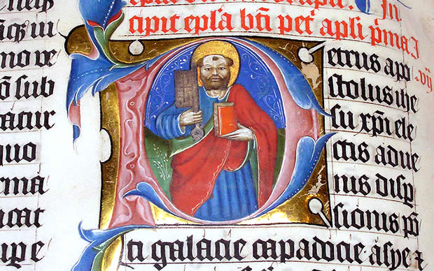
Illuminated letter P in the 1407 AD Latin Bible on display in Malmesbury Abbey, Wiltshire, England
This post examines different styles of initial caps and discusses the challenges of transitioning smoothly from large initial characters to the much smaller characters of body text. Digital tools and shortcuts make it easy to create initial caps but the easy way isn’t always the best way. Serious publishers understand the subtle differences between good typography and great typography. Many thanks to author and typographer Dick Margulis for editing and fact-checking.
Book Design: Different Styles of Initial Capitals
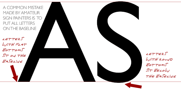
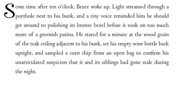
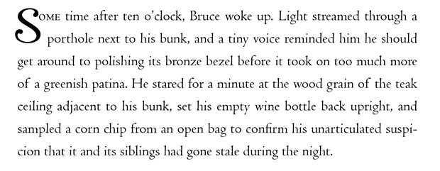
The Baseline Initial Cap is the simplest style; the large initial character sits on the same baseline as the body text. In the example below, I adjusted the initial cap downward to accommodate the curve of the S (which actually sits slightly below the baseline anyway) and the relative size of the body text.
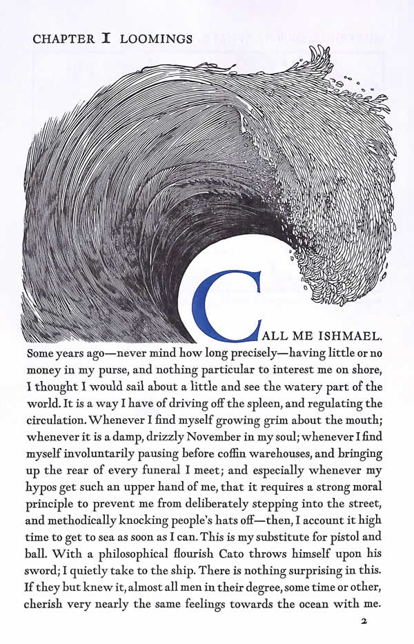
Here’s a beautiful example of a Baseline Initial Cap from Moby-Dick or The Whale by Herman Melville. San Francisco : Arion Press, 1979 Wood cut illustrations by Barry Moser
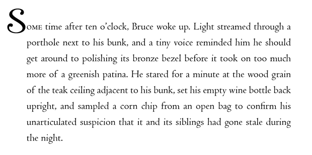
The Hanging Initial Cap is another option. The initial is set beside the block of text where it “hangs” in the left margin. As margins shrink to save paper and printing costs, hanging initials are used less frequently, but POD-Publishers who opt to use classic layouts may find them useful and elegant.
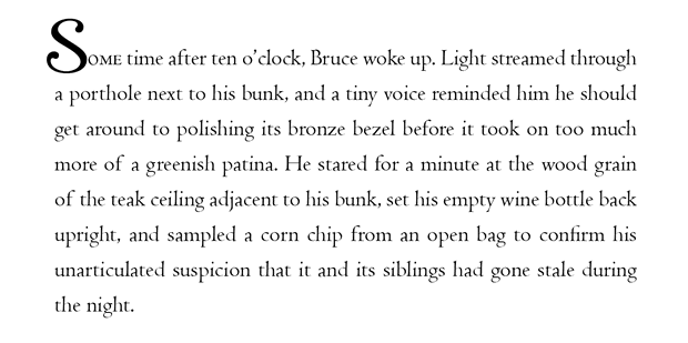
The hanging initial can introduce typographic problems. Because the left edge of the text block remains left-aligned, the relative spacing between the hanging initial and the words adjacent to it is inflexible. The spacing between the first two letters of “Some” is too wide and I don’t even want to think about what a “Sporthole” is on line 2. Though readers will likely understand the intention of the text, the goal of “Crystal Goblet Typography” is to remain transparent and not introduce subtle anomalies readers can trip over.

The Baseline Hanging Initial Cap combines the previous two styles. As with the Baseline example, I adjusted the initial downward to accommodate the curve of the S and the relative sizes of the first two characters of the first word. Though the technique works best with wide margins, it does dispense with some of the problems caused when the initial hangs across multiple lines.
The Drop Capital is the most popular style of Initial. The first character is inset or “dropped” into the text. To make a Drop Cap in Adobe InDesign automatically, select a paragraph, set the first line indent to zero and then use the drop cap controls to specify how many lines tall the initial should be and how many characters should be initialized.
![]()
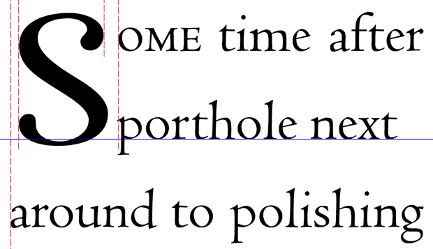
In the example below, the first character is initialized across two lines.
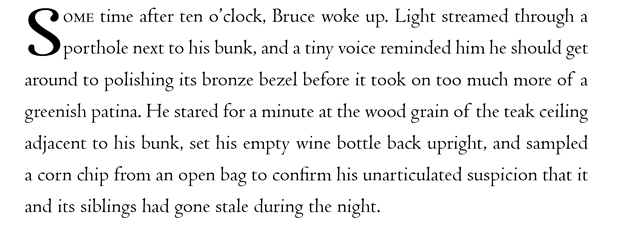
Notice how the first two lines are indented equally to accommodate the initial character, resulting in spacing problems. The Drop Cap Tool is certainly convenient, but digital characters have a certain amount of built-in space on either side (called side bearing) that causes the initial to sit slightly to the right of the left edge of the text block. Essentially, the Drop Cap Tool clears a box and drops in the initial—an easy solution but hardly an ideal one.
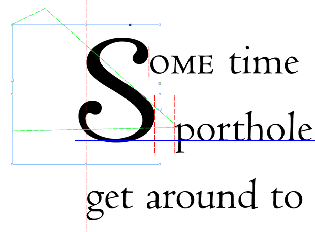
The best—if not the easiest—solution is to create Drop Capitals as separate text boxes where the position and text wrap can be adjusted by eye to accommodate both the shape of the initial and the proximity of the text that wraps around it.
Use Indesign’s TextWrap Tools to set the Initial Cap’s own textbox to “Wrap Around Object Shape.” Then use the white arrow tool to manually adjust the shape of the text wrap to produce ideal results for each character.
![]()
With a Handset Drop Cap, the first word is not so broken up and the first word of line 2 isn’t appended to the initial S to form unintended nonsense. The initial is positioned manually relative to the left edge of the text and the baseline. The text wrap area is outlined in green in the diagram below:
Book Design: Initial Caps with Quotation Marks
There are no hard and fast rules for using initial caps; typography is an art and art requires a discerning eye. When a chapter’s starting paragraph begins with quoted text, some typographers simply dispense with the opening quotation mark altogether.
Others add the opening quotation mark, letting it hang in the left margin. Many recommend using a quotation mark slightly smaller than half the point size of the initial cap.

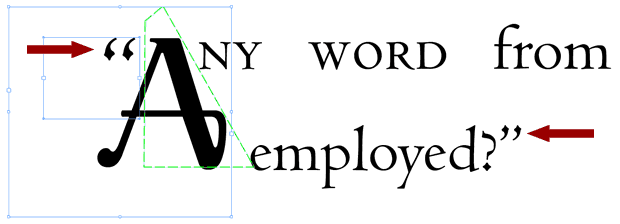
As is the case in my examples, the initial cap is a different typeface (Raniscript) than the body text (Centaur). If the opening quotation mark is set with the same typeface as the initial, the first sentence can appear subtly off-balance. In the examples below, the initial’s text wrap is outlined in green to show how the quotation mark is positioned in its own text frame. Though the initial and the quotation mark can be combined, it’s easier to zoom in and adjust the elements separately by eye.
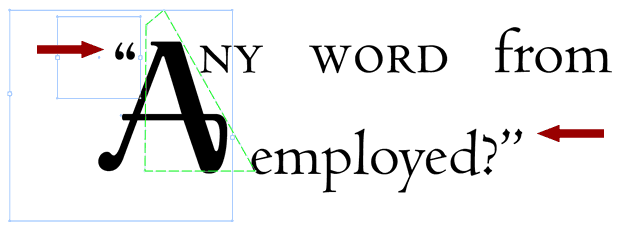
Setting the opening quotation mark to complement the closing quote is subtle but sensible, even if the two marks are set at different point sizes.
Book Design: Transitioning from Initial Capitals to Body Text
Because of the difference in size between an initial cap and body text, some typographers create a “bridge” by setting the first word or phrase following the initial in big or small caps (as in the examples shown on this page). Read my post on small capitals for tips and perspectives on how to use them effectively.
For a lighthearted treatment of Initials, don’t miss Jessica Hische’s Daily Drop Cap. For a good discussion about how to correctly render drop caps on the web with CSS, Safalra’s explanation is the best I’ve seen.
More Book Design Basics:
Book Design Basics Part 1: Margins and LeadingBook Design Basics Part 2: Optical Margins, Indents and Periods
Book Design Basics Part 3: Running The Numbers
Book Design Basics - Dashes, Hyphens and Dots
Book Design Basics: Small Capitals – Avoiding Capital Offenses
Book Design Basics - Drop Caps and Initial Impressions
Article: Writing is Design: The Grammar of Book Design
Book Design Basics - Use Hyphens for Justified Type
Article: Fine Control Over Justified Text
Simulating the Appearance of Traditional Print
Page Layout: Illustrated Books and the Rule of Thirds
Book Cover Design: Moving from Screen to Printing Press
Book Design Basics: Quotation Marks and Primes
Book Design Basics: Choosing a Book Font


