 Digital typography offers capabilities that printers working with hot lead type and wood type could only dream of. Digital type can be stretched and resized infinitely, justified within unusual boundaries, or wrapped around almost any shape. And yet, traditional letterpress and wood type specialty shops continue to marry ink and paper. Their work offers a special, organic warmth that digital type lacks. This article explores the differences between digital and traditional type, and suggests techniques for simulating the appearance of traditional print. Though it ultimately fails to reveal a magic formula for turning pixels into authentic printer’s ink, it offers insights into why that goal is so difficult to achieve.
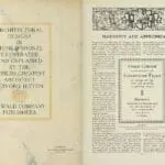
The best source for historical information is old books. Reading about traditional typography is nowhere near as valuable as looking at it. Observe the interaction between ink, paper, and time. I find old design books on eBay that typically cost half of what contemporary books do. My collection goes back to the 1830s. Two of my favorites: The Art & Practice of Typography by Edmund Gress, (1917), and The Manual of Linotype Typography by William Dana Orcutt and Edward Bartlett (1923) are available for online viewing (click their titles in this sentence). These books offer insights into evolving language as much as they do into evolving typography. Above all, they inspire one question: Why doesn’t my type look like that?
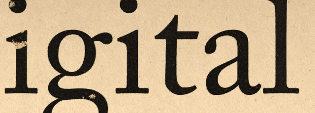
You may not want your text to look like it was typeset 100 years ago; styles change, but so have methods for applying ink to paper. Close inspection of physical copies of these books reveals subtleties that won’t be revealed in their online reproductions. Type applied with a press is embossed into the paper; the letters have a “physical” quality to them. And though type emboss is impossible to reproduce with inkjet printing technology, other more reproducible artifacts of the printing process contribute to the warmth of analog type.
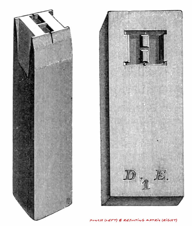
Printed letters are full of irregularities that come from several sources. Lead typefaces were originally cast in brass matrices created with steel punches that were crafted by hand. Handwork meant that no two letters—no two Ts or Rs or Ns—were exactly alike. And the physical process of forming soft metal with a punch led to more variations. Imagine punching shapes into clay with a mold. Each impression will be similar but you’ll find subtle differences.
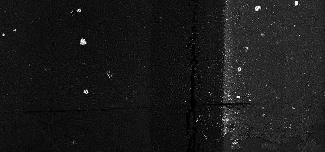
Ink coverage is another variable. If ink is applied inconsistently on the plate or roller, or too many impressions are made before re-inking, voids and variations in saturation occur.
At the perimeters of a printed impression, ink creeps into the fibers of the paper. And on a microscopic level, the fibers of paper are like mountains and valleys. Ink adheres to the high spots while it may never even touch the low spots. And in the case of wood type, the wood letters, themselves, are subject to changes in geometry due to humidity and other factors. Wood grain contains relatively harder and softer areas, and these transmit ink and pressure to the paper differently.
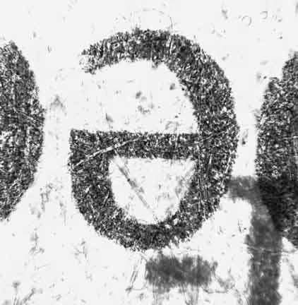
image courtesy of scienceprofonline.com
Another consideration is ink spread. In fact, many typefaces are designed with “ink traps” —tight corners of letters are “opened” up so the ink won’t “clog” up the crisp shapes of the letters. These ink traps work well with ink on paper and small type, but they look terrible at large sizes or when used in vinyl signage. And yet, few typefaces offer alternate versions for larger type. The type you use in your catalog’s item descriptions may be ill-suited for use in your shop window. Ink is a liquid (granted, a viscous one) that is squeezed beyond its intended boundaries by high-pressure rollers and drawn beyond them into the paper fibers by surface tension.
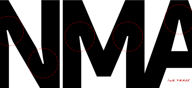
The purpose of the printing press is to push ink and paper together under pressure. Coated printing stocks were developed to provide even printing surfaces that minimized ink spread. But paper and printing processes have changed. Inkjet printing “spraypaints” tiny dots of ink on the paper, bypassing mechanical type and inked plates and rollers. The result is crisp and precise—perhaps too crisp and precise. Contemporary books are clear and legible, but hardcore bibliophiles prefer the warmth of the traditional, mechanical approach. Pick up almost any old book in an antique shop and you’ll see there’s something about it that isn’t seen in contemporary books.
So how do we simulate traditional printing with digital tools?
We can start by using simulated ink. Digital type is made of pure black pixels. As shown earlier, printing ink varies in density; it may have voids and thick spots, especially if the ink needs replenishing.
Some font designers attempt to solve this problem using distressed fonts—typefaces with ink voids already built in.
 Trixie Plain simulates the look of an ink-saturated typewriter ribbon pressed against paper by a key. We can see how the ink travels beyond the characters along the vertical and horizontal threads of the ribbon, but at larger sizes, the repeated distress patterns give away the type’s digital nature, especially when we print consecutive same letters. When we distress type and scale it up, the patterns become increasingly artificial.
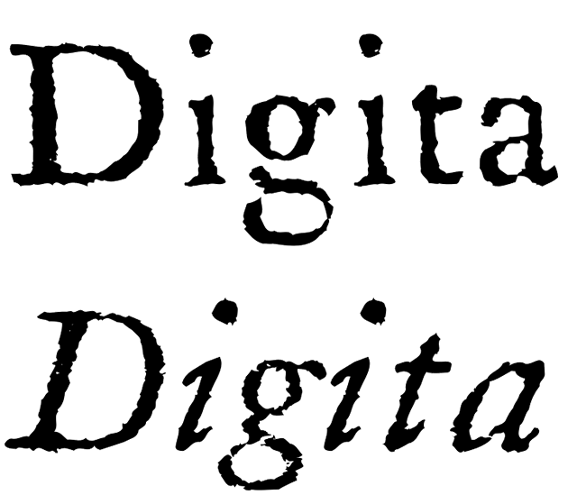
Chris Costello’s Letterpress text does a capable job of simulating rough ink on paper at small sizes.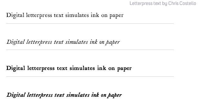 But when we blow it up, the distress patterns look they belong on a pirate’s rum bottle. The letterpress effect is lost.
 Metal typefaces were, of course, not scalable so they were cut in discrete sizes. Because uniform ink spread was anticipated, the strokes of the letters were cut on the thin side. And assuming a rather uniform spread of ink around both thick and thin strokes, smaller type offered more contrast between thick and thin strokes.
 With digital printing processes, ink spread is negligible; the same glyph can be set at 8-point or 80-point size. But the above example reveals how smaller type sizes require more compensation. As type size increases, ink spread accounts for a relatively smaller percentage of stroke expansion. This creates a quandary for revivalist type designers: If your goal is to recreate Caslon or Garamond or Didot from scans of the original type, which size represents the “real” one, given that size variations in the same font were created by estimation and trial and error? The differences between large and small versions of the same metal typeface were often significant, even in the final printed result. The notion of one-size-fits-all, scaled type is a product of the digital age.
A few type designers combat this problem by offering a single font in several “optical sizes.” The typeface is offered with distress patterns optimized for use at specific point sizes. The “gritty edges” on letters intended for large print are too fine for use at small sizes, but we avoid the problem of scaling the distress patterns to a point where they lose their authenticity.
 In the zoomed-in example of Justin Howes’ ITC Founder’s Caslon above, you can see the differences between the 12-point version and the 30-point version. The larger the type, the more subtle the distress patterns.
Why not use digital text to mask a photo of real ink?
 The above example uses the same exaggerated ink texture shown earlier to illustrate ink coverage. Digital text masks a scan of ink rolled on paper. Despite the number of voids in the ink, the text is sufficiently dark and crisp to read. Each individual letter is different. And it works at large sizes; every letter is different because the ink pattern varies across the entire image.
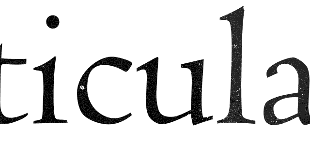 But no self-respecting press operator would ever use such sparse ink coverage. Yes, the effect looks like ink, but it looks like bad ink. Print a book like this and expect to receive heaps of complaints about “poor production.”
In the absence of a scanned ink texture, another strategy is to add digital noise to the text:
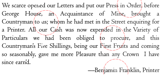
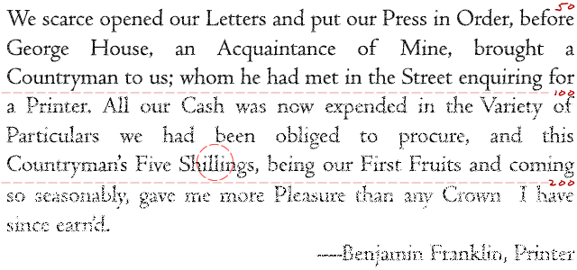 A little bit of this effect goes a long way. Each group of 3 lines in the example doubles the amount of noise (and halves the authenticity of the effect), but as seen in “Shillings” (circled), the problem of repeated distressed patterns is no longer an issue. Even the first example (with the noise setting on 50) is exaggerated; I’d be tempted to halve it.
But when we zoom in on the noise effect and compare it to actual ink on paper, the differences become obvious—even if we tone our perfect black digital ink down to a dark gray. I added a touch of blur to make the grain pattern less harsh. (The left side of the image is the original, scanned letter).

Whether we use noise or a scanned texture, this only accounts for the insides of the letters. Some additional techniques are required to simulate ink spread—the ink that bleeds beyond the letter.
By adding a hint of black glow to the text and then adding noise to that glow, we can simulate ink spread at small font sizes:
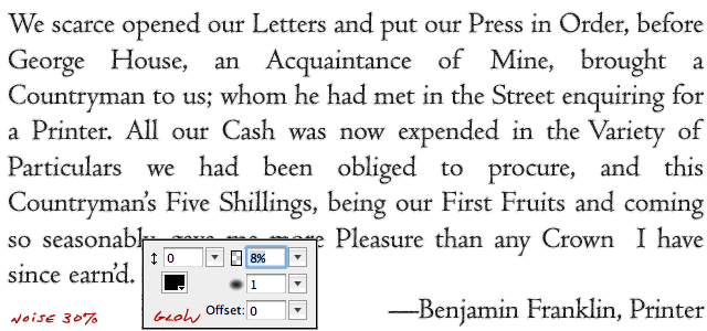 Put this on top of a paper texture (instead of pure white pixels) and the effect is more realistic.
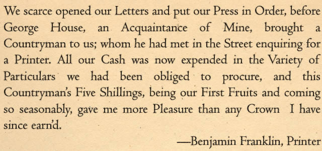 Thus far, I’ve simulated ink on paper using an image editing program (Adobe Fireworks). Such techniques, to be practical, must work in a page layout program. Adobe Indesign offers a sophisticated typesetting engine, and the convenient ability to apply digital noise to a digital glow.
 The effect is believable and easily customizable for different type sizes, though the “random” noise patterns are identical for each instance of a given letter—much like the pre-distressed fonts in the earlier example. However, the problem of scaling distress patterns is not a concern. Simulated ink spread is uniform for all font sizes as it would be on a real printing press.
And while it’s technically possible to combine the masked ink texture with the grainy outline, this must be accomplished by converting the text used to mask the ink to outlines, and then layering the precisely aligned ink spread layer on top—not practical for typesetting anything other than a short piece.
Conclusions on Simulating the Appearance of Traditional Print:
In his (definitely worth a read) article on “Reviving Caslon,” William Berkson details his struggles to create an authentic version of the original Caslon font. He explains why the pursuit of authenticity in digital type is a “snare and a trap.” Berkson’s original goal was to create an authentic reproduction of a classic typeface; mine was simply to imitate the look of ink on paper—but his explorations informed my conclusions:
Truth is Abstract: There is no one true appearance of a given typeface at a given size. The appearance of type results from a variety of factors, including irregularities in the original punches and matrices from which the type was cast, paper type and moisture content, ink coverage, press pressure, and others. Digital printing processes remove most of these factors and in doing so, add a uniformity that is further removed from the typefounders’ original vision.
Don’t Overdo it: When simulating ink on paper using digital processes, it’s tempting to exaggerate for effect. The voids in the ink texture used in this article’s examples are charming and organic when displayed in a digital context, but a serious printer would toss impressions like these in the trash. Printing is a craft practiced by skilled artisans; keep scanned textures subtle and respectful of the printer’s art. Though less visually obvious, authenticity is better achieved with dark, consistent ink. Chris Costello’s Letterpress Font is a case in point. Use it to simulate weathered, rustic type, but don’t confuse distressed letters with authentic printing of any quality. Text looks “rustic” only after centuries of deterioration. Letterpress printing, even very old letterpress printing, is remarkably precise— anything but “shabby chic.”
Special Effects like digital noise applied to a glow around text can be effective, but if applied to the body text of an entire book, your computer will likely melt when you try to render a print-ready file—and there’s no telling what will happen on the printer’s side. Use digital effects sparingly on short pieces. They’re not ideal solutions for book typography.
Distressed typefaces (or any of the techniques discussed) work best at small font sizes where duplication of the distress patterns on identical characters is less obvious to the eye. When larger type is required, consider using a font like ITC Founders Caslon that comes in a variety of optical weights. Multiple-weight fonts overcome the problem of scaling up distress patterns as you scale up font size. If you prefer another typeface (though Caslon is an excellent book font), you’re unlikely to find many that offer optical sizes.
Invest in quality typefaces. This article illustrates only a few of the challenges faced by digital typeface designers. Given the research and technical work involved in creating a useful digital book face, do you really think a free font is usually worth anything more than what you pay for it? Despite the relatively sterile appearance of digital typography, you’re likely to score more authenticity points with a well-rendered classic typeface than with an attempt to simulate ink on paper with visual effects.
Consider language and its typographic evolution as an alternative path to creating authentic, historicist typography:
Congrefs shall make no law…
I shall see you to-morrow.
Use emspaces (wide spaces, not double-spaces) after a period to emulate pre-1961 sentence spacing conventions.
Consider using classic page layout strategies instead of the paper-saving designs favored by contemporary trade book printers.
Though it’s possible to add organic edges and textures to digital typography, recreating the magic of letterpress printing is an elusive goal. Though a study of the relative characteristics of digital and analog type doesn’t result in a “secret formula” for resolving their differences, it does offer valuable insights into the evolution of book typography. Though it’s easy to grab the random typeface du jour from a font menu, those who do so risk “trying to play jazz without ever having listened to the blues.” The marvel of point-and-click book production rests on a remarkable history of innovation, engineering, artistry, and craftsmanship. If the printing press represents a cornerstone of human civilization, understanding it—along with the reasons we can’t imitate it authentically—is an essential element of every serious, contemporary publisher’s foundation.
More Book Design Basics:
Book Design Basics Part 1: Margins and LeadingBook Design Basics Part 2: Optical Margins, Indents and Periods
Book Design Basics Part 3: Running The Numbers
Book Design Basics - Dashes, Hyphens and Dots
Book Design Basics: Small Capitals – Avoiding Capital Offenses
Book Design Basics - Drop Caps and Initial Impressions
Article: Writing is Design: The Grammar of Book Design
Book Design Basics - Use Hyphens for Justified Type
Article: Fine Control Over Justified Text
Simulating the Appearance of Traditional Print
Page Layout: Illustrated Books and the Rule of Thirds
Book Cover Design: Moving from Screen to Printing Press
Book Design Basics: Quotation Marks and Primes
Book Design Basics: Choosing a Book Font


