


 Page layout programs like Adobe Indesign and Quark, allow typographers to exert fine control over justified text to remove gaps and “rivers.” The default settings produce “pretty good” results—better than a word processor—but a few small tweaks will dramatically improve the spacing of your text. This article explains how to balance hyphenation settings with word spacing, letter spacing, and glyph scaling to optimize the appearance of justified text.
My last “Book Design Basics” post discussed the importance of hyphenation settings. These should be adjusted to suit the line width and the purpose of the text. A long legal disclaimer in small print in a narrow box can often be set without regard to how many hyphens are required to produce consistent spacing. Body text is likely to be a compromise based mostly on one group of settings. A short blurb on the back of a book cover should be poked and prodded until spacing and hyphenation are ideal. This article explains how to combine hyphenation and justification settings to achieve optimal results.
Disclosure: If you’re reading this article, you’re probably working on your own next book and don’t care about mine (selling books to writers is like selling boxed lunches at a chef’s convention). At the risk of appearing self-promotional, I’m using the blurb from my new book’s back cover as the example text. It offers a perfect, real-world, one-paragraph example of how adjusting hyphenation and justification settings can turn so-so text into a harmoniously spaced, easy-to-read message, but if you feel I’m “slipping an ad into your drink,” you can bail out here.
Still with me? Good. Let’s look at the text in its “pure” left-aligned form:
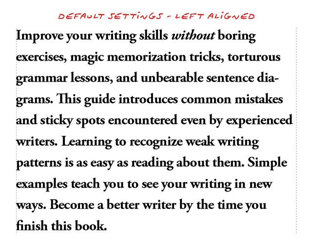 The spacing is ideal for the font (Adobe Garamond Pro) as it’s unaffected by justification settings; the spacing you see is the spacing designed into the typeface. Many people prefer left-aligned (ragged right) text for this reason, but others prefer justified text because of the neat, tidy way it fills its box.
Here’s the same text with hyphenation and justification at their default settings:
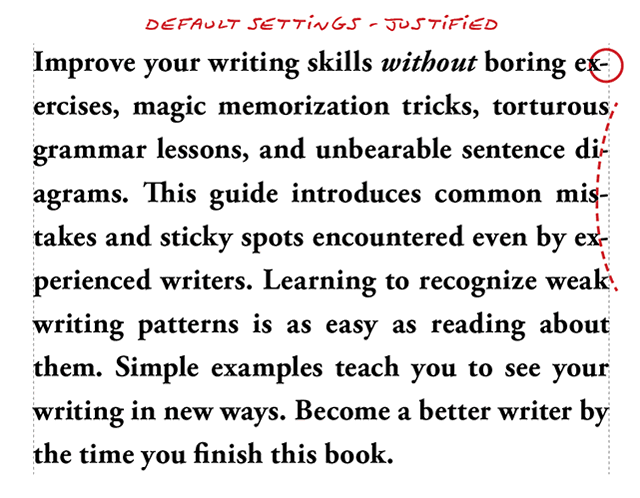 We end up with a lot of hyphens (4 in a 10-line example), including a “ladder” made by three consecutive hyphenated lines. Notice how the hyphens take a “bite” out of the right edge. One solution for this is to use “hanging punctuation,” accessed in Indesign at Windows > Type & Tables > Story (don’t ask me why the Optical Margins control appears in a “Story” panel). Punctuation marks take up space but they use a fraction of the ink used by other glyphs. By placing them (mostly) outside the text area, the appearance of ragged edges is reduced. (Probably the disappearance of the double-space after a period went largely unnoticed for the same reason. A period followed by a space uses only slightly more ink than two spaces on their own; the visual gap is built-in.)
 After turning on optical margins, we gained enough space to get rid of a hyphen; the text looks better even though we haven’t adjusted the hyphenation or justification settings yet. See how “ex-perience” is hyphenated on line five? Let’s tune the hyphenation settings to require at least three characters before a hyphen break (instead of the default two).
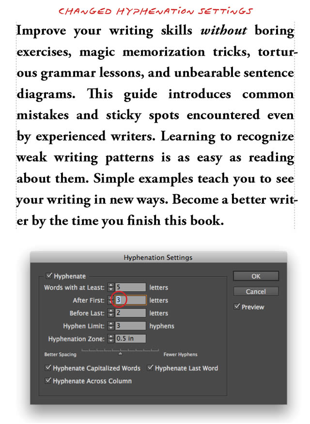 Now we have fewer (and better) hyphen breaks, but to accomplish this, Indesign adjusted the spacing between the words on each line. Line four has noticeably wide spacing while the second-to-last line looks tight.
Here’s where the justification settings come into play. Access these inside Indesign’s Paragraph palette (or select a paragraph and type option/alt – command/control – shift – J).
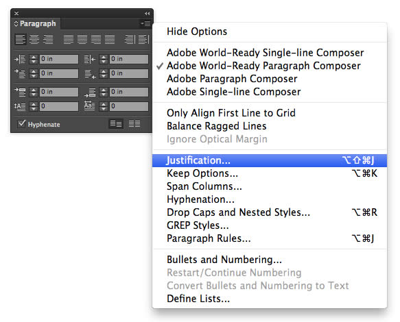 By default, when Indesign adjusts text to fit on a justified line, it changes only the spacing between words. The Justification controls offer useful, additional options.
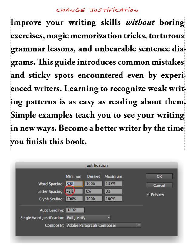 By allowing the typesetting engine to adjust the minimum letter spacing by a meager 2% (in addition to the word spacing), the overall spacing becomes much more even.
Another option is to allow Indesign to scale the glyphs—to adjust the widths of the letters themselves. Do this minimally and only if needed; type designers work hard to create letterforms with harmonious proportions. Stretching type is a practice to be avoided as much as stretching a photograph, but tiny letters stretched a tiny percentage won’t be noticeable. If a glyph is 1/8-inch wide (.125″) and we narrow it by 2%, it’s only reduced by an invisible two-and-a-half thousandths of an inch (.0025″). Larger glyphs will have proportionately larger scale changes.
 In this case, I allowed the glyphs to get either narrowed or widened by up to 2%. I also allowed the letter spacing to scale within the same range. But while the glyph scaling is not noticeable, the wider letter spacing (on the first line, for example) is. To preserve the tight-but-not-too-tight spacing we had before, readjust the settings so letter spacing can get tighter but not looser. Lines requiring too-wide word-spacing will be partially compensated for by wider glyphs. Lines that would otherwise have too-tight word spacing get some relief from narrower glyphs.

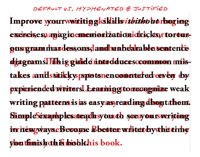
Here’s my final revision. These changes may seem subtle, but they become obvious when we overlay our final result (black) on top of the text we ended up with when we added optical margins and default hyphenation (red).
 Typesetting is a tedious and time-consuming process. The ideal end result is elegant, harmonious— and (unfortunately) unlikely to be noticed because its principle virtue is a lack of offensive qualities.
Not every publisher can afford to invest in a typesetter or a typesetting program; few books will sell enough copies to pay for one. Most people will read just about anything without complaint, and though the results are aesthetically inferior, using a Word Processor as a typesetting application is often a prudent business strategy.
Whichever route you choose, understand the differences and trade-offs. Smart publishers make informed decisions. If your goal is to produce the world’s greatest book, professional typesetting is an essential part of the process.
More Book Design Basics:
Book Design Basics Part 1: Margins and LeadingBook Design Basics Part 2: Optical Margins, Indents and Periods
Book Design Basics Part 3: Running The Numbers
Book Design Basics - Dashes, Hyphens and Dots
Book Design Basics: Small Capitals – Avoiding Capital Offenses
Book Design Basics - Drop Caps and Initial Impressions
Article: Writing is Design: The Grammar of Book Design
Book Design Basics - Use Hyphens for Justified Type
Article: Fine Control Over Justified Text
Simulating the Appearance of Traditional Print
Page Layout: Illustrated Books and the Rule of Thirds
Book Cover Design: Moving from Screen to Printing Press
Book Design Basics: Quotation Marks and Primes
Book Design Basics: Choosing a Book Font