

 Selecting a book font seems simple enough, but important subtleties and fine points of typography are not obvious to the average writer. This article offers insights into fonts suitable for book typography. Though it won’t turn the average author into a professional typesetter, it will inform indie publishers about the kind of guidance they should expect to receive from one. And if economic constraints force you to typeset your own book, the information offered here will help you make informed choices.
Book typography is an unusual art. Its success is best measured by the invisibility of the final result. The reader should not notice the type, and the type should not obscure or dilute the author’s intentions. Yet, the reader should be affected by the type. Reading is an aesthetic experience, and book font selection lies at its foundation.
Choosing a Book Font: Why Bother?
Choose a book font to set the tone for your book. In our data-driven age, it’s too easy to focus on simply getting information on the page. Type has a functional role to play, and it doesn’t have to do much more than be legible to accomplish that goal. But the highest compliment I’m paid as a designer is when someone opens one of my books and says “this looks inviting.” Though readers will probably not take conscious note of your book font choice, they’ll react instantly and intuitively to the tone it sets. “Once upon a time” requires a charming, lyrical font. “Finance tips” wants a no-nonsense font. “Recursive functions in C++” needs something dry and technical.
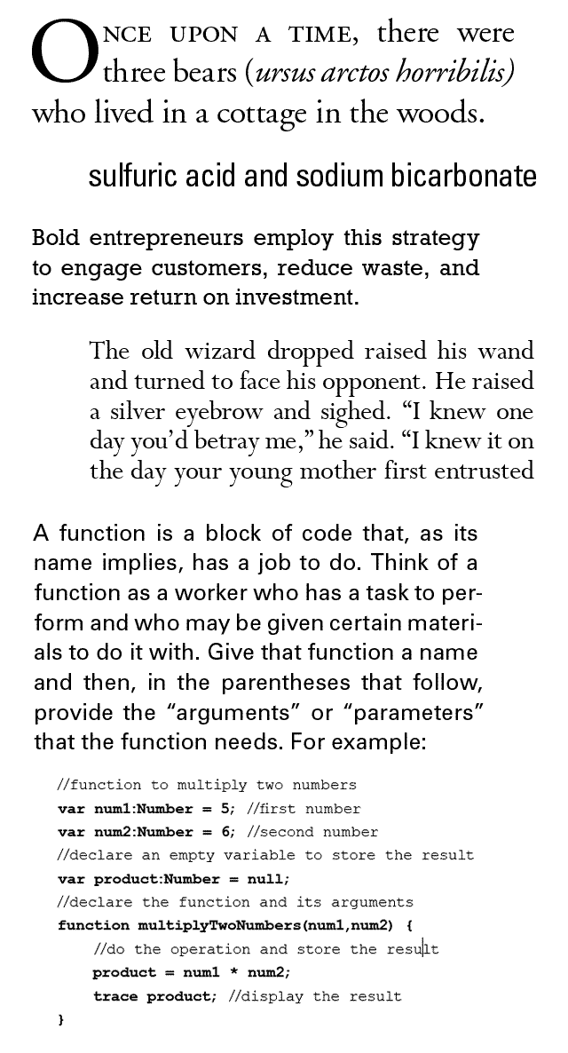
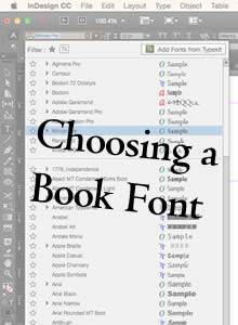
Study the examples in the gallery of font samples below (click any one and a gallery will pop up full-size). The content is the same for each, but the book font is different. How does each make you feel? Do you find some to be more romantic and others to be more rigid or technical? Reach out with your feelings, Luke. Even if you don’t notice a difference, the majority of your readers will. Selecting the right typeface from a list of fonts that all accomplish the same functional goal will change the reading experience in the same way that choosing a particular word from a list of synonyms will change the tone of your prose. What typeface best represents your personal writer’s voice? You don’t dress yourself in neutral gray clothing every day; what will you dress your words in?
-

- Univers Font Weights and Styles
-

- Serifs
-

- Times New Roman font by Victor Lardent, 1931
-

- Crimson Text font by Sebastian Kosch, 2010
-

- Font weights
-

- Mrs. Eaves font by Zuzana Licko, 1996.
-

- Mrs. Eaves font by Zuzana Licko, 1996.
-

- Agmena Pro font by Created by Jovica Veljović, 2013
-

- Minion® font by Robert Slimbach, 1990
-

- Adobe Garamond font by Robert Slimbach, 1989
-

- Agmena Pro font by Created by Jovica Veljović, 2013
-

- Roman and Italic versions of book fonts
-

- Roman and Italic versions of book fonts
Book Typefaces and Font Terminology:
Understanding the basics of font terminology will help you understand what you’ll get when shopping for a book font. Though “typeface” and “font” are commonly thought to mean the same thing, font vendors often adhere to the traditional definitions.
Font family refers to all the variations of a typeface that share a common name. For example, Times Roman, Times Italic, Times Bold, and Times Bold Italic are all members of the same font family.
Back in the days of hot metal type, Times Roman 12-point was considered to be a separate font from Times Roman 16-point. Now that type is digital and usually (but not always) designed for one-size-fits-all application, we refer to Times Roman as a single font. But you can still purchase a TrueType version or an OpenType version (discussed later); each is considered a separate font.
A typeface is essentially the same thing as a font, and it’s also equivalent to a type style. Garamond regular is a typeface within the Garamond font family, and its style is “regular” or “Roman.” This article uses “font” and “typeface” interchangeably.
Typically, writers think of Times as a single font that comes in four styles. But technically, Times Bold is a separate typeface from Times Italic. If a font vendor offers 10 type families, they may advertise 36 typefaces. And if their typefaces are available in two font formats, they might advertise 72 fonts.
Each character—a letter, number, or punctuation mark—is referred to as a glyph. A glyph is a mark or shape, as in “hieroglyphics” or “petroglyph.”
Book Typefaces: Avoid “Institutional” Typefaces
Some fonts are deliberately designed to be “institutional”—like the drab pastel colors they paint municipal schools and prisons with. Times and Times New Roman are ideal for journalism because they’re “neutral”; they don’t “color” the news. Helvetica and its knockoff, Arial, are likewise colorless, flavorless, and perfect for presenting dry, factual information. Though designers have found clever ways to bring it to life in numerous applications, it has limited application for book typography. It’s also the default font in PowerPoint. Make a presentation with it and you’ll look like you put neither thought nor effort into your design.
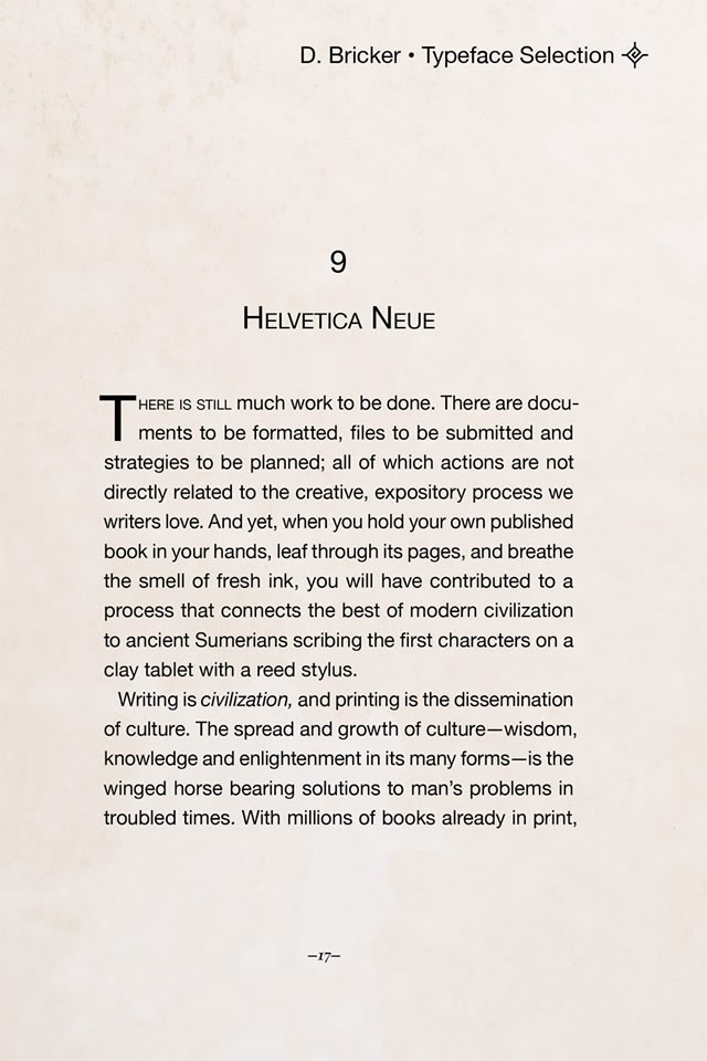
Helvetica Neue font, 1983 by D. Stempel
Times New Roman font by Victor Lardent, 1931
Use institutional typefaces for institutional purposes. Helvetica might be an ideal choice for a sidebar in an annual report. Times might be the perfect book font if your subject is epidemiology—but even then, you might consider a typeface that looks sophisticated, scholarly, or authoritative.
Font Categories: I Sought the Serif
The typography world is full of font categories; Display typefaces, for example, are built for signage and headlines. Some fonts defy categorization. But for book typography, the principal categories are serif and sans-serif. Serifs are those little lines at the ends of the strokes of the letters. Sans-serif fonts, as the name implies, lack these. Though serifs come in numerous shapes and styles and sizes, think of them as little “rails” that guide the eye through the text. Serif typefaces are easier to read, and are usually considered a better choice for body copy.
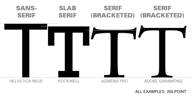
Serifs
In the examples above, notice how the two bracketed serifs examples on the right are not symmetrical. They lean subtly to the right to draw your eye through the text. The serifs on Adobe Garamond dip slightly below the baseline of the text. Some of the serifs extend higher than the overall height (cap height) of the typeface. (And though the samples are all the same point size, notice that some glyphs appear relatively larger or smaller—which means formulaic approaches to choosing font size won’t work.)
Even at small sizes, minute details of typeface design register subconsciously with the reader. Compare the vertical stroke on the Agmena Pro T with the vertical stroke on the Adobe Garamond T. The brackets at the bottom and where the stroke joins the crossbar are taller in Agmena Pro. They create a subtle concavity to the sides of the vertical stroke. Agmena is a bit more “bell bottomed” and Adobe Garamond is more “rigid” by comparison.
Font Selection: Weight Matters
When selecting a book font, consider what weights or styles a typeface is available in. Most fonts include Roman/regular, bold, and italic versions. Many include a bold, italic style. Others rely on your typesetting software to artificially embolden or slant the letters—which is not the same as true bold and true italic. Some fonts offer a “book” version that may be lighter or heavier than the “regular” version of the same font. Some fonts, like “Univers” and “Helvetica Neue,” were developed as complete font systems with a variety of harmonized weights and widths ranging from condensed to extended. The average fiction book can usually get away with the four basic styles mentioned earlier (Roman, bold, italic, bold italic), but if you’re creating an educational text, you may want the option to assign various weights to subtitles, photo captions, callouts, sidebars, etc.

Univers Font Weights and Styles

Fazeta Sans Various Font weights
Be sure your book font contains all the styles and weights you’ll need to express yourself clearly and professionally.
Font Selection: Check out the Italics
Sometimes a beautiful Roman font will have an italic version that appears to have come from a different planet. If you insert italic words into your text, they should harmonize with the surrounding words. If the italic version appears to be a different size, width, or weight, italicized phrases can look awkward or create visual distractions in the text. Compare this selection of Roman fonts to their italic counterparts:
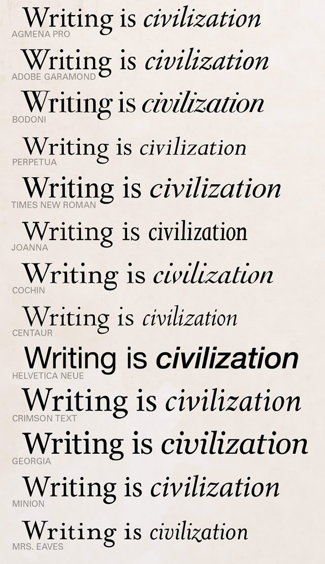
Roman and Italic versions of book fonts
Fonts like Perpetua and Centaur have beautiful italics, but they appear slightly smaller than their Roman versions. I love to use Centaur as a book font, but I usually set the italic type a half-point larger than the Roman. Georgia Italic appears to be slightly larger than Georgia Roman. Notice how much bolder Helvetica Neue Italic appears than Helvetica Neue Regular. Mrs. Eaves Italic appears narrower and more tightly spaced than Mrs. Eaves Roman. Joanna Italic is hardly an italic at all; it has almost no slant to it and the letters are much narrower than the Roman version.
Choose a book font where the italic version complements the regular version. Figure out how you’ll compensate for any apparent differences in height/size between the two.
Font Selection: Does Your Type Have Character(s)?
Most typefaces come with the standard uppercase and lowercase characters plus basic punctuation, but a proper book font includes many more. For example, choose a typeface with a good selection of ligatures. For example, in some fonts, when you type “fi,” the ball at the end of the f collides with the dot on the i. Good typefaces substitute a ligature that combines the two characters. Better typefaces have a wider selection of ligatures and smarter substitution algorithms.
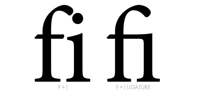
Ligatures
Compare the character set of Agmena Pro with the characters included in Georgia. Agmena contains big caps, small caps, accented versions of each, lining and oldstyle figures, numerators and denominators, a variety of ligatures, 4 different ampersands(!), plus symbols and ornaments.


Both are attractive, legible typefaces, but which would you use to typeset your book? You might feel more intimidated than empowered by all those options, but this is another reason why a professional typesetter working with good page layout software will produce better work than an amateur with a word processor.
Font Selection: Font Technologies
Fonts are available in several formats. OpenType is king. OpenType fonts allow font designers to build in decision-making logic. For example, in a script font, if a letter “a” is in the middle of a word, its tail might end at a certain height where it joins the next letter. If it’s at the end of a word, the tail might be slightly longer and lower. OpenType fonts contain optional stylistic sets, special ligatures (letter combinations that are joined together), small capitals, figure (number) styles, etc. that can be switched on and off in a high quality typesetting program. Other font technologies (e.g. TrueType) require small caps and other font variations to be released as separate fonts. For example, my copy of Centaur is a TrueType font. When I want to use small capitals, I have to switch the font to Centaur Expert. Though I love Centaur, I set more books with Agmena Pro and Adobe Garamond. Having all my options available in a single OpenType font makes the work easier.
And this is one more reason not to typeset your book with a word processor. Word processors offer no facility for activating advanced OpenType features like small caps, swash capitals, tabular figures, etc. The Character palette in Adobe InDesign gives you quick access to the OpenType features available in a given font, many of which can be implemented automagically by the decision tables embedded in the font software.

Raniscript alternate glyphs

Accessing OpenType features in Adobe Indesign
The Hoefler type foundry offers an excellent explanation of the features and advantages of OpenType at http://www.typography.com/techniques/opentype/
When you select a book font, know that font technologies and typesetting technologies are not created equal. Understand the benefits and trade-offs associated with various font formats and tools.
Book Fonts: You Can’t Beat the Classics
 Typography and font design expanded as digital tools replaced hot metal type. But type design has been around for centuries; it’s had plenty of time to solve problems and evolve. Rarely does an artist in any medium create a new and viable form out of the ether. Artists are inspired by artists who preceded them, regardless of their medium. Art lives on a continuum and the best contemporary book faces are often digital revivals of classic designs. A typeface designed without historical influence is more likely to be rootless than innovative.
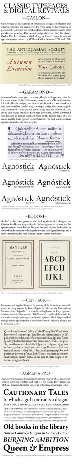
Classic Typefaces and Digital Revivals
As a survey of classic book typography, this article barely scratches the surface, but information about typefaces and their designers is easily found. Do your homework. Choose a typeface that’s informed by history and created by artisans. Take advantage of the centuries of exploration and evolution that make the best typefaces not only legible but spirited and evocative.
Choosing a Book Font: Conclusion
If you had the opportunity to sing in a concert, you might choose opera, jazz, rock or some other style. That concert is like your writing style. If you could choose to sing in any voice, you might choose Pavarotti’s, Ella Fitzgerald’s, or Elvis Presley’s—or you might mix and match attributes of your favorite artists (as those singers did with their favorites to create their own sounds). That voice is the font you choose to typeset your book with.
Though a good book font family can cost hundreds of dollars, it’s a art investment that can bring your book to life, and it can be used over and over. Good free fonts are available, but don’t sell yourself short. Choosing a book font requires more than simply choosing something “pretty” from the font menu. Times New Roman and Microsoft Word are an easy “grab and go” production method, but well crafted typefaces handled by powerful page layout software and type-savvy designers are the best recipe for legible and spirited type that represents the tone and feel of your unique author’s voice.
More Book Design Basics:
Book Design Basics Part 1: Margins and LeadingBook Design Basics Part 2: Optical Margins, Indents and Periods
Book Design Basics Part 3: Running The Numbers
Book Design Basics - Dashes, Hyphens and Dots
Book Design Basics: Small Capitals – Avoiding Capital Offenses
Book Design Basics - Drop Caps and Initial Impressions
Article: Writing is Design: The Grammar of Book Design
Book Design Basics - Use Hyphens for Justified Type
Article: Fine Control Over Justified Text
Simulating the Appearance of Traditional Print
Page Layout: Illustrated Books and the Rule of Thirds
Book Cover Design: Moving from Screen to Printing Press
Book Design Basics: Quotation Marks and Primes
Book Design Basics: Choosing a Book Font