 Use of Small Capitals—uppercase characters designed at lowercase scale—is one aspect of writing and book design that isn’t taught in grammar school. We all know every sentence begins with a capital letter and ends with a period. We all should know that writing in all capital letters is the typographic equivalent of shouting—a “capital” offense.
A Small Capital (or “small cap”) is a specially designed character—not a regular capital letter scaled down to a smaller size. Word processors and even some typesetting programs reinforce the abuse of small caps by offering a “small caps” shortcut that scales down the uppercase letters to match the height of the lowercase characters. A real small cap is different from a full-capital letter in subtle but important ways.
This article explores proper use of capital letters, explains the difference between big caps and small caps, and offers book design tips to help you manage abbreviations, names, directions, chapter starts and other typographic challenges. Many thanks to author and typographer Dick Margulis for editing and fact-checking.
Book Design Tip: Use a Small Cap Font.
In a previous article, I wrote of the importance of selecting typefaces that include both Lining and Oldstyle figures for correct typesetting of numbers. Choosing a typeface that includes a set of specially designed small caps is also important. The following examples reveal why small caps are necessary.

The “fake small caps” example uses scaled down capital letters. Notice how the big capitals have thicker strokes than the faux-small caps? Scaling the big capitals down scales down the thickness of their strokes disproportionately.

The “real small caps” example uses small caps designed to harmonize with the big capitals. Though the characters have the same height as the lowercase letter x (called “x-height” by typographers), they have thicker strokes to match the weight of the big capitals.
Book Design Tip: Use Small Caps Instead of All Caps.
Groups of consecutive capital letters often appear in acronyms and abbreviations. When regular capitals are used, they create sections of type that are noticeably different than the words surrounding them. Use small capitals instead to keep the weight of the type consistent. Acronyms set in big or small caps can omit the periods between the letters with the exception of “U.S.”
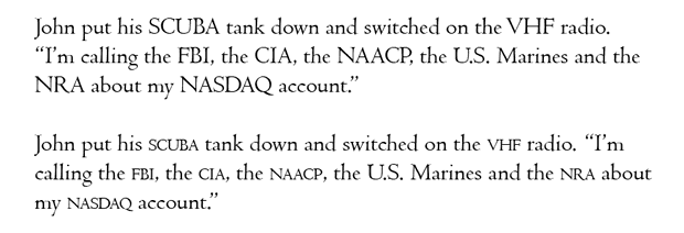
In the first example, the big capitals are jarring; they stand out from the text. The small capitals harmonize better with the surrounding text in the second example.
Book Design Tip: Capitalization and Periods.
Some publications use small caps for acronyms and initialisms longer than three letters. Set “U.S.” in normal caps, but set NATO in small caps. Use small caps preceded by a space for:
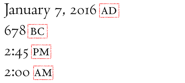 The Chicago Manual of Style offers different guidelines: Instead of am and pm, CMOS specifies a.m. and p.m.—with lowercase letters and periods. Unfortunately for the look of the page, other abbreviations traditionally set in small caps should be set in full caps when writing to CMOS specifications.

This means that pretty much anything you do, apart from putting periods between the capital letters is technically correct. If you are writing an academic paper, consult your style guide but don’t imagine it to be a recipe for elegant typography. Many respected style manuals still attempt to get word processors to emulate a clunky manual typewriter.
Book Design Tip: Names and Places.
Use full caps and periods for proper names with initials:

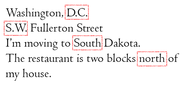
Use full caps and leave out the periods for place names, but use the periods for directions. Only capitalize directions when they are part of a proper name.
Book Design Tip: Use Small Caps to represent Characters in a Play.

Book Design Tip: Use Small Caps for Elegant Headlines.
Small capital letters mixed with full-caps have a certain regal quality to them. When not overused and properly tracked (letterspaced), mixed capitals are great for captions and headlines.

Book Design Tip: Use Caps or Small Caps to Begin a Chapter.
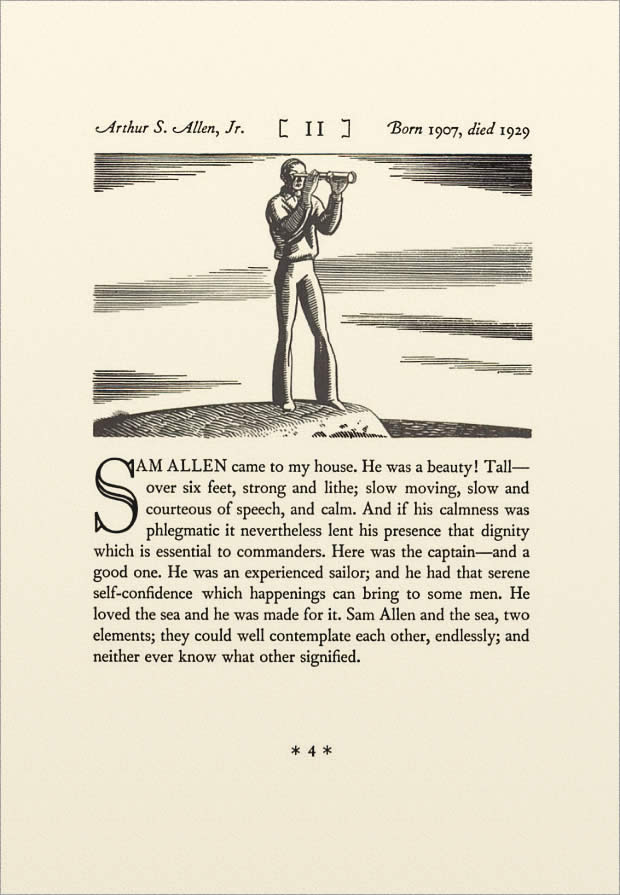
This is an option rather than a rule, but “old school” typesetters often used caps or small caps to transition between a drop capital (a large capital letter that spans two or more lines at the beginning of a block of text) and the regular text. There is no hard and fast rule for how many letters should be set in small caps on the first line. Some typographers like to set the first word in small caps, but this doesn’t work well if the first word has only two or three-letters. Others like to set the first line in small caps though this can cause problems if the last word is too long for the line and requires hyphenation. I prefer to set the first significant words of the first line in small caps, working by feel instead of by formula.
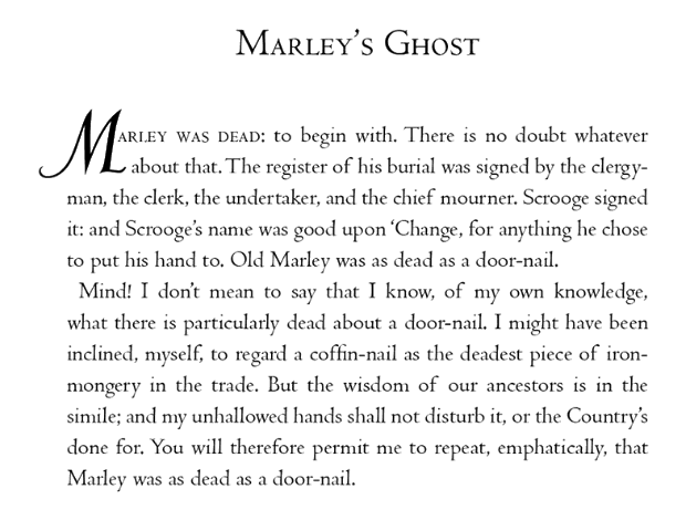
The following example is a chapter opening from N by E (North by East) published in 1930 by artist, author and adventurer Rockwell Kent. (I took the original layout and centered it so it would look better displayed as a single-page instead of as a spread.) The big drop capital-S transitions into full-sized capitals and then into the standard text.

Above all, whether you use all caps, small caps or a combination, be consistent in your use of capital letters. If you do use small caps for a professional touch, choose a typeface that has the alternate small cap characters built in or invest in an “Expert” typeface that supplies characters not included with the corresponding “Regular” typeface (The examples here were all typeset with Bruce Rogers’ Centaur typeface. The small capitals were set in “Centaur Expert”).
Even if you don’t do your own typesetting, use these book design articles to improve the accuracy of your writing, enhance your knowledge and evaluate prospective book designers. Many contemporary designers understand the technology but have never studied the fine art of typography. Ask your designer a few questions about small caps, tabular figures and em dashes to reveal the depth of their expertise. Let them know you’ll be checking their work with a critical eye; excellent work is done for excellent clients.
More Book Design Basics:
Book Design Basics Part 1: Margins and LeadingBook Design Basics Part 2: Optical Margins, Indents and Periods
Book Design Basics Part 3: Running The Numbers
Book Design Basics - Dashes, Hyphens and Dots
Book Design Basics: Small Capitals – Avoiding Capital Offenses
Book Design Basics - Drop Caps and Initial Impressions
Article: Writing is Design: The Grammar of Book Design
Book Design Basics - Use Hyphens for Justified Type
Article: Fine Control Over Justified Text
Simulating the Appearance of Traditional Print
Page Layout: Illustrated Books and the Rule of Thirds
Book Cover Design: Moving from Screen to Printing Press
Book Design Basics: Quotation Marks and Primes
Book Design Basics: Choosing a Book Font
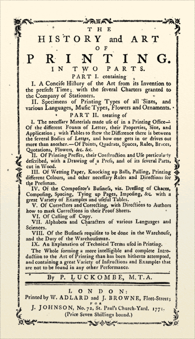
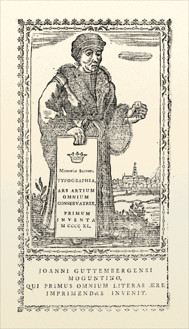
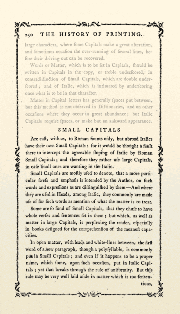
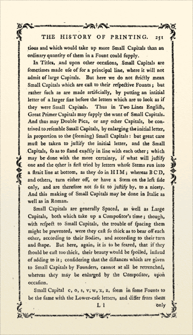
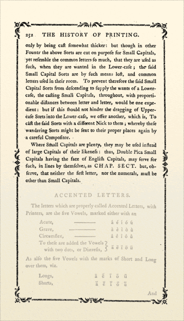
Addendum: Advice on Small Capitals from The History and Art of Printing by P.Luckombe, M.T.A. 1771 (pp. 250-252).
More Book Design Basics:
Book Design Basics Part 1: Margins and LeadingBook Design Basics Part 2: Optical Margins, Indents and Periods
Book Design Basics Part 3: Running The Numbers
Book Design Basics - Dashes, Hyphens and Dots
Book Design Basics: Small Capitals – Avoiding Capital Offenses
Book Design Basics - Drop Caps and Initial Impressions
Article: Writing is Design: The Grammar of Book Design
Book Design Basics - Use Hyphens for Justified Type
Article: Fine Control Over Justified Text
Simulating the Appearance of Traditional Print
Page Layout: Illustrated Books and the Rule of Thirds
Book Cover Design: Moving from Screen to Printing Press
Book Design Basics: Quotation Marks and Primes
Book Design Basics: Choosing a Book Font


