 Part 3 of Book Design Basics explores better ways to present numbers on your pages. Numbers (called figures) look simple at first glance, but they present interesting typesetting challenges. Many digital typefaces offer several number styles but few designers know what they are or how to use them properly.
If you got to class late, Read Part 2 of Book Design Basics first to learn about optical margins, paragraph formatting and spaces.
Read about margins, layout and leading in Part 1.
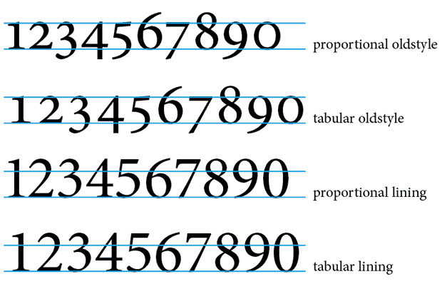
Numbers (figures) come in four primary categories. Though they play a very small role in the text of an average novel, numbers still have an important effect on the appearance of your text. Tables, menus and recipes use numbers in different ways than text set in paragraphs. There are two figure styles: Oldstyle and Lining. Each comes in two flavors: Proportional and Tabular. An understanding of their differences allows your numbers to communicate clearly and effectively.

Book Design Tip: Tabular Figures and Proportional Figures
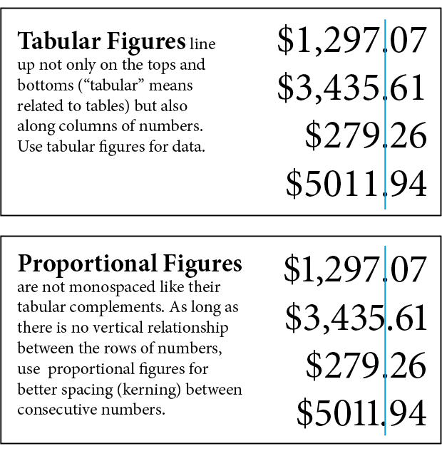
Tabular Figures are monospaced. They’re ideal for columns of numbers that have to add up or be compared because they always line up vertically.
Proportional Figures (like proportional type) are designed for ideal letterspacing between characters. When you’re not dealing with rows and columns of data, they are easier to read. Use them whenever numbers are embedded in text.

Book Design Tip: Oldstyle Figures and Lining Figures
Lining figures are also called Regular Numerals or Titling Figures. Lining Figures are most commonly included with digital typefaces that only include a single set of numerals. Uniformly the same height as capital letters, Lining Figures sit on the baseline of the type (though they are sometimes of a lighter weight than the capitals). Use Lining Figures for forms, tables, business reports or any place alignment is critical.

Lining Figures also blend in nicely with headlines set in all capitals:

Oldstyle Figures break the flow of the headline:

Less-used but still important are subscript and superscript figures, numerators and denominators.
Subscripts and superscripts are used in chemistry and math. Numerators and denominators are used specifically for fractions.

Accessing Special Features in Book Design
Though special figures are available across all font technologies, the easiest way to access them is to use an OpenType typeface. (OpenType will be the subject of a forthcoming article). In Adobe InDesign, the Character menu offers quick access to a wide range of typographic alternates.

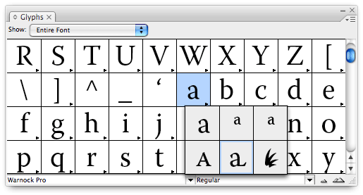
Additionally, a Glyph palette allows you to select a character within the text and choose an alternate from a popup list.
Book Design Tip: Choose a Full-Featured Typeface
It’s easy to judge a typeface by its cover and end up with a poor selection if you don’t understand what tasks it will have to perform. Even some of the old standards may not have what it takes to get you through the typesetting process.
 Look for OpenType typefaces and typefaces with “Expert” options. Think carefully about your content. Even if your book is a narrative with few numbers in it other than a few dates, it will benefit from a set of Oldstyle Figures. If you’re writing a business or math book, a set of Tabular Figures is essential.
If you can find a designer who knows what Oldstyle Figures are, your book is probably in good hands. If you are typesetting your own book, an understanding of typography basics will empower you to produce a result that honors the effort you put into your writing.
Addendum: Again, the ever watchful Dick Margulis pointed out that when typesetting a fractional figure, the standard keyboard “slash” should not be used. Instead, use option-shift-1 on a Macintosh or alt-shift-1 on a PC to insert a “division slash.”
Addendum 2: David Bergsland mentioned that I overlooked Small Cap Figures. Though the use of small capital letters in typesetting will be discussed in a later article, it’s important to use figures that are sized proportionately to the letters. Not all typefaces include Small Cap Figures, so choose your fonts carefully to ensure they’ll meet your needs.
More Book Design Basics:
Book Design Basics Part 1: Margins and LeadingBook Design Basics Part 2: Optical Margins, Indents and Periods
Book Design Basics Part 3: Running The Numbers
Book Design Basics - Dashes, Hyphens and Dots
Book Design Basics: Small Capitals – Avoiding Capital Offenses
Book Design Basics - Drop Caps and Initial Impressions
Article: Writing is Design: The Grammar of Book Design
Book Design Basics - Use Hyphens for Justified Type
Article: Fine Control Over Justified Text
Simulating the Appearance of Traditional Print
Page Layout: Illustrated Books and the Rule of Thirds
Book Cover Design: Moving from Screen to Printing Press
Book Design Basics: Quotation Marks and Primes
Book Design Basics: Choosing a Book Font


