Part 2 of Fundamentals of Book Design explores optical margins, paragraph formatting and spaces.
Read about margins, layout and leading in Part 1.
 The self-publishing revolution is (aside from the Internet) the greatest thing ever to happen to freedom of speech and expression, but self-published books are widely stigmatized as poorly produced. Why? Because they almost universally are. Moreover, the declining standards of mainstream publishers do not justify the mediocrity of self-publishers. In fact, self-publishers will find a competitive advantage in applying basic book design principles to produce books that are comfortable to read and pleasing to the eye.
After all those hours writing and editing, why not produce a book that conveys your good taste, attention to detail and care? Here are some simple but powerful book design tips to help your book achieve excellence.
Book Design Tip: Optical Margins
Optical margins are one thing you won’t get your word processor to do, but with a dedicated typesetting program like Adobe InDesign, you can improve the look of your book design with a simple but underused feature.
Let’s look at an ordinary block of text (from Oliver Twist by Charles Dickens).
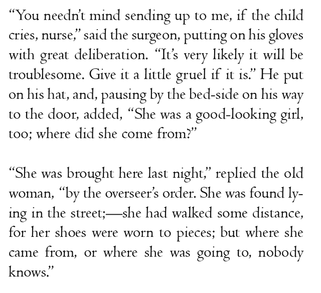
At first glance, it looks legible enough, but on closer inspection, the text looks awkward wherever there’s a punctuation mark at the beginning or the end of a line. Those places are highlighted in the next figure:
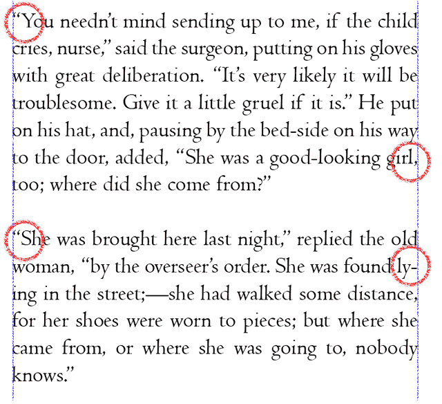
Notice how all the punctuation stays strictly within the boundaries of the text box. In longer blocks of text, this creates noticeably ragged edges. In cases where there are quotation marks at the beginning of a line, the appearance of an indented new paragraph is created whether that’s the intention or not.
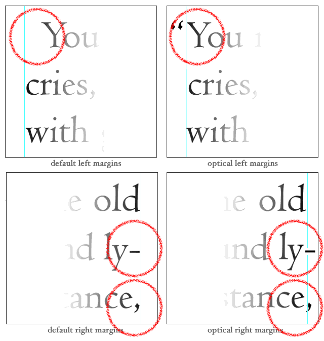
What we need to improve our book design is optical margins; margins that line up the letters while letting the punctuation hang over the edges. Though this technically introduces less even margins, the tiny punctuation marks use less ink than the letterforms and are more or less invisible. When we turn optical margins on, the effect creates an illusion of straight, tidy margins.
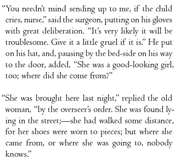 This looks straighter, but take a look at the punctuation with the guides turned on:
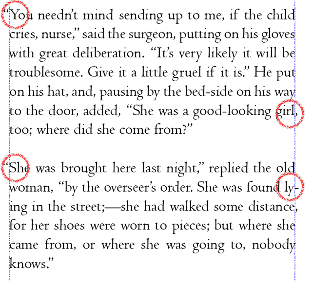 The hanging punctuation makes the edges of the text look straighter even though we have pushed portions of it past the guides we might intuitively rely on to produce “straight text.” It looks straighter even though it’s not. Optical margins make better book design. Here are some blown up examples:
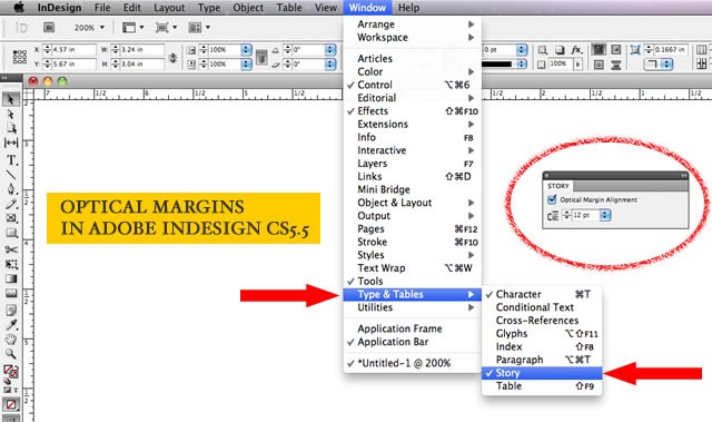
 To turn on optical margins in Adobe InDesign, simply select any text box you wish to apply them to and then open up the (not very intuitively named) “Story” dialog box. You can adjust the degree to which the punctuation hangs over the edges of the text box to match to match the size of your text or suit your own preferences.
Book Design Tip: Paragraph Indents
One of the first things I do when I’m given a manuscript to typeset is do a global find and replace to make sure none of the paragraphs begins with a tab (I search for paragraph breaks followed by a tab and then replace them with only paragraph breaks). Putting a tab at the beginning of a paragraph is a holdover from typewriter days when that was the easiest way to put a half-inch indent at the beginning of a new paragraph. There are worse ways to indent a paragraph, but we’ll get to those shortly.
For some time after the introduction of word processors, attempts were made to “legitimize” them by getting them to mimic the look of a typewriter. Half-inch tabs and indents are a legacy of this and sadly, both the Chicago Manual of Style (CMOS) and the Modern Language Association (MLA) still specify half-inch paragraph indents in their style guides for manuscripts. It’s a recipe for ugly academic papers that ignores basic, long-standing principles of book design.
Typesetters have traditionally used an em as the standard size for a paragraph indent. What’s an em? Back in the days of hot metal typesetting, an em was literally the width of the letter “m” in a given typeface and type size. With digital type, there’s no need to measure the letter “m.” Simply use a measurement equivalent to the point size of your type. If the text is set in 12-point type, use a 12 point indent. A point is 1/72nd of an inch so with 12-point type, use 12/72nd or 1/6th of an inch. Or, you can use your eye to adjust the paragraph indent to suit your tastes. I often let mine vary from a digital “em,” because every typeface has characters of different widths and proportions, even at the same point size. As always, when in doubt, defer to a trained eye. If stranded on a desert island, use a hair shy of 1/8-inch.
To adjust the paragraph indent (you can—and should—do this in your word processor, too), highlight your text and use the tab ruler.
In Adobe Indesign, use command/control – shift – T to bring up the tab rulers.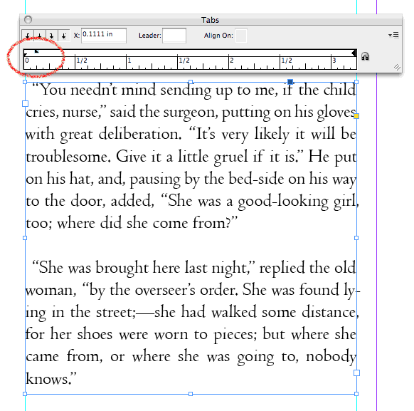
Notice that the right-facing arrow at the left side of the ruler (highlighted in the figure) is split in two. The top half of the arrow represents the first line of the paragraph. The bottom half of the arrow represents the rest of the paragraph. Slide the top half to the right to set the size of the paragraph indent. Easy!
Book Design Tip: Spaces
Invisible as they may be, from a typesetter’s perspective, spaces are probably the most abused character in book design. An exploration of how spaces were treated by typewriters and metal typesetters reveals their importance and the problems associated with them.
Back in the days of typewriters, monospaced typefaces were used; a letter “i” was the same width as a “w.” This happened because each keystroke caused a gear in the typewriter to advance the carriage one gear tooth to the left. Letter spacing was absolutely consistent, but it appeared absolutely inconsistent because of the relative shapes of adjacent letters.

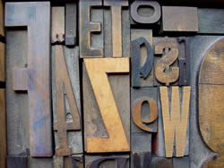
In printing, gaps occurred between letters because the letters were carved or cast into wood or metal blocks. Here’s a wood type sample from David Wolske’s LetterPress Daily.
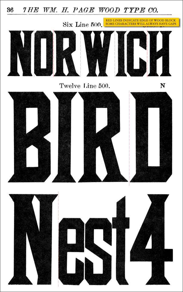
Notice the gaps around the “W” in “NORWICH” and between the “R” and the “D” in “BIRD.” Of course, typographers like Wolske and Letterpress printers like Hatch Show Print will argue that the imprecise spacing of wood type is part of what gives it its charm. I agree with them fanatically, though contemporary Letterpress printing has more to do with fine art than with producing clean, legible text for book design. Interestingly, though designers have access to digital reproductions of wood typefaces, they almost always fail to reproduce the spacing idiosyncracies of Letterpress printing that give the work its authenticity.
Book Design Tip: Kill the Double Space
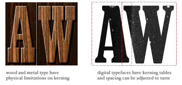
Don’t ever use consecutive spaces in book design—ever. Monospaced typewriters had enough problems with spacing; added to their difficulties is the convention to use a double space after a period. But with the exception of intentionally monospaced fonts like Courier (used most often today to designate computer code), digital typefaces are proportionally spaced. Digital fonts contain internal kerning (letter spacing) tables that define how close one letter should be to another. This makes for much more elegant type. An “A” can nest inside the complementary angle of a “W,” something that was impossible back in the days when each letter sat on its own block of wood or lead. This means every letter “knows” how close it should be to the character next to it. Simply put, a period already has just the right amount of space to the right of it. (CMOS and MLA now specify a single space after a period in their style manuals).
One of the other first things I do before I typeset a manuscript is convert double spaces to single spaces over and over until there are no more consecutive spaces left in the document. This solves—or at least reveals—several common book design problems.
- It gets rid of double spaces after periods, eliminating a possible source of white “rivers” running through the type.
- Using a tab before the first line of a paragraph is bad enough form, but some writers use five consecutive spaces instead. Removing the preceding spaces from paragraphs allows the typesetter to control paragraph indents precisely using the tab rulers.
- Some writers attempt to center or otherwise adjust the horizontal position of portions of the text by using consecutive spaces. This may look fine on an 8 ½ x 11″ manuscript, but when you set up a 4″ x 5″ book block on a 6″ x 9″ page, the consecutive spaces will cause the line breaks to change completely, utterly wrecking the effect the writer is hoping to achieve. Writers who want to request special formatting need only send a note to their book designer.
Typesetting for Better Book Design
The goal for digital typesetters is to preserve the warmth, charm and craft of hot metal type while leveraging the advantages of today’s technology. By combining an understanding of the history of printing and the typesetter’s craft with knowledge of how to work with typesetting software, things are possible in book design that printers could only fantasize about a few decades ago.
As a self-publishing advocate, I like the idea that the tools for setting elegant type are within reach of the average person, but, as a book design educator, I cringe whenever someone typesets their own book with Microsoft Word. The intricacies of typesetting are clearly beyond the scope of most writers’ knowledge and it’s easy to get duped by the “pretty good” text displayed by a word processor. Like a good editor, an educated typesetter is one of those necessary expenses that always produce a better book design. In cases where budget or business opportunity limit a book’s production resources, defer to a trained eye to develop some styles and standards for your book before you head off on your own.
Addendum: After I posted this, Dick Margulis was kind enough to point out a few things worth mentioning.
1. Kerning did exist before digital type. It required physical cutting of the letters with a “kerning saw.” Now that it’s easy to adjust, few typographers bother to tweak the default kerning specs built into their digital typefaces.
2. Paragraphs should either begin with an indent OR be separated by a double line break (preferably the former)—not both.
More Book Design Basics:
Book Design Basics Part 1: Margins and LeadingBook Design Basics Part 2: Optical Margins, Indents and Periods
Book Design Basics Part 3: Running The Numbers
Book Design Basics - Dashes, Hyphens and Dots
Book Design Basics: Small Capitals – Avoiding Capital Offenses
Book Design Basics - Drop Caps and Initial Impressions
Article: Writing is Design: The Grammar of Book Design
Book Design Basics - Use Hyphens for Justified Type
Article: Fine Control Over Justified Text
Simulating the Appearance of Traditional Print
Page Layout: Illustrated Books and the Rule of Thirds
Book Cover Design: Moving from Screen to Printing Press
Book Design Basics: Quotation Marks and Primes
Book Design Basics: Choosing a Book Font


