


 Book design is a lost art. Though book design discussions usually focus on covers, consider how much more time a reader spends staring at the text. An elegant book block is just as important. Decades ago, professional tradesmen practiced the fine art of typesetting. Today, book design is often executed (pun intended) by amateurs. As easy as it is to set type, many fine points of typography are commonly overlooked. Fortunately, for the design-aware, digital tools like Adobe InDesign make it possible to produce pages that aspire to the old standards of hot metal type. This is the first of a series of articles offering book design tips to help polish your pages.
Sacrificing comfortable margins is unfortunately a good business decision, even if it’s a bad design decision. As the book industry has grown, page margins have shrunk. Text is packed ever more tightly onto the page. Why? A big publisher may print 30,000 copies of a new author’s book. That’s a huge financial risk. If more text can be fit on each page, the print run uses less paper and less ink, resulting in huge savings.
Fortunately, self-publishers don’t have this problem because print-on-demand (POD) allows for the production of one book at a time. Using classic margins and printing a few more pages per book adds negligible cost while giving POD publishers a competitive edge.
Book Design Tip: Margins
Page Margins make a difference because certain shapes and proportions are naturally pleasing to the eye. These have provided a historical backbone for classic architecture and were adopted by typesetters as early as the 1400s. A page with a well-proportioned and well-positioned block of text is perceived to be at rest. Removing tension from the design allows the reader’s focus to return to the meaning of the text.
Wider Margins not only bring visual harmony to the page, they provide space for those who like to annotate the text and a place for readers to rest their thumbs without covering up the words.
Line Width is another important book design consideration. We read by taking in groups of 3-4 words at a time. The average book has 2-4 word groups per line. Text set in wide line widths becomes difficult to read because it’s more difficult for the eye to keep track of where it is in the text. That’s why newspapers use narrow, single columns; to facilitate faster and easier reading. The relationship between margins and line width is obvious; wider margins mean narrower line width. The rule of thumb is 65 characters per line, but ideal length can vary with choice of typeface and with the writing itself. Writers who use long words or languages like Spanish or German can find their work fragmented by dozens of unwanted hyphens if typeface, type size and margin sizes aren’t balanced.
White Space lets a design “breathe.” Seen as a single unit, a block of text has a certain density. Viewed out of focus, it appears as a dark gray rectangle within the white rectangle of the page. Dark and light areas of the page should be in harmony. If the page is too dense, it feels heavy; the page creates tension. Ultrawide margins feel luxurious and are often used in advertising design, but they don’t do much to help with the practical task of getting enough text on the page to efficiently and effectively convey the meaning of the text. Balanced book design is important.
According to Richard Hendel in On Book Design,
In books of text meant for continuous reading, facing pages should be positioned in relation to each other such that the reader thinks of them as a single unit. The gutter margin—the margin by the spine—is therefore smaller than the front margin—the margin opposite the gutter, so that the two facing blocks of text are close together and the space to the outside of them is greater. The top margin is smaller than the bottom margin, which is the largest of all. The large bottom margin is another of those conventions of ideal Renaissance proportion that we now think of as rules. The text block that sits square in the center of the page can look arbitrarily placed. Books with large top margins and small bottom margins sometimes feel as though they have met with some mishap at the bindery.
Typographers have developed several Canons of Page Construction. Many have arrived at similar conclusions by different means. Though it’s difficult to explain why one specifically proportioned rectangle is more universally pleasing to the eye than another, centuries of successful application support the idea. A common form for classic art and architecture is the “golden ratio” of 1:1.618. To implement the golden ratio, simply create a rectangular box in your drawing or page layout program 1 inch wide x 1.618 inches tall. Scale the rectangle up proportionately to preserve the relationship between width and height
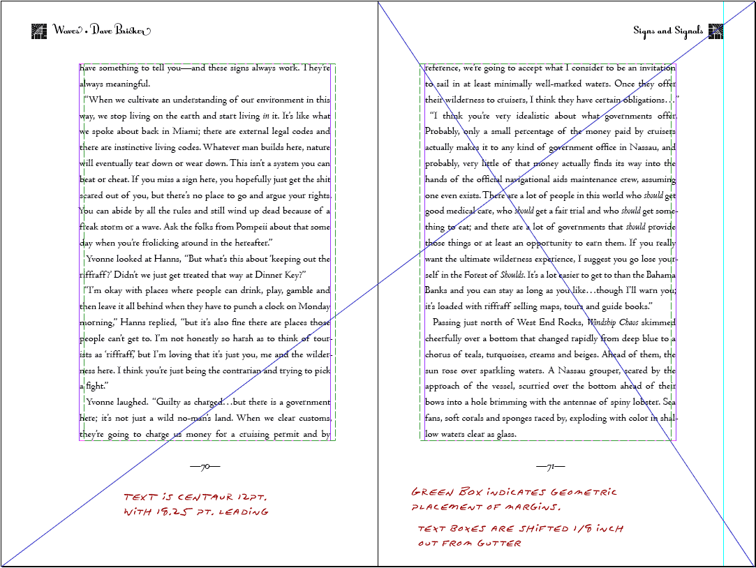
The J.A. Van de Graaf Canon is a book design based on the “golden ratio” and a survey of medieval manuscripts. It works for any page size, and enables the book designer to position the text body in a specific area of the page. The black, angled lines provide insights into the geometry Van de Graaf used to position the red text blocks but in today’s digital world, things are easier. Download the SVG file or the high-resolution PNG file, import the design into a two-spread master page and adjust margins accordingly.

Van de Graaf canon
The great typographer, Jan Tschichold, proposed a simpler set of guides for positioning and sizing a golden rectangle on the page. The results of Tschichold’s Golden Section Canon are identical to the Van de Graaf Canon but much easier to construct by drawing a few guide lines on the page.

Tschichold’s Golden Section Canon
When planning margins, remember that a book spread isn’t flat. A certain amount of paper will disappear into the gutter where the pages are attached to the book’s spine. Even when following standard printers’ guidelines (Lightning Source specifies ¾ inch margins all around the page), I like to move my text boxes an extra 1/8” outward from the gutter. Though this would seem to go against the convention of having larger outside margins than inside margins, enough of the inside is swallowed by the gutter to make up the difference.
Of course, not all book design needs such spacious margins or formulaic approaches. Before you typeset your book, drop a text box full of sample text into a page spread. Play with margin specifications until you achieve a balance that works.
Book Design Tip: Leading
Leading (pronounced “ledding”) is the typographer’s word for line spacing, named for the lead shims that were once inserted between rows of typeset characters. Possibly, you have played with the controls in your word processor and seen how text looks with single or double line spacing selected? Manuscripts are generally created double-spaced, not only so editors have a place to write comments above the text, but because they’re easier to read that way. Convention suggests a leading value of 50%—that’s 50% larger than (1.5 times the size of) your chosen typeface. In other words, if you’re using 12-point type, start with 18 point leading. From there, make fine adjustments to account for the typeface itself. I like to set a full block of text with my selected typeface and type size, then expand the leading so the last line sits perfectly on the bottom of the text box.
Here are samples of 12 point Centaur Regular set to different leading specifications. Type sizes and leading are commonly specified with a slash between them. 12-point type at 18-point leading is notated as 12/18.

Examples of Text Leading
Notice how the tight leading looks tense, intimidating and difficult to read? The values in the middle feel comfortable. Once we get to 100% leading (12/24), the text starts to fall apart; our eyes have to jump too far from one line to another.
When in doubt about margins, leading or other important typographical elements, defer to a trained eye. Even if you’re a do-it-yourself publisher on a budget, a capable designer likely won’t charge much to help you develop some type specifications for your book. That simple guidance can make a huge difference in the book’s final appearance.
More Book Design Basics:
Book Design Basics Part 1: Margins and LeadingBook Design Basics Part 2: Optical Margins, Indents and Periods
Book Design Basics Part 3: Running The Numbers
Book Design Basics - Dashes, Hyphens and Dots
Book Design Basics: Small Capitals – Avoiding Capital Offenses
Book Design Basics - Drop Caps and Initial Impressions
Article: Writing is Design: The Grammar of Book Design
Book Design Basics - Use Hyphens for Justified Type
Article: Fine Control Over Justified Text
Simulating the Appearance of Traditional Print
Page Layout: Illustrated Books and the Rule of Thirds
Book Cover Design: Moving from Screen to Printing Press
Book Design Basics: Quotation Marks and Primes
Book Design Basics: Choosing a Book Font