I created a sample, low-resolution book cover design for this exercise. The imagery contains saturated colors, photographs, and dark areas that contain subtle details—all potential stumbling blocks for publishers who don’t understand the printing process.
Figure 1. Example Cover Design in RGB Mode
I set some body text on my original design so I could visualize my final result, but for purposes of adjusting color, I’ll strip it out. Adobe Photoshop is a remarkable image editor, but it lacks sophisticated typesetting tools. If this was an actual cover, I’d leave the back cover text and the bar code out while I adjusted the images, and then add them later with a page layout program like Adobe Indesign or Quark. Please don’t set body text with Photoshop—ever.
Computer monitors rely on additive color. Think of every pixel (dot) on your screen as a bundle of three tiny flashlights—one red, one green, and one blue. If the lights are off, you see black. If the lights are all on, you see white. Each flashlight has 256 levels of intensity between on and off. This doesn’t sound like much, but when you multiply 256 x 256 x 256, you get 16,777,216 possible colors—quite a few considering the human eye can only see about 38,000.
Fig. 2 RGB and CMYK
Printwork relies on subtractive color. Light in your environment hits the ink on your paper. The various colors of ink subtract certain frequencies and reflect others. Black ink, for example, reflects almost no light; white ink reflects most frequencies; red ink absorbs frequencies other than red and bounces the rest into your eyes. The subtractive color model describes how we see objects in the world. Unless you’re looking directly into a light source, you’re observing reflected light that’s had color subtracted from it. And of course, the color and quality of the light source is a major determiner of the colors we perceive.
The red, green and blue phosphors in your computer monitor (RGB) are analogous to cyan, magenta, and yellow inks in the subtractive color world. If we overlay transparent cyan, magenta, and yellow inks, the areas of intersection give us red, green, and blue (Figure 2). Printers add a fourth color—black—to sharpen details and darken the shadows, giving us CMYK printing (K is used for “black” because B is for “blue”) (Figure 3).
Figure 3. CMYK Halftones
RGB colors are controlled by changing the relative intensities of the red, green, and blue phosphors; CMYK colors are controlled by changing the sizes of the dots of the various colors. All those sparkling photographs in National Geographic are printed with four colors of ink! Consider how remarkable that is, and also consider how different the two display technologies are from each other. Walk away from your monitor and look at Figure 3. The detail that emerges—even in the “big dots” version—is impressive.
Digital graphics are worked on in either the RGB or the CMYK color space, but computers can only simulate CMYK due to the nature of how a computer monitor works. Displaying CMYK files on an RGB monitor is only the first of many places where colors and contrast can potentially drift on their way to the press. Changing RGB files to CMYK color mode sometimes introduces noticeable changes in color, contrast, and saturation; at other times, the change is invisible.
Figure 4. Conversion to CMYK Mode in Photoshop
Part of controlling the appearance of ink on a press involves adjusting your images to conform to the printer’s specifications for ink density. The reason is simple: a given area of paper can only hold so much ink; too much ink spreads out, clogs up all those fine dots, and eliminates details. In Figure 5, I converted the sample cover to CMYK, added some contrast, and darkened the shadows to simulate what happens on a press when we apply too much ink. In the areas outlined in green, all the detail is gone from the shadows.
Figure 5. Simulated printing without ink density adjustment
I’m trying to keep my maximum ink density under 240%—the specification required by Lightning Source. (Check your own printer’s specs as printing equipment varies.) The number refers to the combined percentages of cyan, magenta, yellow, and black. For example, if each color had 50% ink coverage in a given spot, the overall ink density would be 200% (50 + 50 + 50 + 50).
If we export this image to PDF format, Adobe Acrobat offers a useful tool for visualizing where there’s too much ink. Though this step is usually used for a final check at the end of the file preparation process, I exported a copy of my Photoshop file to PDF early so we can compare the final result to it.
After opening the PDF in Adobe Acrobat, open the Print Production tools and select Output Preview.
Figure 6. Adobe Acrobat Output Preview Controls
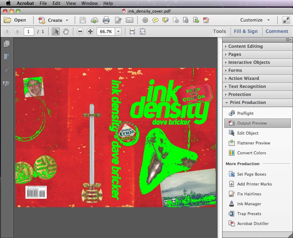
Select the desired maximum ink density and check “total area coverage.” (If your cover just happens to be bright green, choose a contrasting color by clicking on the green square. Otherwise, the highlighted problems will be the same color as your artwork.)
The green areas (Figure 7) show the parts of the image that exceed an ink density of 240%. The black title text isn’t a huge worry as it’s supposed to be black anyway, but we’ll lose lots of detail in the shark tooth, the bottle cap, and the photos if we don’t adjust the image.
In Photoshop, we can adjust the elements on various layers individually. For example, the red background isn’t a problem; leave it alone and focus on the trouble spots. For this article, to keep things brief, I’m treating the design as a single flat image without layers. All my adjustments are made globally.
To use a real world example, the cover design for Mort Laitner’s, A Hebraic Obsession provided a number of ink density challenges. The background image is a black and white halftone with large dots superimposed on a red background. The postage stamps and the ink stamps on top of them each presented various ink density problems. By adjusting those layers independently, I was able to get the background photo to print without blotting out the red background. The layers were each adjusted without affecting the colors of the others (Figure 8).
Figure 8. A Hebraic Obsession
Using the “Info” palette and the eydropper tool, roll over the dark spots to check the ink density and the amount of CMYK ink on a pixel-by-pixel basis. Before starting, access the Info panel within Photoshop’s “Window” menu. Use the submenu in the upper right of the Info panel to open up “Info Panel Options.” Select “Total Ink” and “CMYK Color” to display the ink density information.
Figure 9. Setting display options for the info panel to show ink density
In figures 10 and 11, the ink density of the pixel in the crosshairs is reflected in the info palette (both circled in green). CMYK values are also displayed. The ink density exceeds the desired 240 spec.
Figure 10. Ink density sample
Figure 11. Ink density sample
Having defined the problem areas, the next step is to fix them. Select a layer containing a problem element (or, as in the case of this example, the entire graphic) and access the “Selective Color” controls from Photoshop’s “Image” menu.
Figure 12. Photoshop’s Selective Color Dialogue Box
Once inside the Selective Color Dialogue, select “Blacks” from the dropdown list as we’re going to adjust the darkest areas of the image.
Figure 13. Photoshop’s Selective Color Controls
Experiment with rolling off different amounts of cyan, magenta, yellow, and black. For this particular image, I was able to roll off a lot of yellow ink without having much effect on the image preview. I removed a total of 83 percentage points from the maximum ink density without radically altering the color of the image. I didn’t overdo it on removing black ink—which means I’ll still have crisp details. Though the shadows are a tiny bit “washy” in the preview image, the dark spots land pretty close to 240; we can assume they’ll print darker than they look on screen because they’re at the maximum density supported by the press. Figures 14 and 15 show the same spots sampled earlier after making the adjustments shown in Figure 12. (Don’t copy my adjustment values. Every image is different. The values I used are not a “formula.”)
While using the Selective Color tool, the “Info” palette will display both the original and the adjusted color values.
Figure 14. Adjusted Ink Density
Figure 15. Adjusted Ink Density
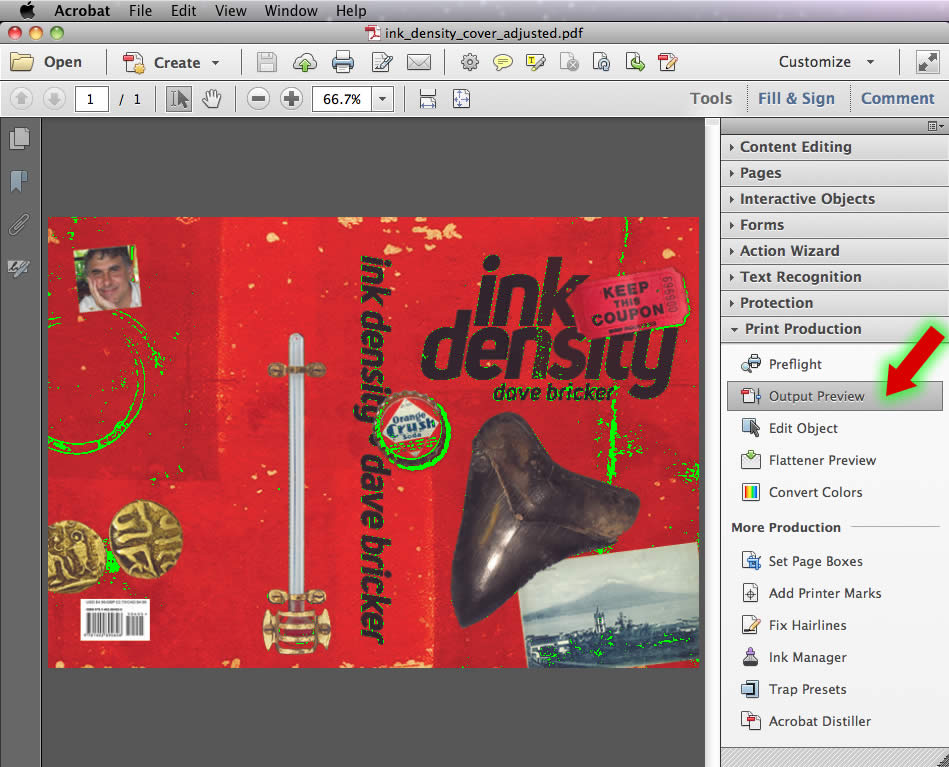
As an added bonus, our black title text now falls right in line with the 240% target (Figure 16). The subtleties of the ink texture used to fill the letters will survive the printing process.
Figure 16. Adjusted Ink Density
After converting to PDF, Acrobat’s “Output Preview” tool confirms that the ink density is within the target range of 240% (Figure 16).
A few things to be aware of:
Book cover design is a mix of informed aesthetic decision making and technical knowledge. Creating a design is only the first step in producing a final, printed book cover. Whether designing your own cover or working with a professional, make sure you get detailed specifications from the printer—and make sure you understand them.
This website uses cookies.