


 This third installment of Judging a Book by its Cover looks at great book cover designs that won the 2012 Design Observer 50 Books-50 Covers award. Part 1 explored how most book design rarely rises above “competent.” Part 2 looked at the state of self-published book covers. But rather than criticize blindly—it’s too easy to proclaim that a design fails or succeeds—both articles explain what works and what doesn’t work about a variety of covers.
After exploring a field of generally mediocre-to-poor examples, I want to try to answer the most difficult question of all: what does work in design? No magic formulas exist. Many designs succeed simply by avoiding some of the weak practices described in the earlier articles. Other designs succeed for many reasons—and ironically, those reasons—and even the perceived success of the work—may not be obvious at first glance.
Take for example, one of my absolute favorite pieces of design ever, an album cover designed by Reid Miles for Blue Note records in 1965.
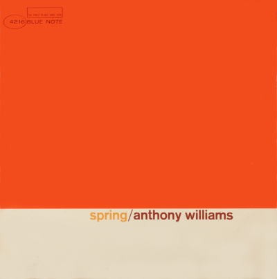
What’s so great about it? The design has only three elements: the artist’s name, the name of the album, and a big orange square. That may not seem like much but Spring is usually associated with the color green. The simple juxtaposition of word and color suggests that Anthony Williams’ take on “Spring” might be a bit more lively and different than than the name would otherwise suggest. That certainly makes me want to listen to it—and isn’t that the goal of a good cover?
What we’ll see in many of these designs are some of the same elements that make great literature: storytelling, symbolism, metaphor, conflict. These covers are more than signs or package labels or mundane identifiers. They set a tone that makes readers want to open the book.
As far as the technical aspects of graphic design—layout, typography, color, etc.—most of these designs are simple. They succeed mostly by not taking shortcuts to nowhere and by not making amateurish design blunders.
Do these covers accurately describe the books they represent? I offer my impressions and then follow up with excerpts from bookstore book descriptions. Do the descriptions fit your expectations after looking at the artwork?
Finally, does a great piece of art necessarily make a great book cover? How relevant should the cover art be to the story, spirit, or tone of the book? I suspect the answers to those questions vary from book to book and audience to audience, but they’re certainly worth thinking about.
Book Cover Design: Art Without Artists
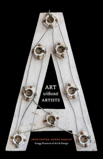
I love the subtle humor of this cover. The big A for “art” is a letter from an old sign—with all of the lightbulbs removed. “A” without lightbulbs stands for Art without Inspiration—a simple but effective metaphor if you’re willing to think about it for a few seconds. And isn’t this what so many designers are afraid of? What if they don’t get it? So often, we end up with safe, boring design that nobody has to think about. But if you ponder this cover design for a moment, it’ll make you smile. It’s clever and subtle and funny and warm.
The typography is simple and unpretentious, and it offers a great example of how centered text can be made to work in the right context.
The designer also took the time to composite the letter onto a pure black background and fit it harmoniously into the space.
Book Cover Design: At Last
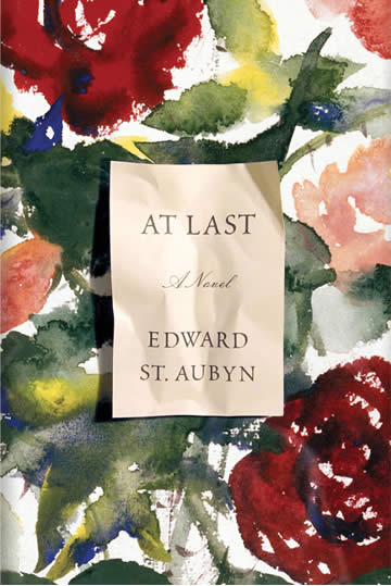
The cover of At Last is subtle and unpretentious. The text doesn’t shout. The design doesn’t try to sell us anything. We have a printed card sitting on top of a piece of watercolor art. And the designer probably printed the card, crumpled it up, laid it on top of the artwork and photographed it. How many designers would have composed this digitally—and never achieved as believable a result?
I like the simplicity and the sincerity of this cover, but on the downside, I can’t tell what the book is about. This book became a national bestseller, but the publisher elected to use a more commercial cover design.
Book Cover Design: Bloodland
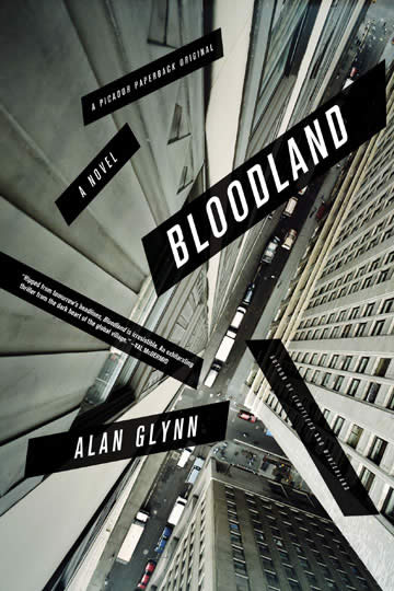
I love the dramatic, chaotic feel of this cover. The angles of the buildings draw the eye to a point approximately one-third of the way up the page. Photographers often use the “rule of thirds” to place subjects in pleasing places and proportions within a composition; pure symmetry is comparatively boring. The rest of the information—the title, author, etc. is placed in “free-fall” above the street far below. Here’s a wonderful example of the title being integrated into, rather than placed on top of the design.
From Amazon.com: Set against a vividly drawn world of corporate and political intrigue, Alan Glynn’s Bloodland is a riveting paranoid thriller of uncommon depth and page-turning suspense.
Book Cover Design: A Death in Summer

Here’s another example of a cover design that uses a real photograph instead of a digital substitute. The paper is torn in a way that would be very difficult to simulate; look at the shadows. The title text and author are set in a simple, harsh, sans-serif—in black on a white background. And look at the rest of the text. It’s all there and easy to read but it doesn’t detract from the composition. The text is centered but it complements the curve of the woman’s throat. The publisher’s name—PICADOR— is rotated and positioned to imply margins at the top of the page.
Mostly, this works because it’s visceral and violent—and we assume the book is, too. This is potent visual storytelling.
From Amazon.com: One of Dublin’s most powerful men meets a violent end—and an acknowledged master of crime fiction delivers his most gripping novel yet.
Book Cover Design: After Freud Left

Here we see “Freud’s glasses” leaving the page. What could be simpler? The text is all left-aligned, unpretentious and small. The background is a warm paper color instead of a stark white. We can assume the content of this book is serious given the subtitle, but the title itself has a playful aspect to it. The book could have been called Post-Freudian Psychoanalysis in America, but I get the impression it’s targeted to more than just the analyst community. And if you have any doubt as to what the book is about, the red subtitle clarifies that perfectly.
From Amazon.com: The essays in After Freud Left provide readers with insights and perspectives to help them understand the uniqueness of Americans’ psychoanalytic thinking, as well as the forms in which the legacy of Freud remains active in the United States in the twenty-first century. After Freud Left will be essential reading for anyone interested in twentieth-century American history, general intellectual and cultural history, and psychology and psychiatry.
Book Cover Design: Girl Land
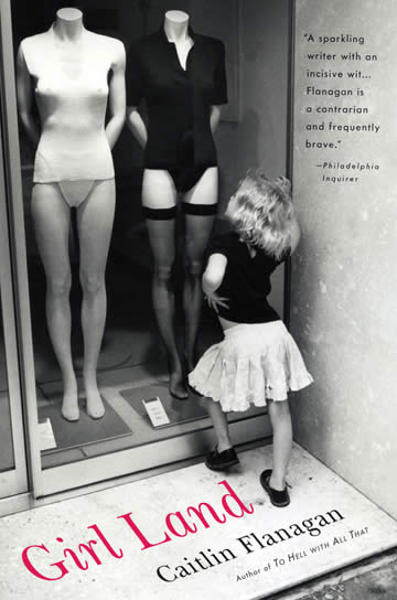 Girl Land is fantastic. Notice how the type is placed on the window sill adjacent to where the little girl is standing. The pink letters stand out from the black-and-white photograph. And the photo has a subtle sepia tint to it instead of pure, stark, gray tones. Take a guess at what the book’s about.
And why is the book endorsement not composited onto the wall next to the girl? Because it’s an outside voice—an addition to the design rather than a part of it. It’s exclusion from being part of the image helps to create a useful hierarchy for the information on the page. Designers make conscious decisions about small matters like this, and they make a difference.
From Amazon.com: In a world where privacy and personal freedom are encroached upon daily, Flanagan examines and redefines the ultimate challenge that we face in protecting, nurturing, and defending our girls.
This cover tells that story perfectly with a single image; that’s great design.
Book Cover Design:Kapow
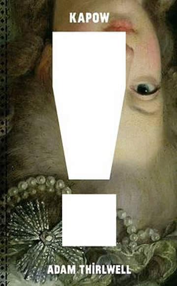 Kapow features a gigantic exclamation mark on top of an inverted renaissance painting. The cover art is striking, I don’t know what this means but I’m curious. The text at the top and bottom is sufficient to imply the margins.
From Amazon.com: Unfolding, turning and spinning, Kapow! … takes place in the thick of the Arab Spring, guided by the highspeed monologue of an unnamed narrator – over-doped, over-caffeinated, over-weight – trying to make sense of this history in real time: with 24-hour broadcasts, YouTube films, lesbian bars in London’s East End and far too many newspaper clippings. A clever, funny and bitingly critical cultural commentary, using spinning digressions to tell the stories of a group of interconnected characters in London and Egypt, each transformed by the idea of revolution.
Beautifully and thoughtfully designed by Studio Frith, hailed by the New York Times as the “go-to graphic designer”, Kapow! asks readers to open and unfold pages, to follow text leaking in and out of paragraphs, to discover more and more visual surprises, while progressively becoming part of and lost within the narrator’s giddy digressions.
Book Cover Design: Kino
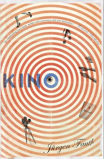 Kino is reminiscent of the work of Saul Bass and Herbert Matter. The concentric rings are distressed and the fold marks suggest a 1940s-50s poster. Black and white additions are both superimposed upon and masked by the rings. The eye at the center is off-center—which adds a bit of playful visual tension.
From Amazon.com: When the long lost, first-ever silent film from visionary director Kino arrives mysteriously on his granddaughter Mina’s doorstep, the mission to discover the man she barely knew begins. As Kino’s journals plunge the reader into the depraved glamour and infectious panic of 1920s and ’30s Germany, Mina turns her life upside down to redeem her grandfather’s legend.
The design style suggests the time period (more or less) and at least one of the elements (the camera) communicates elements of the plot.
Book Cover Design: The Sardinians
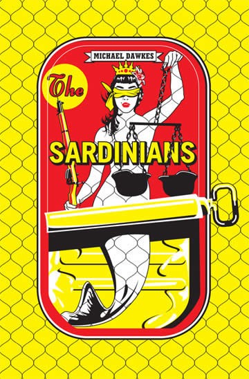 The Sardinians offers a Michael Doret-style illustration based on a Sardine can. I’m not sure what to make of this one but I love the artwork—and I don’t usually love digital artwork. This is what happens when a real illustrator uses Adobe Illustrator software. Inexperienced designers create soulless vector art with the same tool.
The image features a blindfolded mermaid with a rifle and scales that appear to made from German war helmets. Hmmm.
From Amazon.com: The Sardinians looks at the truth behind the phrase coined by the metaphysical poet, John Donne, ‘No man is an island…’ Michael Dawkes … thinks that Donne was wrong. … Ostensibly, the issue is capital punishment. A journalist is drawn into the world of a criminal family in Sardinia, to whom [the narrator] is linked through his own father.
This cover works well as art. But it’s difficult to tell how much the location—Sardinia (an island in the Mediterranean)—matters to the story. The sardine can provides an engaging visual pun but… My verdict: great cover art but not necessarily relevant cover design. The book description isn’t helping me decide. Would I pick this up in a bookstore for a second look? Probably, and that’s good, but I probably wouldn’t buy it; nothing in the promotional copy is helping me to connect the experience of the cover with the experience of the book.
Book Cover Design: Narrative of the Sufferings of Lewis Clarke
 One of my favorites, this cover uses an old typeface and even a wordy title to suggest an 1870s timeframe. The design is a composite of an old photograph with what looks like the cover page of an old book, a very modern treatment of some very old design styles. Given that the subject is captivity, the horizontal bars have symbolic value as well.
From Amazon.com: Lewis George Clarke published the story of his life as a slave in 1845, after he had escaped from Kentucky and become a well-regarded abolitionist lecturer throughout the North. His book was the first work by a slave to be acquired by the Library of Congress and copyrighted.
Book Cover Design: The Teleportation Accident
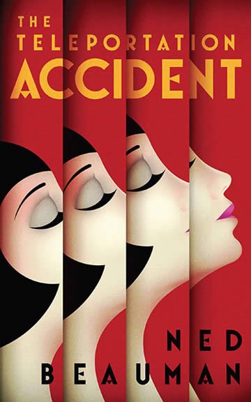 Looking like a 1920s poster printed on venetian blinds, this cover suggest teleportation about as well as one could expect a static, printed piece to do. We see clean typography and good use of implied margins.
From Amazon.com: When you haven’t had sex in a long time, it feels like the worst thing that could ever happen. If you’re living in Germany in the 1930s, it probably isn’t. But that’s no consolation to Egon Loeser, whose carnal misfortunes will push him from the experimental theaters of Berlin to the absinthe bars of Paris to the physics laboratories of Los Angeles. … From Ned Beauman … comes a historical novel that doesn’t know what year it is; a noir novel that turns all the lights on; a romance novel that arrives drunk to dinner; a science fiction novel that can’t remember what isotope means; a stunningly inventive, exceptionally funny, dangerously unsteady and (largely) coherent novel about sex, violence, space, time, and how the best way to deal with history is to ignore it.
Okay, I’m ordering this one. The cover took me to the description and the description took me home to bed.
Book Cover Design: True Believers
 A peace sign juxtaposed against crossed fingers—good luck with those good intentions. Simple colors. Clean margins with the type weighted evenly at the top and bottom. I’d say 1960s or 70s.
From Amazon.com: In True Believers, Kurt Andersen … delivers his most powerful and moving novel yet. Dazzling in its wit and effervescent insight, this kaleidoscopic tour de force of cultural observation and seductive storytelling alternates between the present and the 1960s—and indelibly captures the enduring impact of that time on the ways we live now.
Book Cover Design: Changing Roles and Times
Remember the days before the Internet when a trip to the record store to buy 12-inch, vinyl records was like a trip to an art gallery? A table full of intriguing book covers provides a similar experience but with bookstores in decline, the chain that leads from visual interest in the art to intellectual interest in the content is weaker than it once was. If your self-published book won’t ever be sold in a bookstore, why should you bother with the expense and the creative challenges associated with wrapping your book in an excellent cover?
The answer is simple. People do judge a book by its cover; they judge whether it’s clever, creative, well-crafted, funny, serious, provocative, daring, or useful—or not. Even if your book cover shows up as nothing more than digital art in an eBookstore, a provocative cover is still the best way to show readers that you care about quality. Also, books are a form of fashion. Nobody wants to be seen in public reading a book that looks amateurish. The book cover you have in your airplane seat pocket reveals your tastes, choices, and standards.
Too many self-published books are wrapped in failed covers; readers automatically assume the writing will fail, too. And the majority of trade-published books don’t surpass “good enough.” They tend to be competently crafted but often borrow aesthetic clichés from movie posters and other popular media. As we saw in Part 1 of this article, big publishers often use cover designs that have mass-market appeal (though we’ve seen notable exceptions on this page, too). This leaves small publishers with a unique opportunity to present their work as outstanding, remarkable, creative, and worthy of readers’ attention.
In this three-part article, we’ve seen the good, the bad, and the ugly of book cover design. After going through the tremendous effort to write and publish a book, which category does your book deserve?