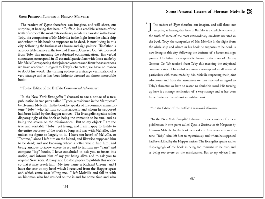
 The word processor has placed new burdens on writers to understand how to use italics, big and small capitals, dashes, hyphens, initials, etc. Writers who do their own typesetting often produce mediocre results. Likewise, trade publishers sacrifice typographic aesthetics when they pack tiny type into small margins to save money on massive print runs.
With type being butchered by big and small publishers alike, how do we establish criteria for professional standards in book typography? Though economic costs and benefits are easy to assess, writers and publishers should be able to evaluate aesthetic compromises based on a set of typographic best practices.
Much of what constitutes “quality” is, by nature, unquantifiable—especially with regard to evaluating creative work, but certain aspects of writing, for example, can be evaluated “programmatically” to useful effect. Based on my experiences with professionally edited, trade-published books, a standard for professional publishing might suggest that one small error per twenty-five thousand words would be “within allowable limits.” To continue with the writing analogy, we could potentially divide errors into “spelling,” “grammar,” and “style” categories and then develop a “checklist” of potential problems to evaluate the work against. William Zinnser does this quite well in On Writing Well. Autocrit.com offers useful style analysis based on the same premise.
If writing can be evaluated this way, why not design? With this in mind, I’m proposing standards for typographic excellence in book design. I’m specifically avoiding any recommendation that boxes typographers in. Any typesetting program, any typeface, any font technology, any layout, etc. is acceptable, but those choices should be purposeful and produce a result that’s both aesthetically pleasing and complementary to the text being presented. Of course, a clever designer may “break every rule in the book” and still produce an inspiring result. The term, “best practices” describes the intention perfectly.
This list below is in no particular order and is by no means comprehensive. I’m wide open to amending it based on the suggestions of experienced typographers.
1. No double spaces after periods – Really. This convention was supposedly based on mechanical typewriters that advanced one gear tooth whether you typed an “i” or a “w.” Digital typefaces are proportional; the correct spacing before and after a given typeface is programmed in. Double spaces create “rivers” in the type. Don’t believe me? Check any contemporary style manual. Chicago, APA, MLA, etc. all specify single spaces.
Style manuals notwithstanding, the single space’s connection to the typewriter is apocryphal. Double spaces were standard as early as the 1700s. We tend to believe what we’re taught by “informed” sources; the potential for myth development—especially when we’re presented with plausible explanations—is huge. Language evolves. We no longer write “congress” as “congrefs,” and the Germans have likewise moved away from the “ß” character to “ss.” As aesthetes, we all pick and choose between the old rules and the new. For example, as a writer of sea books, I prefer to say a vessel is “under weigh” instead of “under way.” The original usage is out of date, but more meaningful; vessels would move after “weighing anchor.” Perhaps sentence spacing is an evolving standard? Contemporary eyes see the double space as offensive while Ben Franklin (who was a printer among other things) might have derided it as “amateur.”

2. Paragraph Indents – Even though some academic standards continue to specify half-inch indents, they are a typographical abomination based on the half-inch default tab settings of mechanical typewriters. A proper paragraph indent is one em, traditionally the width of a letter “m” in a given typeface. In the digital world, an em is considered to be equivalent to the point size of the text. In other words, for a 12-point typeface, use a 12-point indent. (Divide by 72 to get inches: a 12-point indent is 12/72 or 1/6-inch.) This needn’t be exact, but the “missing tooth” effect of big paragraph indentations should be dealt with. Traditionally, the introductory paragraphs of chapters and sections are not indented, though that’s a stylistic option.
That said, any standard should probably be concerned more about not adhering to the half-inch default than about whether a particular typographer chose to apply the one-em “rule.”
3. Dashes and hyphens – dashes and hyphens are not the same things. Because the role of the typesetter is generally not to edit the copy (though we do point out mistakes we find), writers must learn how to use them as well as editors and typographers. Double hyphens, for example, were once “manuscript code” for an emdash. Writers who don’t know how to access emdashes should probably stick to that convention, but it shouldn’t survive the typesetting process. A detailed discussion of dashes and hyphens can be found here.
4. Typeface selection – A useful set of standards should not specify or exclude particular typefaces; typographic designers should be free to explore the full spectrum of available letterforms. However, typeface selection should be tailored by the designer to the writer’s application. Here are some suggested criteria for evaluating type choices for book block design. Note that proper implementation of some of the remaining best-practices suggested below is dependent on selecting typefaces suitable for book design.
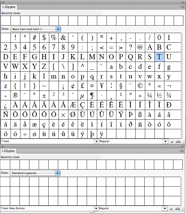
- Reasonable selection of ligatures and alternative glyphs – Here are the Basic Latin glyphs included with Times Roman. Notice that no ligatures (discussed later) are available. Though often presented as a “standard” typeface, Times is unsuitable for book design.
By contrast, here are the Basic Latin glyphs and ligatures included with Adobe Garamond Pro. Adobe Garamond includes small caps, ligatures, oldstyle figures, lining figures—everything necessary to typeset a book. The tiny arrows next to each glyph reveal optional alternates.
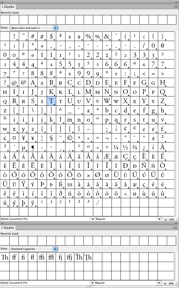 Though some of these glyphs are rarely used, good typeface selection empowers designers to address most any situation. If the type isn’t carefully chosen up-front, its limitations may not reveal themselves until a project is well under way. Switching typefaces halfway through a project requires starting again from the beginning. Even if a limited typeface can be “made to work,” the omission of oldstyle figures and a correctly proportioned set of small capitals (discussed below) will produce work that falls short of typographic excellence.
 - Avoid Cliché Typefaces – obviously, this is a highly subjective topic, but well-known clichés like Comic Sans and Papyrus should be avoided unless the designer wishes to make a conscious statement by using them.
- You Can’t Beat the Classics – With thousands of typefaces to choose from, designers are free to roam, but classics like Garamond, Caslon, Goudy, etc. will always produce a manuscript that’s comfortable to read. The farther you stray from these “typographical archetypes,” the “artier” a book potentially becomes. At a certain point, the typography begins to overshadow the text and the goal of “crystal goblet typography” is sacrificed. Good book typography may stray far away from convention but it does so successfully.
- Display and Script Faces — are not suitable for body copy. The look of the hand-calligraphed page is elegant—until someone has to read it. Body text is not a decorative element; its impact is in its subtlety. Good typeface selection imparts an almost invisible overtone to the text—a hint of seriousness or a whiff of lyrical storytelling—while making the reading experience easy and pleasant. Your typography is the vehicle for the author’s inspired words; stay out of the writer’s spotlight.
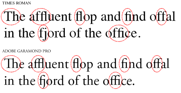
5. Ligatures – are letterforms that combine one or more standard glyphs. They’re substituted automatically in most typefaces—as long as the typeface includes ligatures for substitution—in cases where standard glyphs would otherwise clash. For example, the ball at the end of a lowercase “f” can clash with the dot on a following “i.” Proper typeface selection will eliminate the majority of concerns about ligature substitution. Here are examples (apparently, Times does have a small selection of basic ligatures, even if they don’t show up in Indesign’s ligature palette.):
6. Figures – are discussed in detail here. Figures (numbers) come in different flavors. Figures can be set with either tabular or proportional spacing depending on whether they’re used in an annual report or within body copy. Figures are available in oldstyle and lining sets—loosely the equivalent of upper and lowercase. Professional typographers understand how to use them, but this is an area most writers won’t understand. Typographers should be prepared to go through the text to ensure correct usage of figures.
7. Layout – A layout has a practical purpose; it arranges and organizes blocks of ideas on the page/spread to imply hierarchy and direct flow. Aesthetically, the layout provides a visual “frame” for the information on the page; it manages the relationship between figure (the text) and ground (the paper). Designers may debate whether or not a layout is successful, but perhaps we can judge a layout by how little it’s compromised by factors unrelated to design? For example:
- Is the text large enough for comfortable reading or has it been knocked down a point size or two to save ink and paper and money? Audience is an important consideration here; children and elderly readers prefer larger type.
- Is the leading (line spacing) open enough for the type to “breathe” or has the text been smashed together by the spreadsheet people?
- Are the margins proportioned to frame the page appropriately or have they been reduced to pack more text on the page? Especially in cases where sidebars and callouts are used, margins should be wide enough to avoid clutter.
- Is the reading width of the body text appropriate? Long lines of text are difficult to read. Typographic convention prefers no more than 70 characters on a line and usually no less than 40. Is the line length appropriate to the content and to the page (or to the screen of the reading device)?
Book layout is discussed in detail here. For general text-based books, consider starting with a tried-and-true golden-section based layout. As with typeface selection, it’s hard to beat the classics, but intelligent innovation should never be discouraged.
8. Big and small capitals – are discussed at length here. Correct use of capital letters, especially for the handling of acronyms, is part of the professional typographer’s domain. The use of capitals or small capitals for the first phrase or line of a chapter is an old (but optional) typographic tradition.
9. Initial Capitals – (discussed at length here) are commonly misused. Some ornamental capitals are ensconced in square boxes; these are easy to drop into the text with your typesetting program’s automatic initial caps feature, but fitting standard letterforms into body copy is a job that requires the typographer to pay close attention to how each individual line of copy interacts with the adjacent initial. Initial Capitals should not introduce gaps into words; neither should they remove spaces between them.
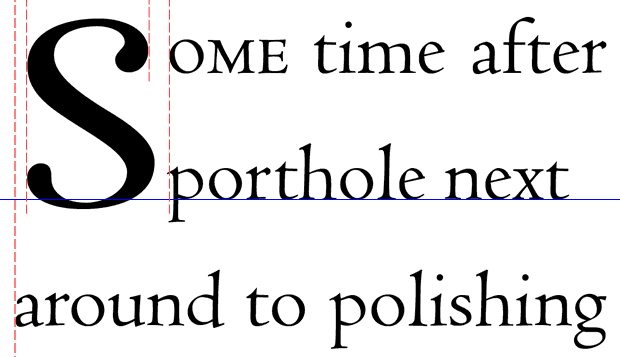
Automatic Initial Capital
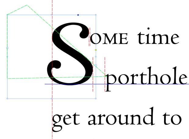
Hand-set Initial Cap Detail
10. Orphans – occur when paragraphs begin on the last line of a page and the rest of the paragraph continues on the following page.
11. Widows – occur when paragraphs end on the first line of a page and the rest of the paragraph is on the preceding page. Widows visually interrupt the flow of the text and are avoided by professional typographers. The solutions to widows are essentially the same as those applied to orphans, runts, and unbalanced spreads (described below): careful adjustment of the text.
12. Runts – are short words at the end of a multiline paragraph, or the short, final section of a hyphenated word which ends a paragraph. The definition of “short” is subjective, but ideally, the last line of a paragraph includes at least two words (unless the last word is sufficiently long to take up a visually “acceptable” portion of the line). Though not technically runts, single-letter words at the end of a line within a paragraph are a pet peeve of mine, especially if they begin a sentence. I usually insert a soft-return to keep these stray characters adjacent to the sentences they contain. On the web, insert a non-breaking space— —between the last two words of a paragraph to produce the same effect.
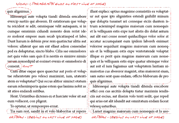
13. Facing Pages (except where a chapter ends and another begins) should be balanced. Typically, this means equal numbers of lines on both sides of a page, but more importantly, the designer should treat facing pages as spreads—as a single visual composition. This requirement makes widow and orphan control especially difficult.
Solutions to Widows, Orphans, Runts, and Off-balance Spreads
- To remove widows and orphans, adjust facing pages of previous spreads to be (no more than) a line longer or shorter than the bottom margin. This shuffles the text up or down two lines (because the adjustment has to be made on each facing page of a spread). If chapters begin on a recto (right-hand) page, adjusting the chapter start page’s lower margin will shuffle the text up or down a single line. Sometimes this works; other times, it creates more problems than it solves.
- To remove runts, put a soft return (shift-return) in front of the second-to-last word in a paragraph. This puts two words on the last line and causes the layout software to reposition the other words of the paragraph. The longer the paragraph, the more “wiggle room” the software has to create elegantly spaced type. Using this technique on one-line-plus-one-word paragraphs may fix the orphan at the expense of introducing “pigeonholes” (wide spaces) between the words in the first line.
- Adjust the spacing between words of the paragraph up or down slightly (in Adobe Indesign this is done with “command/control | shift | +” and “command/control | shift | \”). Often, reducing the spacing a tiny bit will pull runts up into the paragraph. This technique will shorten the paragraph by a line—which either helps with spread balancing or hurts it.
- Adjust the kerning/letter-spacing – as with spacing adjustments, use this technique with caution. You’re better off with an orphan than you are with text that’s crammed together to accommodate an extra word.
- Adjust the proportional width of the type – but do so only as a last resort and don’t adjust to more than +/- 5%. Diddling with the design of the typeface itself is considered heresy in some circles. Use this technique subtly, in concert with other measures, and only as a last resort.
- If you see a possibility for an editorial change that won’t affect the flow of the narrative but will solve frustrating typographical problems, ask the author. Sometimes, eliminating the word “that” will solve a world of problems if you have access to an accommodating writer.
Ideal book layout discourages widows, runts, orphans, and off-balance spreads but eliminating them altogether is difficult, tedious, time-consuming and frustrating work. With respect to how labor effects pricing, widow, runt, and orphan control, and spread balancing are perhaps the most difficult aspects of typography for clients to understand, especially when some “designers” will dump the text into a template for nearly nothing.
Definitions for terms like “widow” and “orphan” vary tremendously, and though the concept is important, the use of “runt” is not in common use. Moreover, these terms are relatively new. See this interesting post by typographer Dick Margulis for insights into the origins of these terms.
14. Proper nouns – especially proper names, should not be split across two lines. These problems won’t show up until after the editor has finished with the manuscript so they’re the typesetter’s responsibility. First names and last names go on the same line.
15. Consistency – stylistic choices should be consistent from cover to cover.
16. Quotation marks – Prime and double prime marks are used for minutes and seconds or for feet and inches. Single and double quotation marks are for text. Use each for its proper purpose.
17. Real Italics and Bolds – Some software will create “fake” italics by skewing Roman type. Bold text is simulated by superimposing two copies of a letter placed slightly out of horizontal alignment. Professional typefaces include specially designed bolds, italics, bold italics, and other type variants. Depending on your software, selecting Garamond and then clicking the “italic” button may produce a different result then selecting “Garamond Italic.” Professional typographers rely on authentic type variants.
18. No ladders – A “ladder” is a series of four or more lines that all end with a hyphen. (Thanks again to Dick Margulis for this one).
19. Use either indents or double line breaks – to transition from one paragraph of text to another—not both.
Conclusion: Great faith is placed in typesetters’ abilities by people who often understand very little about what that job entails. Like quality writing, professional typography is crafted line-by-line, paragraph-by-paragraph, page-by-page, and chapter-by-chapter; there are no shortcuts. A list of typographic best practices will enhance general understanding of what typesetters contribute to a book, and offer a set of guidelines against which excellent book typography can be assessed. Designers learning the art of typography will likewise benefit. Comments are welcome and encouraged.


