


![]() This article explains the tab ruler found on every word processor and typesetting application. Understanding the simple and elegant split ruler and tab functions opens up a world of formatting opportunities.
This article explains the tab ruler found on every word processor and typesetting application. Understanding the simple and elegant split ruler and tab functions opens up a world of formatting opportunities.
Digital typesetting and word processing inherited a number of outdated conventions from the typewriter. When producing a paragraph indent on a typewriter, it makes no difference whether you hit the tab key or type a few consecutive spaces, but on a word processor, those approaches create problems as your manuscript moves from editing to final page layout. Though the “two spaces after a period” convention was not descended from the typewriter as is popularly thought, consecutive spaces are generally considered bad practice in the digital world. And though a half-inch paragraph indent (along with double line spacing) is perfectly suitable for manuscript work, the typesetter’s convention has long been to use an indent of one em (the width of a letter “m” in the analog world. In the digital world, the convention is to use the point size of the typeface, so if you’re setting 12-point type, your indent would be 12/72-inches or 1/6-inch). And yet, the old habit of repeatedly hammering the space bar to position elements on the page persists—even to a point where centered elements are sometimes left-aligned text preceded by dozens of spaces.
The difference? In the old days, your typed manuscript was whited out, penciled in, annotated, and finally sent off to be retyped into a linotype machine or similar typesetting device. Flaws in the original document, line spacing, typefaces—none of these typewritten attributes survived the layout process. But in the electronic realm, your word processor document is imported directly into a typesetting application. Sometimes, when budgets are tight, the word processor is the typesetting engine. Formatting choices are not written in red ink in the margins; they’re embedded in the document. The first thing a professional typesetter does with your manuscript is convert all instances of “space-space” to single spaces, over and over until there are no double-spaces left in your document. All that formatting work you did with the space bar to make your manuscript look pretty is wasted effort that slows down the typesetting process. There are many things you can do to make your manuscript flow more easily into the typesetting process; mastering the tab ruler is at the top of the list.
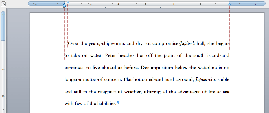
Fig. 1 The Split Ruler
Above your text lives the tab ruler (fig. 1). It changes to reflect the attributes of any block of text you highlight, so you can apply various styles to different parts of your document. The left side of the ruler usually contains some variation on a “split triangle” theme. The top half controls the first line of the paragraph; the bottom half controls the rest of the paragraph. The positions of the left and right triangles control your overall paragraph margins. Instead of using spaces for paragraph indents, set your left margin with the bottom half of the left triangle and then adjust your first line indent with the top half. Save this as a “body text” or other relevant style so you can apply it anywhere with a single click.
Need a quotation with inset margins? Drag the left and right guides in a half-inch on either side. Save the style as “Quotation” text.
When combined with a custom tab, the split ruler allows you to easily format text that would be a nightmare to manage with a typewriter. Consider this excerpt from a Chekhov play (fig 2).
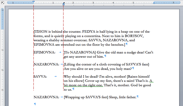
Fig. 2 – Play by Anton Chekhov
Look carefully at the bottom half of the left margin guide. The tiny arrow coming up from the triangle and angling to the right into the ruler is a left tab. The names of the characters speaking the dialogue are aligned to the top half of the guide. By setting a custom tab above the lower half of the guide, a click of the tab key after the character’s name pushes the first line of dialogue into alignment with the rest of the speech. The blue arrows in the text show the tab characters, and notice how this tab configuration is not applied to the first paragraph as it isn’t part of the dialogue.
Tabs come in a few useful flavors. Choose the desired one from the “secret” menu to the left of the tab ruler. The text will align to the tab in the corresponding manner (Figs. 3,4, 5).
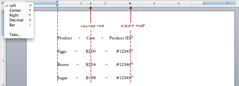
Fig. 3 Tab Alignment and the Tab Menu
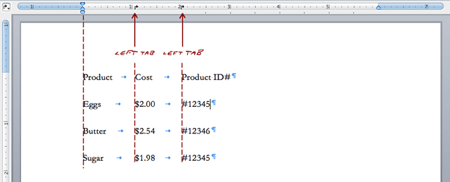
Fig. 4 – Tabs – Left aligned
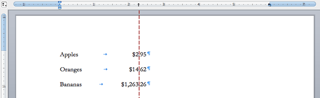
Fig. 5 – The Decimal Tab is useful for aligning prices
Consider the case of creating a table of contents. Your 8 1/2 x 11-inch manuscript will change dramatically when you convert it to a 6 x 9-inch book. If you type long rows of periods between your chapter titles and page numbers, you’ll get a pretty page—that turns into a disaster as soon as page size, font, type size, or any other attributes invariably change during the typesetting process. Instead, set a tab between your titles and page numbers (fig. 6). (And while we’re on this topic, don’t forget that page numbers will also shift when you convert your manuscript into a book. The table of contents you painstakingly created in your manuscript may be of some small use to your editor, but your typesetter will delete it and create a new one.)
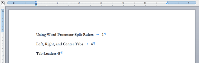
Fig. 6 – Setting Up Tabs for Table of Contents
Custom tabs are easily created by clicking on the ruler. Drag the newly created tab to the precise, desired location (in this case, a right tab at the right edge of the text area) or open up the tab controls to precisely control positioning.
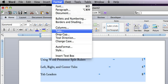
Fig. 7 – Opening the Tabs Dialogue in Word
In the Tabs dialogue, choose a “right” tab (the tab will stay to the right of the tabbed text), set the tab stop position to the far right edge of your page (where you want your table of contents page numbers to be) and then choose the dotted tab leader.
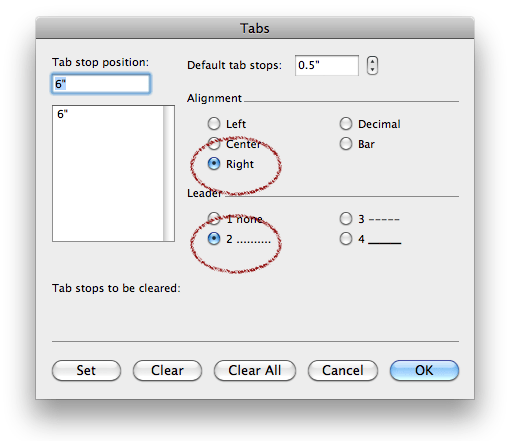
Fig. 8 – The Tabs Dialogue in Word • Setting Tab Stops and Tab Leaders
Voila! The table of contents is elegantly aligned (fig. 9)—and if imported into a typesetting application, the tabbed formatting is easy to manipulate.
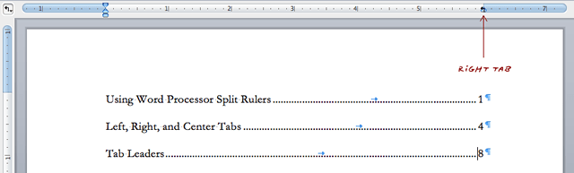
Fig. 9 – Final Table of Contents
The split tab ruler stares many an author in the face for decades without ever being used. Given a keyboard and a screen that displays what’s been typed, many writers prefer getting on with their storytelling over engaging with technology. But the publishing world has changed; authors are more responsible than ever for typographic finesse. Fine points of typography like hyphens, dots, and dashes, and basic paragraph formatting are now part of the writer’s art. These tools for expression empower you to share your thoughts as powerfully as a strong vocabulary and a command of grammar.
The good news is there isn’t much to learn. Basic text formatting with custom tabs, indents, and margins can be mastered in minutes—and once you get it, you’ll find it works pretty much the same way in every word processor and page layout program. Why not avail yourself of this easy way to engage more deeply with the inseparable processes of writing and publishing?