Scientists Have the Climate Story Wrong
Oh, they’re right enough about climate change. If you look at the data and at changing weather patterns around the world, it’s difficult to argue otherwise. But when it comes to telling the story, scientists have it all wrong.
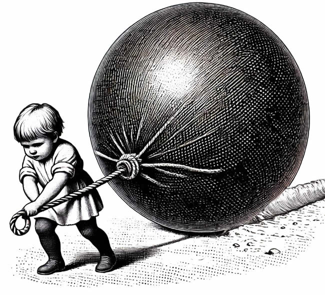
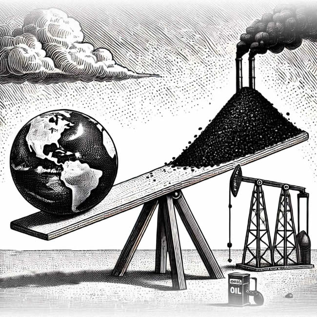
Measuring atmospheric carbon by the ton may make sense to those tasked with analyzing climate data, but CO2 is an invisible gas. Visualizing a ton of CO2 is a bit like trying to gather a ton of helium—the more you have the less it weighs!
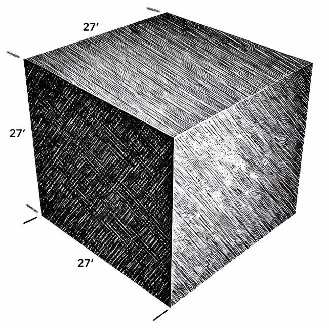
Effective storytellers use metaphors and measurements that people understand. We get a bit closer if we imagine a 27-foot cube of charcoal—that’s roughly equivalent to a ton of carbon— but it’s still difficult to visualize that floating around in the sky. CO2 is an invisible gas.
So how do we visualize atmospheric CO2 if “tons” aren’t doing the job?
Maybe it isn’t so important to count the units as it is to understand the impact of environmental CO2.
Think of earth’s atmosphere as a glass shell with holes in it. Some heat is trapped and some heat escapes into space.
If we clog the escape holes up with soot, more heat gets trapped. Temperatures increase, ice melts, sea levels rise, hurricanes and typhoons form, and we have trouble.
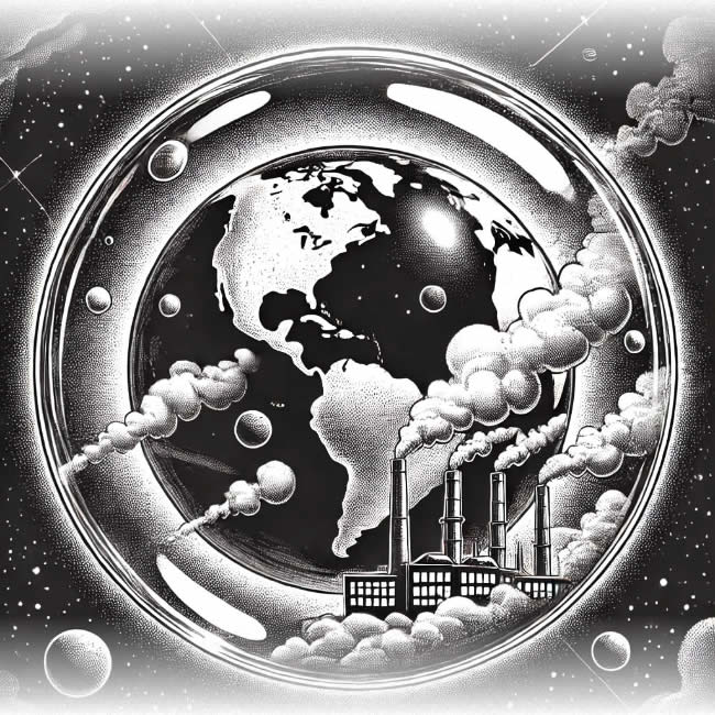
Do we need to know how many tons of carbon are in the atmosphere to understand the problem?
Unless you’re a scientist, the numbers are a distraction.
And then they give us the climate tipping points—various natural systems that will fail catastrophically once we exceed certain temperature thresholds.
And those are:
- Greenland Ice Sheet
- West Antarctic Ice Sheet
- Arctic Sea Ice Loss
- Amazon Rainforest Dieback
- Boreal Forest Shift
- Permafrost Thawing
- Atlantic Meridional Overturning Circulation (AMOC) Slowdown
- Coral Reef Die-Offs
- Indian Monsoon Shift
- Sahel Desertification

The scientists have the data right but the storytelling is as disastrous as excess CO2. Do you know what these are?
Here’s a useful explanation:
Excess heat trapped in the atmosphere by carbon emissions has the following effects:
- Melting Glaciers and sea ice raise ocean temperatures and transform white, heat-reflecting areas into dark, heat-absorbing ones. Sea temperatures rise.
- Rising sea temperatures impact seals, polar bears, and other animals that live on the receding ice. This heat also kills coral reefs which are an important part of global ocean ecosystems.
- Ocean currents like the Gulf Stream regulate temperatures in the Northern Hemisphere. Slowing of these currents caused by rising temperatures will lead to more extreme weather patterns and cooler temperatures in Europe, and disruption of marine ecosystems.
- Forests sequester enormous amounts of carbon, which is released when we cut them down. And higher temperatures lead to more fires and pest invasions.
- As permafrost thaws, it releases methane into the atmosphere. This accelerates warming and further permafrost loss.
- Critical weather systems bring seasonal rains to South Asia, supporting agriculture and water supply for millions of people.
- Desertification of central Africa and arable land degradation threatens agriculture, water supply, and the livelihoods of millions of people.
Where the problems occur and what their names are distracts people from understanding what the problems are and how they’re connected. These systems are resilient to a point, but when any one fails, they’ll fail catastrophically together.

Despite their noble intentions to save the planet, the scientists have the storytelling catastrophically wrong.
If the goal is to engage climate change skeptics and overcome their beliefs that “climate change” is a hoax, or that rising temperatures are part of a normal, cyclical, system, discussions of the Atlantic Meridional Overturning Circulation Slowdown will not inspire anyone to challenge their own beliefs.
And though it isn’t sexy, there’s one illustration—a simple graph of global CO2 levels over time—that really tells the story.
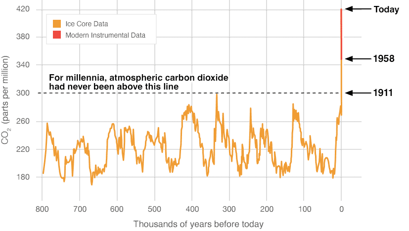
Credit:NOAA
In a well-told story, the main character is living a “normal” life—it might be good; it might be bad, but it’s “normal”—and then something happens.
Though this simple graph may look like an uninspiring data dump, it perfectly mirrors the beginning of a story—and it’s a story about US. After 800,000 years of normal, we see a catalyst event.
This graph mirrors the way our brains process stories, and that makes it interesting. And this cliffhanger inspires important questions:
- What does this mean to me, my loved ones, and my community?
- What journey will we take?
- How will we be transformed?
These are just the questions we need to be asking, because if we don’t, the people we need to reach won’t care enough to learn about climate systems, inspire and educate others, and oppose the industrialists who are making their fortunes on the future misfortunes of our children.
Data and evidence are nothing compared to the strength and tenacity of a deeply-held belief—even if that belief has nothing but misinformation or unfounded faith as its foundation. What good is data against a story—even if the story is bullshit?
Want to change someone’s mind?
Tell a better story!


