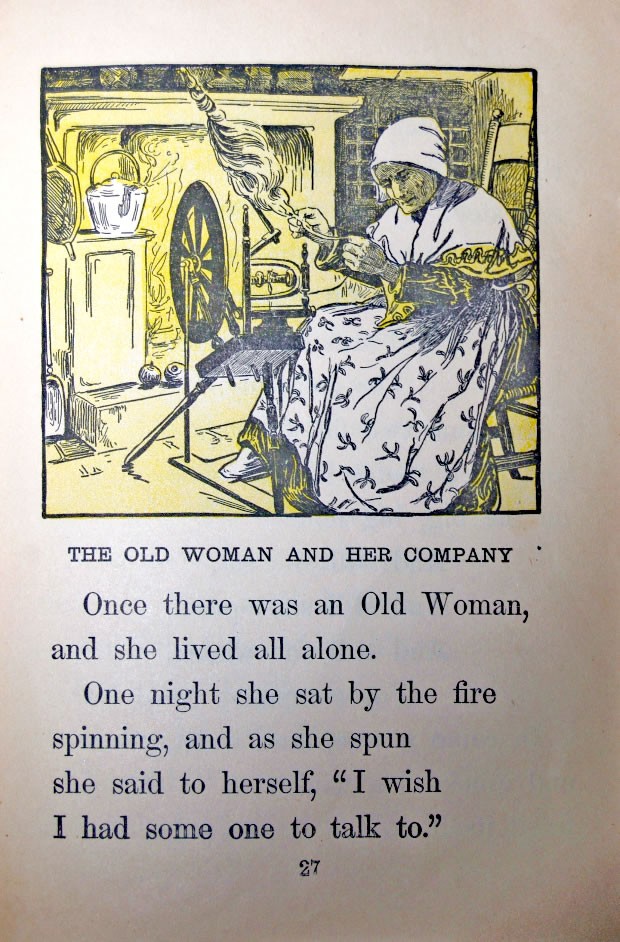
 Many readers still love to feel the subtle emboss of letters stamped on paper with metal type. I was rummaging through the garage and came across an old copy of The Progressive Road to Reading Book 2 by Georgine Burchill, William Ettinger and Edgar Dubs Shimer. Published in 1909 and reprinted in 1920, it was probably my father’s elementary school reading book. (See it on Google Books here.) It has me reflecting on what is undoubtedly the greatest achievement in publishing.
When I gave the book to my six-year old daughter, she was drawn to it immediately. It’s different from her other books. The paper is yellowed. The inked letters are not so perfect as the digitally printed ones in her paperback library. It’s filled with beautiful, engraved images printed with a color overlay. Some of the spelling conventions like “to-day” and “to-night” and “to-morrow” are clearly outdated. The line breaks in the type are strange.* It’s charming.

The night I brought the book home, Eva had her homework done and was ready for bed early. “There’s still time to watch a video before you go to sleep,” I told her.
“That’s okay, Daddy,” she said. “I want to read my book.”
Now I can die happy.
I share this story for two reasons.
- I love that a 102-year old book can educate and delight a six-year old reader. That’s an extraordinary example of recycling and it speaks volumes (sorry) for the power of the printed book. Anyone who thinks paper books are dead is grossly misinformed. I have since tracked down original copies of books 1 and 3 and have them on order.
- It’s easy for writers and publishers to get caught up in the craft of writing, lost in the labyrinth of book formats and overwhelmed working the endless stream of book marketing channels. But lest we forget, at the end of the chain is a reader—a thinking person who consumes our words to become enlightened, inspired, informed or entertained. There’s nothing more powerful, important or valuable we can do for the world and for ourselves than to encourage someone to read.
 (it’s true the book’s stated purpose is self-referencing gibberish but its intentions overpower the writing’s technical problems).
Here are some statistics from BeginToRead.com:
- According to UNICEF, “Nearly a billion people will enter the 21st century unable to read a book or sign their names and two-thirds of them are women.”
- 85 percent of all juveniles who interface with the juvenile court system are functionally illiterate.
- More than 60 percent of all prison inmates are functionally illiterate.
- One child in four grows up not knowing how to read.
- 43% of adults at Level 1 literacy skills live in poverty compared to only 4% of those at Level 5
- 3 out of 4 food stamp recipients perform in the lowest 2 literacy levels
- 90% of welfare recipients are high school dropouts
- 16 to 19-year-old girls at the poverty level and below, with below average skills, are 6 times more likely to have out-of-wedlock children than their reading counterparts.
- Low literary costs $73 million per year in terms of direct health care costs. A recent study by Pfizer put the cost much higher.
Without readers, publishers are silent and powerless. As you cultivate your craft of writing, make time to introduce a young one to the amazing world of the printed word. The greatest contribution you can make to the world of publishing, without a doubt, is the simple act of inspiring the love of books in a child. No agent for change is more powerful, important or valuable.


