


 Few subjects arouse more passion among writers and designers than the debate over how many spaces should follow a period. If you adhere to a style manual, you’ll be hard-pressed to find one that doesn’t specify a single-space. Chicago and MLA specify one—debate ended—but the popular arguments in support of the single-space after a period (arguments I must confess to having perpetuated in previous writings) turn out to be mostly apocryphal. The single-space after a period is a simple style evolution—and it’s a fairly recent one. This leaves traditionalist typesetters like myself in something of a quandary; staunch advocates for the single-space must question whether their “classic” design work is authentic.
This article surveys book typography from the 1700s to the present. The survey is small and the examples come from various publishers in different parts of the world, but the trends revealed are, at least, a catalyst for deeper exploration. As a “core sample,” the images suggest a certain path of typographical evolution.
One Space After a Period: The Mythology
The typewriter came of age during the late 19th century. The mechanism relied on gears that advanced the carriage a single gear tooth each time a key was pressed. This means that a letter i occupied as much paper as a letter w; non-proportional typefaces were developed to close gaps that would be more obvious if a traditional typeface was used. Still, there was no way to nest letters into one another.

Proponents of the single-space argue that digital typefaces have appropriate spacing already built into each letterform. Quality typefaces have extensive kerning tables that govern the default spacing between different combinations of glyphs (this is part of the “you get what you pay for” factor associated with font software; free fonts are usually either stolen or lack the exhaustive work needed to produce elegant kerning without extensive manual adjustment). Adding a double-space goes against the type designer’s intentions as spacing between a period and the following sentence has already been taken into consideration.
The argument for the single-space sounds compelling. The claimed transition from typewriter text to digital typography creates an “easy out” for those who were taught to double-space in the days before computers. But though the supposed history is logical, book designers and printers were using proportional typefaces and wide spaces long before the typewriter entered the scene.
Moreover, the choice of whether or not to use a double-space on a typewriter was always, itself, a matter of style and convention. A period typed on a typewriter will print on the left side of the space and leave plenty of room to the right before the next sentence begins. The non-proportional digital typeface argument is an interesting distraction that ultimately fails to either support or discourage use of the double-space. And the argument that digital typefaces have built-in spacing lends itself to the notion that writers shouldn’t have to type any spaces after a period. Clearly, that’s not the case.
Two Spaces After a Period: A Typographic Tradition
A brief note on terminology: the “double space” (no hyphen) requires two consecutive space characters to be struck on a keyboard. The “double-space” (with a hyphen), or “wide space” is a single, wide character that’s more properly referred to as an “emspace” like its cousin, the emdash.
The following examples show that traditional typesetters (without typewriters) used the double-space—actually an emspace—as a convention early on. I’ve circled periods in red along with a few other typographical oddities in green. Apparently, a number of typographic elements have been subject to stylistic evolution over the centuries.
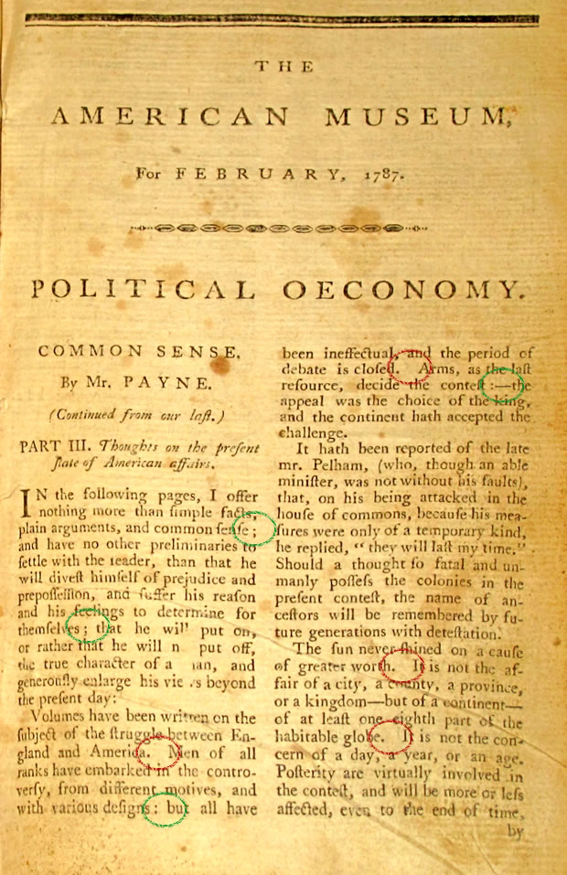
figure 1
In Figure 1 (1787), the emspaces are evident in red. Note also (in green) the spaces before the semicolons and the strange space–colon–emdash combination (green, upper right) that are no longer seen in today’s typography.
figure 2
Figure 2 (1840s) shows continued use of emspaces and continued use of the space (green) before the semicolon. (The subject matter is also of interest).
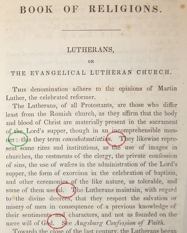
Figure 3
Figure 3 (1855) shows the styles to be unchanged.
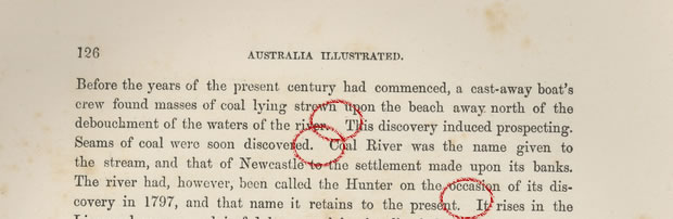
Figure 4
Figure 4 (1876) offers no surprises. The wide spaces after periods continue. Clearly this style is no passing fad. When did things change?
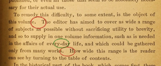
Figure 5
Figure 5 (1892) shows the wide space after a period to be alive and well during the Victorian period. Notice the interesting hyphenation (green) of a word which is now compound. (I own a children’s book from 1909 that hyphenates “today” as “to-day.”) The figures reveal subtle style changes that define the correct usage and authentic appearance of their times.
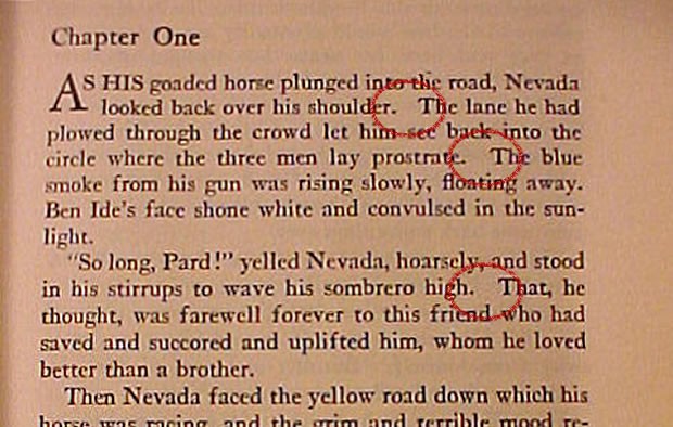
Figure 6
Figure 6 jumps ahead to 1928. Same thing.
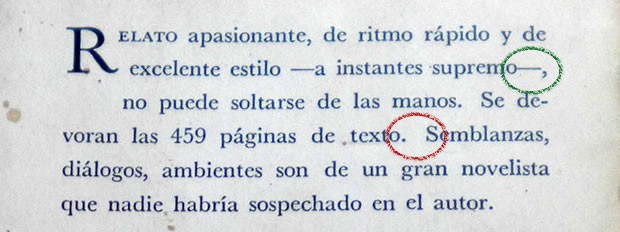
Figure 7
Figure 7, a Spanish book cover back from 1959 shows the wide space and an unusual comma after the emdash. As this is a relatively contemporary piece, I don’t know if this punctuation is a mistake, a style convention, or acceptable Spanish language typesetting. The space before the first emdash is also unusual.
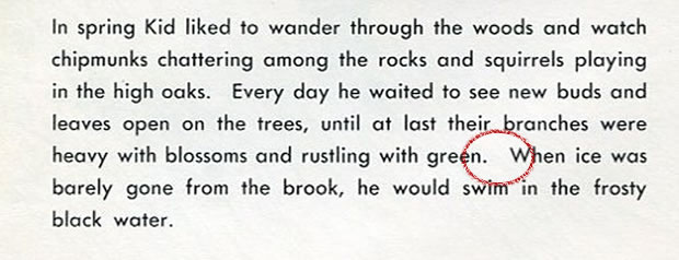
Figure 8
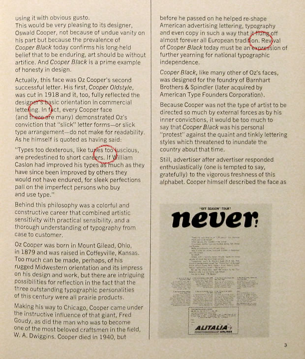
Figure 8 (1960) is from a book by the poet, E.E. Cummings. Though the poet was known to take typographical liberties, this looks like straightforward use of the double-space.
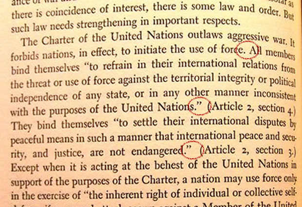
Figure 9
And then, in 1961, things begin to change (figure 9). A wider survey will likely reveal the style change taking place over several years and at different times in different places, but I found no examples of single-spaces being used after periods prior to 1960.
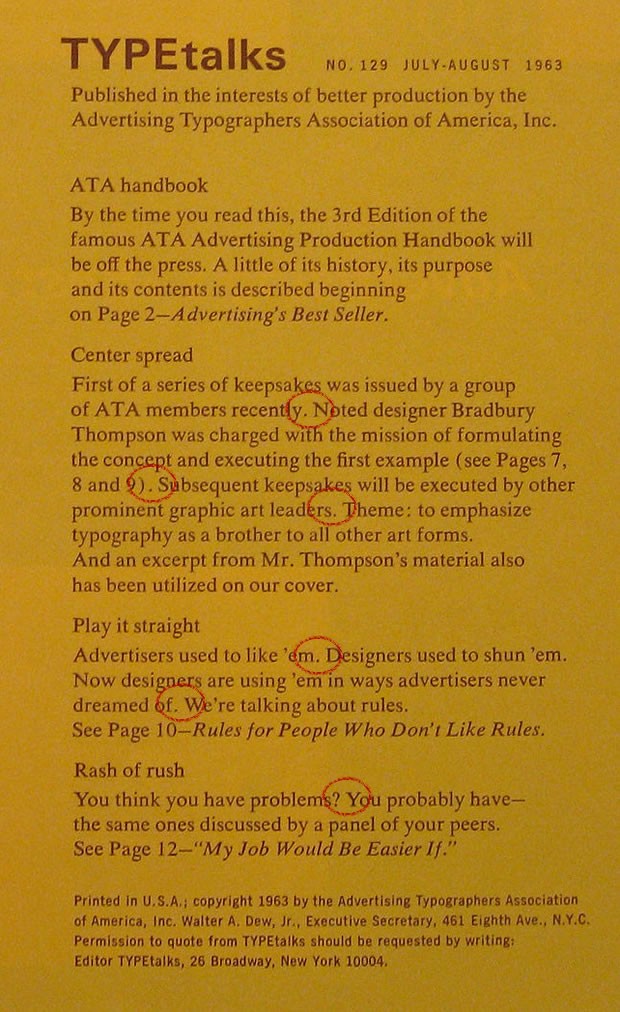
Figure 10
Figures 10 and 11 (1963 and 1964 respectively) are notable because the type is featured on graphic design journals of that time, suggesting that the design community had accepted the single-space as a standard.
Could it be that the single-space was adopted by the book industry as a paper-saving measure? Though it existed as early as the mid-19th century, the paperback book turned literature into a mass-market commodity during the 1930s. Publishers developed huge distribution chains that required print runs of tens of thousands of books; type size shrank along with leading (line spacing) and page margins. Mass-deployment by the publishing industry would explain the rapid acceptance of a spacing design that ran contrary to centuries of tradition.
Single-space or double-space After a Period?
The style, since about 1960, has been to use a single-space after a period; it’s fair to say this is the working typographic standard. The adoption of that standard by major style manuals more or less codifies the single-space into law. And if you have any doubt, check your own bookshelf; you’ll be hard-pressed to find text with double-spaces after periods.
Contemporary typographers and readers are accustomed to tighter text. The period and the following capital are considered sufficient to alert the eye that a sentence has ended and a new one is about to begin. Designers tuned to the single-space standard see gaps in the text that disturb the visual flow.
But the double-space is a tradition that abruptly faded not so long ago—certainly within the lifetimes of many of today’s active writers. Though no longer in standard use, the emspace may be a simple sacrifice to industry. Given that context, along with the facts that typewriters and digital typography are largely irrelevant to the discussion, it becomes difficult to argue that the double-space is simply “wrong.” It’s not difficult to imagine that typographers and readers once looked upon those gaps as welcome sentence separators. Designers who wish to produce authentic historicist work should consider using the double-space after a period.
Your typesetter will remove double-spaces from your manuscript; that’s a simple fact. Though writers are encouraged to unlearn the double-space typing habit, they may be heartened to learn that intellectual arguments against the old style are mostly contrived. At worst, the wide space after a period is a victim of fashion.
Addendum
Several readers have suggested that my post-1961 examples are left-justified while all the preceding examples are full-justified—not a fair comparison.
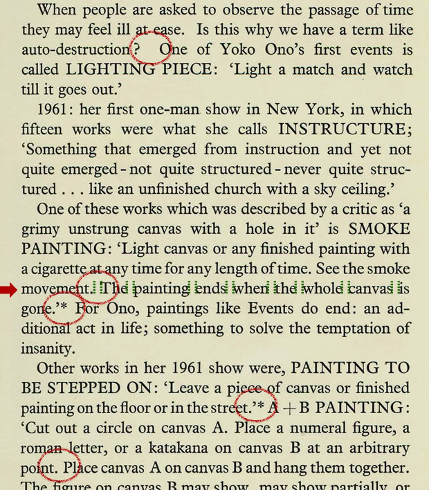
In Figure 12 (1966) above, the space widths vary but they are consistent across each line (except for one emspace after a question mark). In the line marked with a red arrow, I inserted identical pairs of green lines into each space. The spaces, even after adjustment to accommodate full-justification, are clearly shown to be single spaces.
Likely, the “meteorite” that suddenly ended the long rule of the emspace “dinosaurs” was Phototypesetting, a technology that rapidly displaced hot metal type during the 1960s in much the same way that “desktop publishing” took over during the late 1980s. The emspace was not a victim of fashion or industry; technology was the catalyst for rapid change.
I’d be remiss if I didn’t refer readers to Thomas Fine’s excellent article, Sentence Spacing: A Typographic Counter-Revolution for an in-depth explanation of the technical origins of spacing conventions.