 Book design has changed since publishing became a gigantic industry. Typesetting was once performed by trained craftsmen who apprenticed to masters before inking their own plates. Phototypesetting arrived in the 1960s and by the late 1980s, digital publishing transferred the job to a new generation of young, digital artists. Much of the old wisdom got left behind—paved over by the pixel. This article looks at a piece of design history—page layout—and places that history in a practical contemporary context.
Book Design: The Role of History
I bought my first Macintosh in 1987. I remember learning Pagemaker and stumbling over concepts like “leading.” Why not just call it line spacing? I learned about publishing technology and worked in the field, but it wasn’t until I started teaching college design classes (jobs I got because I knew the software) that I encountered the history of design and its value. My students were talking about Constructivism and the Bauhaus School and Pushpin Studios. I was all about Beziér curves, vector graphics, and the clone tool. The Graphic Design department chair looked me in the eye one day. “Get ready,” she said. “You’re teaching History of Graphic Design next quarter—and you’d better know your shit.”
This was one of the best favors anyone has ever done for me. I started with the present, worked my way back through cave paintings in France, and found myself on an inspiring journey that changed the way I worked and taught. Over the years, I’ve infected a handful of students with my love of design history and seen them win portfolio awards on graduation day. You can’t just pick up a guitar and play the blues; you have to listen to modern day bluesmen and work your way back to Robert Johnston. Design is the same way; without roots it has no soul.
Book Design: Trade Books Suck (Don’t Imitate Them)
Getting off the soapbox and onto the topic at hand, the subject of this article is page layout. Big publishers have sacrificed it to the gods of efficiency. Pick up a book in an antique store and you won’t find half-inch margins. But when you’re printing and shipping 30,000 books, small type, tight leading (called “leading” because line spacing was once adjusted by inserting lead shims between rows of metal type), and narrow page margins save significant ink, paper, and shipping cost. Readers aren’t complaining and publishers are wise to save the money.
But I have picked up so many books and thought That type is so dense! This looks like a chore to read. As I’ve gotten older and made it a habit to always tuck a pair of reading glasses into my shirt collar, I’ve become less forgiving of “efficient” book design. Reading a properly typeset page is a joy—not a job.

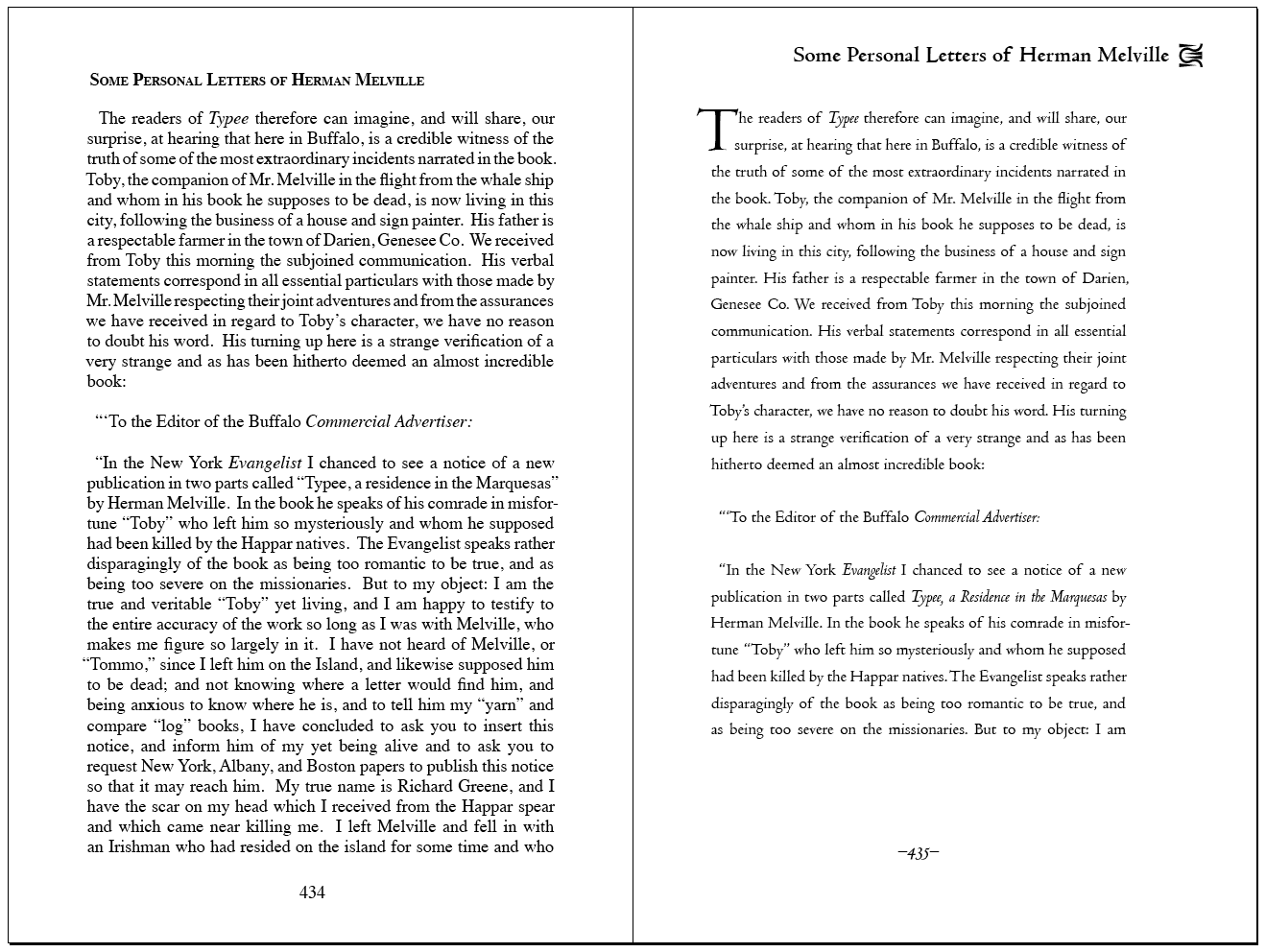
trade margins (left) vs. classic layout (right)
The tragedy is compounded by POD (print on demand) and short run publishers who blindly imitate the design aesthetic of trade books, imagining that the similarity between their books and mass-market books will inspire confidence in readers. Herein lies the missed opportunity. So what if your book is 25 pages longer? On a one-book-at-a-time basis, the difference in cost is negligible. Small publishers are not restricted by efficiency requirements. They miss an easy chance to exceed industry standards and release books that are better looking than those offered by the trade.
Book Design: Your Mileage May Vary
Before I offer solutions, let me concede that many people have gotten used to the “trade book aesthetic.” Classic layout appeals to some while appearing outdated and obsolete to others. Regardless of its basis in economics, an argument can be made that half-inch margins are part of contemporary visual language. If you prefer that look and think I’m arguing for the equivalent of reintroducing “thee,” “thy,” and “doth” into modern English, by all means, use any design strategy that pleases you. There is no right or wrong way, but whichever path you choose should be the result of conscious consideration of options.
Book Design: Ideas for Elegant Page Layout

Wikipedia offers an excellent description of Canons of Page Construction, but the explanations are a bit technical. The article discusses various mathematical bases for deriving an “ideal” page layout (that will be of interest mostly to typography geeks) but the unspoken secret is that they all look pretty much the same.
One easy way to apply these is to copy one of the layout diagrams from the article, import it into your layout software, and stretch it to fit a two-page spread of your desired size. Because the gutter (between pages) will swallow some space on the inner edges of your pages, I usually bump the text areas outward about an eight of an inch, but the images on Wikipedia make useful templates.
Tschichold’s “Golden Canon” and Rosarivo’s (right) are described in terms of a page divided up into ninths but the true foundation of this design is sensible, easy to understand, intuitive, and interesting. It’s rooted in a fundamental aesthetic principle: the “rule of thirds.”
Photographers use the rule of thirds to guide their compositions. Images where the subject is centered are static, balanced, and uninteresting. Calculated asymmetry is a classic formula for adding tension and interest to an image. The example photo on the right is composed according to divisions of thirds. It’s balanced but not too balanced. The example on the left is boring because of its symmetry and perfection.

Rosarivo’s and Tschichold’s constructions apply the rule of thirds to book design and add a twist; they divide the thirds into thirds—ninths. In the second example on the right, Rosarivo’s construction shows the page with a grid of ninths superimposed on top.
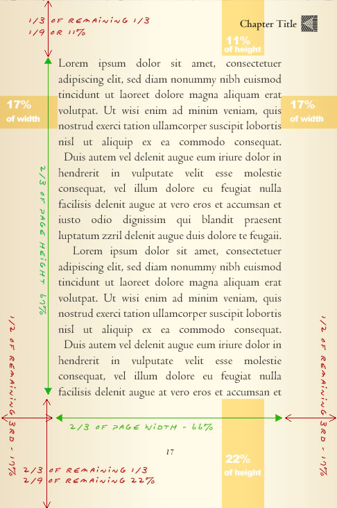
The text takes up two thirds of the overall width of the page and two thirds of the overall height. This leaves a third for margins in each direction.
The unused third of the page is then divided. Two thirds of the remaining third are used for the bottom and outside margins. One third of the remaining third is used for the inside and top margins.it.
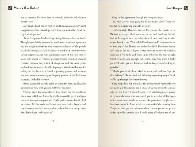
This design works well for traditional print books. It’s based on the premise that the two pages of a spread will balance each other out. As mentioned above, the design does not consider that an eighth-inch or more of the inner margins will disappear into the gutter. Without some adjustment, the final printed pages will look shifted toward the spine. But if you ever picked up a book in an antique store and marveled at how much better it looked, classic layout may very well be what you’re noticing.

Book Design: Classic Layout for eBooks
Ebook designs intended for small screens like phones should probably minimize margins in favor of presenting a reasonable amount of text as comfortably as possible. Phone screens don’t offer enough real estate to squander on luxurious margins, but tablets and desktop screens are well-suited to take advantage of classic layout strategies.
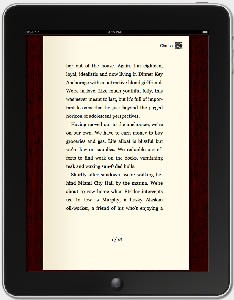
The difference is that usually, only a single eBook page is displayed at a time. How do we use our rule of thirds to display a single page that isn’t part of a two-page spread? The solution is to use the rule of thirds on the vertical axis while centering the text horizontally. Presto! — a one-page, on-screen, classic eBook layout. Such a layout is easily rendered in most viewing devices with basic CSS. Why wouldn’t you?

Book Design: Closing Thoughts on Classic Layout
Big publishers must be forgiven for bending the aesthetics of book design to the requirements of printing and shipping economics, but small publishers have no excuse. When it comes to eBooks, the prevailing design aesthetic is based on the assumption that an eBook is merely a container for data; the value of elegant typography as an important enhancer of the reading experience has been almost universally overlooked. Classic layout offers an ample quantity of text per page while improving readability and allowing the selection of typeface to subtly and invisibly set the tone of the book. Certainly, the layout adds nothing to e-publishers’ costs or the ebook’s file size.
Whether you’re publishing a print edition or an eBook, consider the value of traditional design formulas. Books are hard enough to sell without making them dense, intimidating, and uncomfortable to read. Why not leverage the advantages of POD and short-run publishing to produce beautiful books that big publishers can’t afford to print?


