


 I recently responded to a question in a writers’ forum from an author who was in the process of designing a cover for her novel set in a swamp in New Orleans. “I chose a ‘swampy’ font that hangs down over the art to make it look like Spanish moss,” she said. For her previous Zombie fiction book, she chose a typeface appropriately named “bullet in the brain.” Though these might seem like obvious choices, their obviousness is precisely what makes them a liability. This article offers a few thoughts on book cover design for genre fiction.
Book Cover Typefaces: You Get What You Pay For
Excellent typefaces often cost hundreds of dollars. Fonts on free font sites are very often either ripped off and renamed or designed by amateurs. Rarely will someone take the time to design a serious typeface and give it away. FontSquirrel and a few others offer some quality typefaces but gimmicky fonts often lack a full set of characters. For example, they may offer only capital letters and might omit dollar signs and other useful glyphs. Like free clip-art that’s available to everybody, free fonts get downloaded and used over and over and over. Paying even a small price for a typeface ensures that 99% of amateurs won’t be using it.
Book Cover Typefaces: What’s in a Name?
Be careful not to be seduced by the name of the typeface. Plenty of “spooky” fonts on free font sites have creepy names but that doesn’t mean the typeface is well-designed or even appropriate. If the font is named “slasher,” how many Horror writers do you think will use it on their homemade covers? Call the same font “Drippy” and writers will ignore it in droves.
Book Cover Typefaces: Lost in Space
Many fonts on free sites have really poor kerning tables—the built-in logic that controls the letter spacing. You can get around this but you have to pay attention. I had an MFA student once who designed a poster about child soldiers. His caption was supposed to read “In war there are two types of casualties.” But because he didn’t pay attention to kerning, his caption read “in war there are two types of casual ties.” Kerning can be manipulated (and almost always should be) but most amateurs take the typeface at “face value.”

Book Cover Typefaces: Letters in Distress
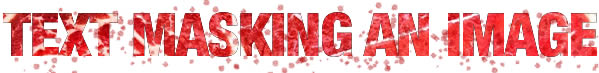
One typographic trend relies on letterforms that come “pre-spattered” or “distressed.” An issue with distressed or “melty” fonts is that if you have two or more letters in the title that are the same—especially consecutive letters—the distress patterns match and the title loses its “organic” appearance.

The identical Ts, Ns, and Rs utterly ruin the effect of the textured type in the “bullet in the brain” example above. If you want spattered brains, get a straw and some India ink; make your own one-of-a-kind spattered letters and then scan them when they’re dry. Probably, the designer of your distressed typeface used a similar technique. How many hours did you work on your book? Why ruin it by taking typographic shortcuts?
Sometimes, it’s better to use a classic, readable typeface instead. With the correct tools, you can melt it or drop another image into it.
The above example was hastily made with Helvetica Neue, a picture of a steak and a Fireworks brush stroke. But though it’s readable and no two letters are identical, it places us squarely back in the realm of predictable solutions. “Frankenstein” fonts and gory textures are a predictable approach, and that’s precisely why an experienced designer will find a different way. If your book looks like the kid’s menu at the Haunted House Restaurant, it will not be noticed by serious readers of your genre.
Book Cover Typefaces: Design Under the Influence
If you absolutely must design your own cover, take some of the hundreds of dollars you’re (dangerously) saving and buy a book of Chip Kidd’s cover designs. Even the best designers work with great influences in front of them. One of my favorites is the cover he did for “Dry” by Augusten Burroughs.

Rest assured that Kidd’s design was not produced with a distressed typeface. The cover design is effective because it shows us a believable image. The cover has storytelling impact because the “wet” text is exactly opposite the “Dry” title. How many designers would have scattered sand on the page or used a photo of a desert or filled the letters with dry, cracked mud? These are precisely the obvious, predictable solutions that would have made the book cover boring.
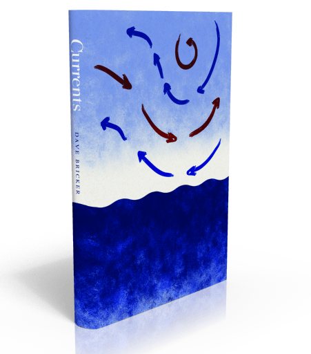
For the cover of Currents, I placed type only on the spine. The absence of a title provokes people to pick up the book and look for one. Moreover, because this is a self-published book, the primary points of distribution are online bookstores where the title is prominently displayed at the top of the book’s product page. Risky? Maybe—but what will “safe” get you?
Book Cover Typefaces: Kids, Don’t Try this at Home
You might save money by designing your own cover but there’s much at stake. You can get your hands on Photoshop as easily as anyone but without a knowledge of typography and an awareness of trends and clichés, that savings comes at a price. Just as amateur poets often ruin their work by jumping on the obvious rhyme (heartache rhymes with heartbreak), amateur designers often choose easy, intuitive solutions that feel comfortable precisely because they’ve seen them so many times before.
You may be talented and design-aware—and there are plenty of so-called designers whose skills are merely technical, but a writer will rarely achieve professional standards in editing, typesetting, or cover design without professional input. At very least, if you’re committed to going the solo route, hire a designer to critique your work as an editor would critique your text. At best, your choices, taste and talent will be validated. At worst, you’ll learn something new and save yourself from yourself.