


 In my work with writers, I come across many common technical problems with manuscripts. These usually spring from the best of intentions as the writer attempts to create the feel of the finished book within the manuscript. Though they’re trying to be helpful, it requires more of the typesetter’s time to strip out all of these stylistic additions. When it comes to manuscripts, simpler is better.
Here are ten tips for writers to consider while they create their manuscripts and ready their books for the design and production process.
1. The double space – Digital typefaces have carefully designed kerning tables that control spacing between various pairs of letters. That way a capital “A” can nest closer to a capital “W” than it would to another capital “A.” Most style manuals specify single spaces but if you want wide spacing, ask your typesetter to insert emspaces. Emspaces are single characters—wide spaces, not double-spaces. Double-spaces were a convention that attempted to get typewriters to imitate the wide spacing seen in book typography prior to the early 1960s when electronic typesetting methods took over. The first thing your typesetter will do is convert all your double spaces to single spaces but if you can break the double-space habit, you’ll save a step. Read more about sentence spacing here. (Really! Read it, especially before commenting.)
Don’t put double spaces after a period. Your typeface already knows how much space is required.
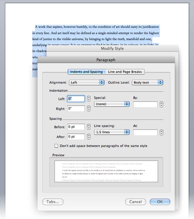
Additionally, consecutive spaces are often used by writers who don’t understand how to set tabs and indents. An indent is not equivalent to five spaces. Indentation is controlled in your word processor’s paragraph settings dialogue or by manipulating the rulers above the text (see below).
Don’t use consecutive spaces to move text around. Use tabs and justification. When it comes right down to it, don’t use double spaces at all.
2. Multiple Line Breaks – When it’s time to bump a chapter over to the next page, many writers simply hit the return/enter key until the text jumps down to the desired place. This makes for a better looking manuscript, but the line breaks will invariable fall in different places when the manuscript is ported from its 8″ x 11″ format to a 5″ x8″ book format. The typesetter has to manually search for and destroy all the consecutive line breaks, but this causes other problems as there are cases (such as a title page) where two or three consecutive line breaks are sometimes useful.
If a page break is required, use your word processor’s page breaks and section breaks. These are distinct from line breaks and are easier for a typesetter to use or remove without compromising other kinds of formatting.
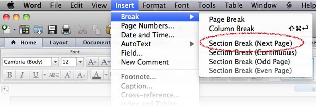
NOTE: In most Word Processors, the shortcut for a page break is Command/Control-Enter
3. Typefaces – Don’t get fancy with typefaces. That’s the job of the designer / typesetter. Create your manuscript with a common serif typeface like Garamond or Times. In cases where a certain character’s voice is represented by a certain typeface, be absolutely consistent and make sure your typesetter is aware of your choices. In many cases, it will be just as easy to indicate you’d like a certain kind of typographical treatment without actually implementing it. As a writer, your job is to create the words. Even if you produce your own book, treat the production as a phase entirely separate from the writing. The fancy title page you created in Word is usually a stumbling block for your typesetter.
I’ve also seen cases where writers use monospaced fonts like Courier in their manuscript body text. There was a time of transition between typewriters and word processors where some academic standards prescribed monospaced fonts in order to emulate the more traditional and (at that time more) acceptable look of a typewriter, but this has since yielded to sanity. Why not use a highly legible book typeface when it’s available?

Work with a designer to choose a typeface that’s appropriate for book typography. Many standard fonts (like Times New Roman) are not only bland and institutional, they lack the special characters needed for professional book typography.
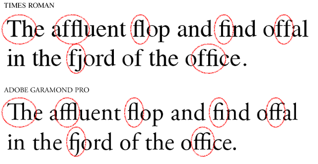
A manuscript is not an appropriate place for complex typography. Save that for the final book.
4. Line Spacing – Manuscripts are traditionally double-spaced. Originally, this was done to facilitate hand-writing between the lines, and in spite of the availability of excellent digital editing and annotation tools, it’s still a good practice (though there’s nothing quite like paper). When you print out your final draft, you’ll be grateful for that space to pencil in notes about the problems you couldn’t see on-screen. Chances are your editor will feel the same way.
Set your word processor’s line spacing to 1.5 lines. Your typesetter can adjust final line spacing after editing is finished.
5. Headers, Page Numbers and Footers – Word Processors offer header and footer areas to allow your title, author name, or page numbers to be automatically displayed on every page. If you manually insert headers or page numbers into the text, your typesetter will have to manually delete them one at a time and then rejoin any paragraphs split by them. Page numbers in your manuscript will not correspond to page numbers in your final book, anyway. For manuscript purposes, it’s recommended to limit header/footer use to simple page numbers.
Don’t add page numbers and headers to your body text. Use your Word Processor’s header and footer features to accomplish this.
The rule of thumb when it comes to manuscripts is simple; manuscripts are strictly part of the writing process. If you’re in doubt, consider whether a potential stylistic addition to your manuscript is an integral part of the writing or if it has more to do with your book’s final look and feel. It’s natural to want to see what your book will look like as a finished product, and you may wish to communicate aesthetic ideas to to your book designer, but by keeping your manuscript aesthetically raw and simple, you’ll stay more focused on the content as you develop it. Once you finish writing and finally get to the design phase, you’ll be amazed at how much more easily your plain manuscript can be transformed and polished into a beautiful book.
6. Paragraph Margins – Using a tab to begin a paragraph is another unfortunate holdover from the days of typewriters—as are half-inch paragraph indents. Instead of using a tab, use your word processor’s rulers to control paragraph style. The left side of the ruler is split. The top half controls the first line; the bottom half controls the rest of the paragraph. 
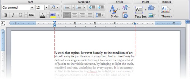
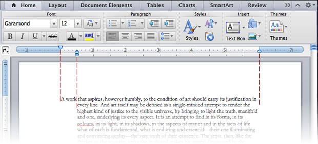 And though using default half-inch margins is hardly egregious within a manuscript, the measurement preferred by typographers is one em. Technically, this is the width of a letter “M” in your chosen typeface but in the digital world, an em translates into the point size you’re setting type with. If your book uses a 12-point font, that’s 12/72-inch or 1/6-inch. Feel free to approximate or to use the defaults, but know that your typesetter will be adjusting your paragraph indents. If she doesn’t have to strip out all the tabs you’ve put in front of your paragraphs, that job becomes easier.
7. Multiple tabs are as annoying as multiple spaces. If you need to center text or create tables of names and values, highlight the desired text and then click the ruler to set paragraph alignment or tabs where you need them. Set tab leaders (usually dots) and let the software fill them in. Don’t type endless rows of dashes, underlines, or periods.
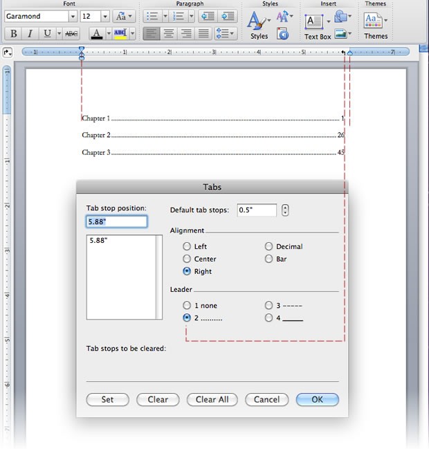
8. Tables of Contents (despite the example above) actually don’t belong in your manuscript. The pages that content falls on in your book will drift considerably from where they fall in your manuscript. Typesetting software like Adobe Indesign will generate a table of contents based on the placement of chapter titles or section breaks. Your carefully hand-built table of contents will be immediately deleted from your manuscript by your typesetter. Don’t waste your time.
9. Text Styles are useful to both writer and typesetter. They aid in manuscript formatting and they can be readily imported into Quark or Adobe Indesign to speed up final typesetting. Type styles are easy to learn—and you’ll never imagine how you lived without them.
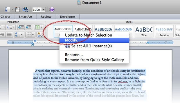
Style shortcut buttons sit at the top of your MS Word toolbar. Highlight text, click a button, and the named style is applied to your text. This is all well and good if you want various shades and species of mostly blue text, but fortunately, the styles are modifiable. Right-click (control-click on a mac) on a style and you can modify it or update it to match fonts and paragraph rulers already applied to highlighted text.
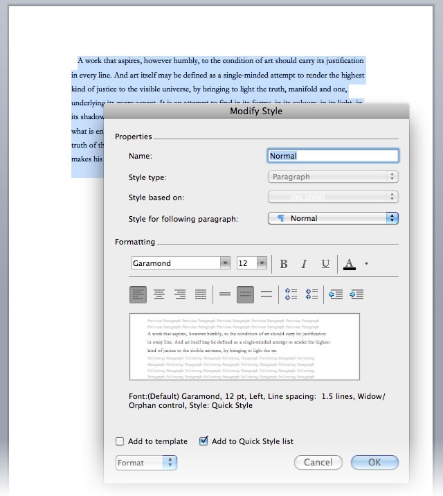
You can modify numerous properties of the text and even rename a style.
For example, you may wish your section titles to be in 24-point centered Garamond with no first-line indent. Modify the “Title” style and then format every title by simply highlighting and clicking the style. Maybe you want quotations to be in slightly smaller text with wider left and right margins? Make a style. Maybe you want 9-point type for footnotes? Make a style.
Custom styles make working with a word processor much easier and they also aid the typesetting process. Once the styled text is pulled into a page layout program, the imported styles can be modified to fit the format and design of the book.
I posted a Word document with about a half-dozen basic, useful styles here (the archive is public; please don’t email me asking my permission to download it). Delete my text and start on your own project or go to Format > Style in Word’s menu bar and then click the “Organizer” button to copy my styles into your own copy of Word. This will make them available to all your documents.
10. Learn about dashes and special characters. In the old days when manuscripts were created on typewriters, the mechanical limitations of the writing device made it difficult to format text correctly. But Word Processors are hardly a new addition to the contemporary writer’s tool box. If you type three consecutive periods (…), most word processors will convert them to a single ellipsis (…). Type double primes around a word (like ″this″) and you’ll probably end up with printer’s quotes (like “this”). But two hyphens (–) won’t get converted into an emdash (—). These punctuation marks aren’t for printers; they are expressive tools that expand the creative capability of the writer. You can count on your software or your typesetter to make the desired conversions, but this doesn’t always work out as planned:
“The GPS’s robot voice said, ‘Current latitude is 78.4˚ 18′ 22″.'”
Software was never designed to sort out a mess of quotation marks and primes like that. (And you don’t want to see what it looks like in HTML code!) Learning about special characters like oldstyle figures, small capitals, and dashes allows you to make creative decisions instead of your software.
Manuscript Prep: Conclusion
Ultimately, typesetters are prepared to manage manuscript shortcomings. Double-space conversions, removal of tabbed paragraph indents, changing double hyphens into emdashes—these are all standard procedure for converting a manuscript into a book. Though it’s not the writer’s job to save the typesetter time, it is the typesetter’s practice to charge for it. Send in a “clean,” well-formatted manuscript and you’re far more likely to encounter negotiable typesetting fees.
And though typesetting a book with a word processor does not deliver the same quality results as a dedicated typesetting program, many writers are forced by economics to do the job themselves. In such cases, time spent learning a few typographic fine points—even simple things like the proper width of a paragraph indent and sentence spacing style—will positively impact the appearance of the final book. (If you must DIY, use one of Joel Friedlander’s MS Word book templates.) Even if you do plan to typeset this way, the process is the same; a manuscript is not a book. Use standard 8½x11 format until you’re finished with the editing process and then format a copy of your manuscript to suit the style and dimensions of your final book. You’ll find writing easier, your editor will love you, and the transition from manuscript to finished book will be streamlined and easy.